


This project was born with the aim of continuing a family saga of pharmaceuticals, where tradition and new practices are accompanied by a knowledge that has been transferred from mother to daughter.
For the Caelles Family it was important to have a strategic development of the brand both at a visual level and in the experience in its retail. To explain to their users three concepts:
Who we are, where we are and where we want to go.
Challenge
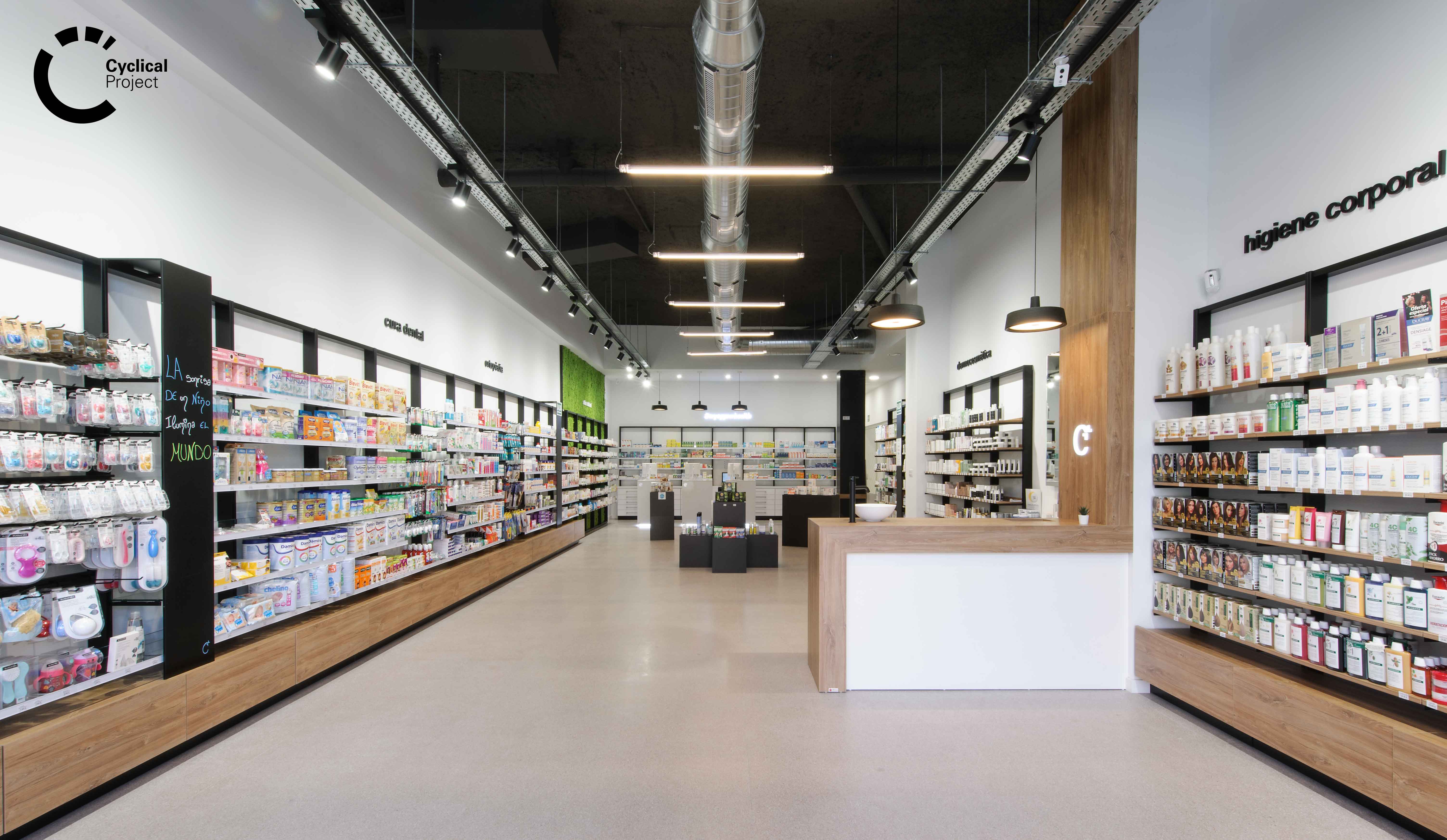
Having already a physical pharmacy in Reus, the challenge of creating and theatricalizing a new space in Ripollet was presented. An industrial town that grew exponentially in the 60s and 70s, due to a migration from different parts of Spain, especially Andalusia, which obtained work in the different industrial estates that existed. Being consistent with the reality of the place and the social environment that was presented, we decided to develop the project taking into account the essence and industrial idiosyncrasies that characterize this place, merging it with the professional value offered by this group of professionals who give life and human warmth to this project.
Outcome
Creation, development and implementation of a global communication branding strategy that includes the verbal, attitudinal, sensory and visual axes.
Farmacia Caelles, is part of the group Caelles, a family project composed of mother and daughters who sought to enter a new vision that allows them to develop in a new stage of strategic communication, taking their business idea to another level and seeking differentiation in the sector.
This project was born from an important value, the human factor. This is conveyed through the Personal Branding of these three professionals. Their personal brand is the value that makes the difference and their seal of guarantee; from this, we started to develop the communication by making a constant symbiosis with the pharmaceutical knowledge and the good work of these three professionals. For them we divided the project into three stages: Group Brand, Personal Branding and Retail. These three stages marked the roadmap to develop the project.
The brand was born from a rebranding that we brought under the same concept of Caelles, as a family and business unit, we focused the development of this brand with a sans serif typography that would evoke freshness and innovation, besides choosing a leitmotiv in English that would not go unnoticed by the new typology of users and to focus their business projection.
Following this, and with the group brand already defined, we had to give life and personality to the Personal Branding of the people behind the brand and endow it with personality, charisma and professionalism; therefore, we developed a sequential visual identity, which would give us the opportunity to function individually and represent a coherent group when used together.
An identity was developed that is based on three concepts:
- Supported visually by the «Caelles» with a serif typography that evokes the whole tradition of the sector.
- The graphic character used for the names is a sans serif typography that generates that contrast between innovation and tradition.
- Intangible value. The leitmotiv of each brand is linked to the intangible value offered by each one of them, it is their personal promise to people, where these three visions generate the real expectation of the users towards the brand.
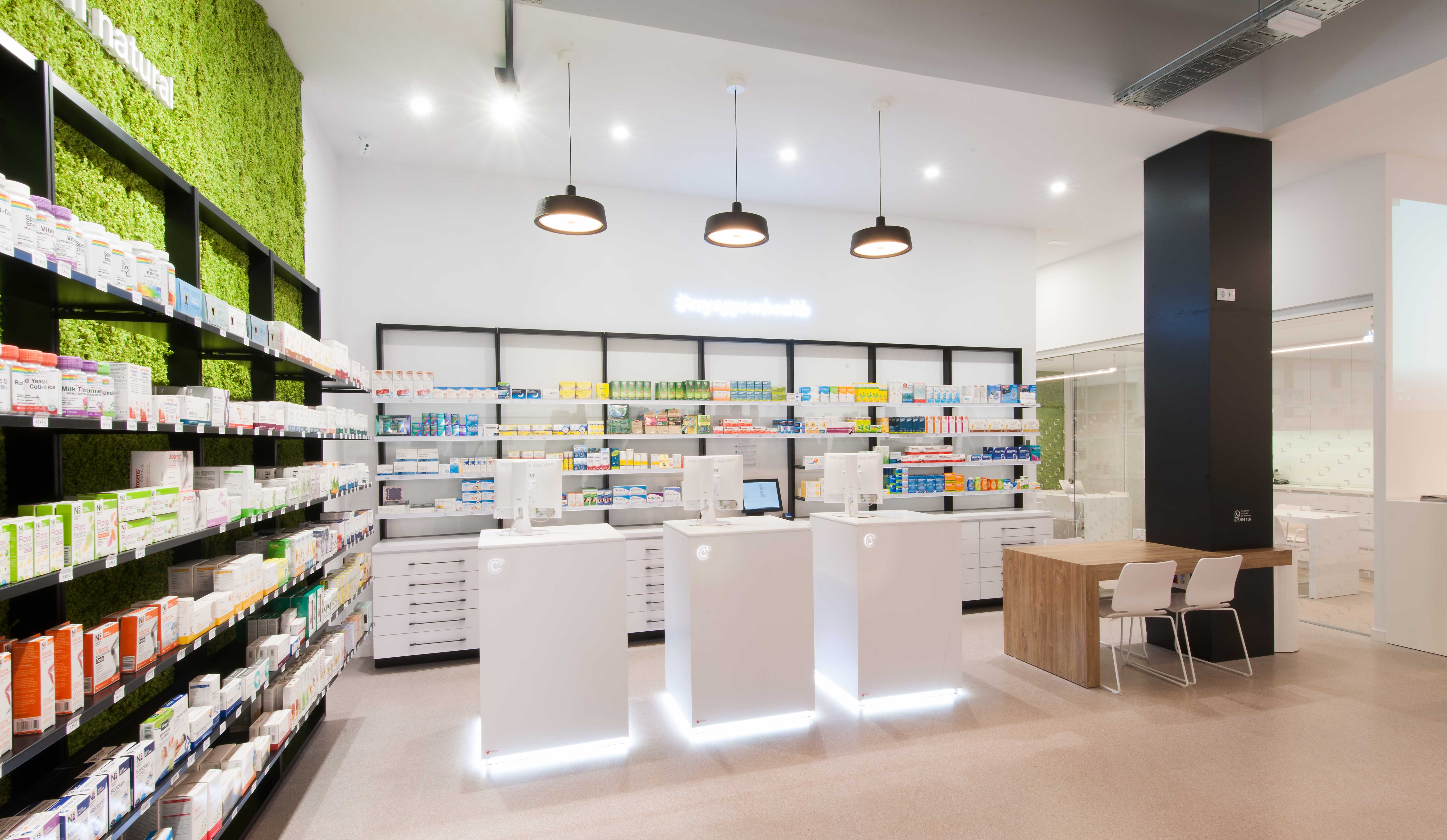
The last stage was devoted to the structural development of the brand experience in space, to its theatricalization; taking into account in its retail the idiosyncrasy of the place and its industrial heritage. Therefore, the materials worked on in the pharmacy had to be in line and coherent with this. Details such as the visible ceiling where all the installations can be seen, the metallic materials such as the shelves of the shelves or the product display modules emphasize this concept of industrialization.
On the other hand, we wanted to greatly enhance the professional figure of the pharmaceutical owner, generating a knowledge space for training and informative talks, which generates a space of knowledge where the user is enriched, with a space where the training of people and collaboration with other colleagues or collaborators prevails. A physical space in the pharmacy where knowledge flows through its corners.
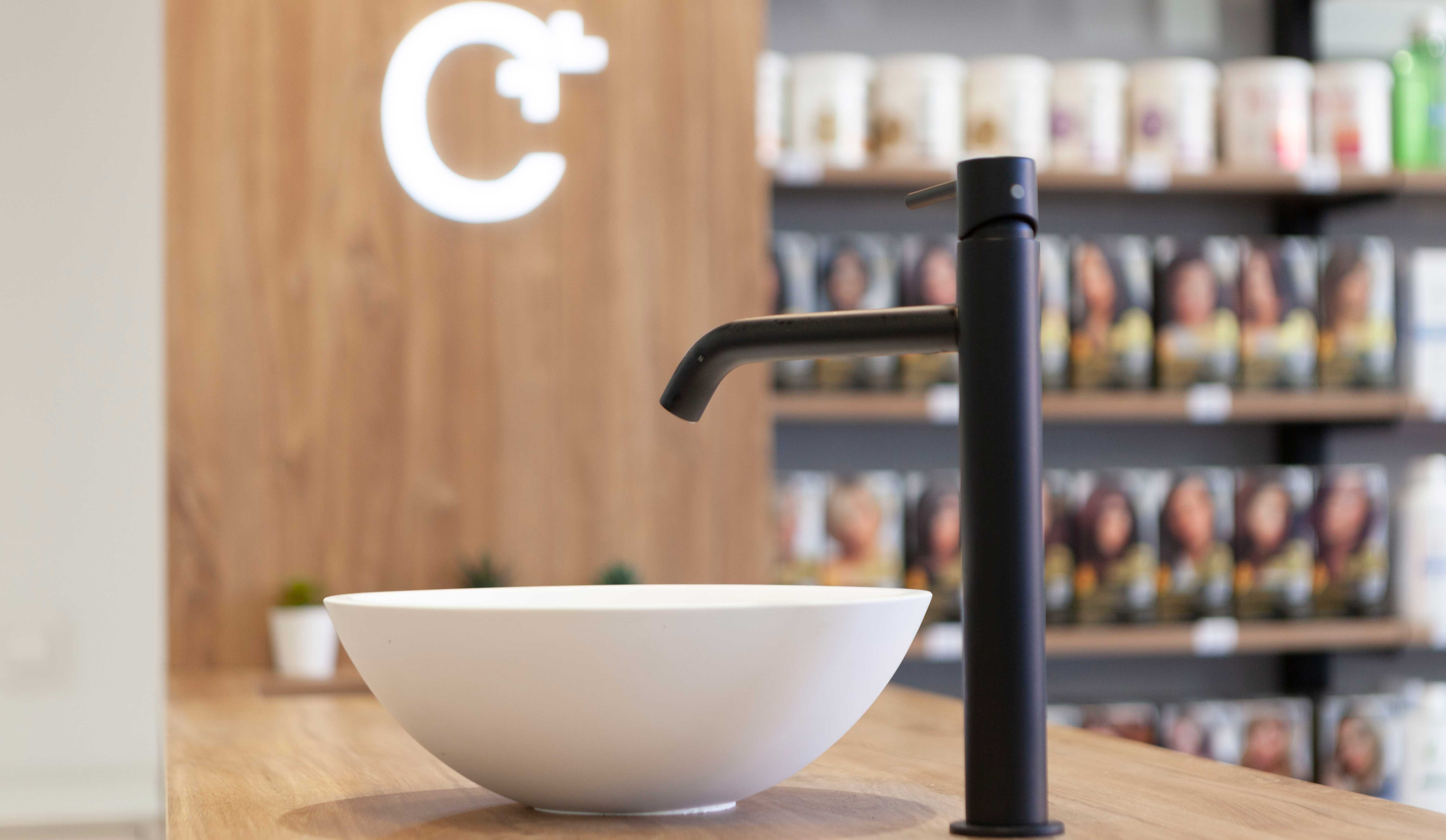
The significant spaces or Wow Effect are equally pieces that help to generate loyalty between brands and people, according to this, we destine a corporate space where the three partners of the group «caellesfarmacias» appear, to promote the concept of pharmaceutical group and family business. The image is accompanied by the Personal Branding of each one, with the corporate promise that explains the values of the brand. On the other hand, we also seek to promote the urban language, close and modern with a side full of hashtags in vinyl cut with the leitmotiv in extrusion, to emphasize the promise of the pharmacy and adapt to new needs of users in constant demand.
With our strategic developments in pharmacies, we seek to enter a new stage, a new language that adapts to the market in a real way with measurable benefits.
Where the knowledge of the professional and the intangibles will be the factors to promote and those that mark the differentiation between the competition.
brandcelona® Strategic Brand Leadership designs smart brands for the new era business through innovative strategic tools and the Cyclical Branding® methodology. For further information please write to hola@brandcelona.com.
www.yellowweare.com
www.cyclicalbranding.com
—–
Este proyecto nace con el objetivo de continuar con una saga familiar de farmacéuticas, donde la tradición y las nuevas praxis están acompañadas por un conocimiento que se ha ido traspasando de madre a hijas.
Para la Familia Caelles era importante tener un desarrollo estratégico de marca tanto a nivel visual como en la experiencia en su retail. Que explicara a sus usuarios tres conceptos:
¿Quiénes somos?, ¿Donde estamos? y ¿Hacía donde queremos ir?.
Reto
Contando ya con una farmacia física en Reus, se presentó el reto de crear y teatralizar un nuevo espacio en Ripollet. Localidad industrial que creció en su población de manera exponencial en los años 60-70, debido a una migración de diferentes partes de España, sobretodo Andalucía, que obtenía trabajo en los diferentes polígonos industriales que había. Siendo consecuentes de la realidad del lugar y el entorno social que se presentaba, decidimos desarrollar el proyecto teniendo en cuenta la esencia e idiosincrasia industrial que caracteriza a este lugar, fusionándolo con el valor profesional que ofrece este grupo de profesionales que le dan vida y calidez humana a este proyecto.
Solución
Creación, desarrollo e implementación de una estrategia de branding global de comunicación que incluya los ejes verbales, actitudinales, sensoriales y visuales.
Farmacia Caelles, forma parte del grupo Caelles, proyecto familiar compuesto por madre e hijas que buscaron entrar en una nueva visión que les permita desenvolverse en un nuevo estadio de comunicación estratégico, llevando su idea de negocio a otro nivel y buscando la diferenciación en el sector.
Este proyecto nace de un valor importante, el factor humano. Éste vehiculizado a partir del Personal Branding de estas tres profesionales. Su marca personal es el valor que marca la diferencia y su sello de garantía; a partir de ello, nos pusimos en marcha para iniciar el desarrollo a comunicar realizando una simbiosis constante junto al conocimiento farmacéutico y el buen hacer de estas tres profesionales. Para ellos dividimos el proyecto en tres etapas: Marca de grupo, Personal Branding y Retail. Estas tres etapas marcaron la hoja de ruta para desarrollar el proyecto.
La marca nace de un rebranding que traemos bajo el mismo concepto de Caelles, como unidad familiar y de negocio, enfocamos el desarrollo de esta marca con una tipografía palo seco que nos evocara frescura e innovación, además de optar por un leitmotiv en inglés que no pase desapercibido por la nueva tipología de usuarios y para focalizar su proyección de negocio.
Seguido de ello, y con la marca de grupo ya definida debíamos dar vida y personalidad a los Personal Branding de las personas que estaban detrás de la marca y la dotaban de personalidad, carisma y profesionalidad; por ello, desarrollamos una identidad visual secuencial, que nos diera la oportunidad de funcionar de manera individual y representara un grupo coherente cuando se usen de manera conjunta.
Se desarrolló una identidad que se basa en tres conceptos:
- Tradición. Apoyado de manera visual por el “Caelles” con una tipografía de serifa que nos evoca a toda la tradición del sector.
- Innovación. El carácter gráfico usado para los nombres es una tipografía de palo seco que genera ese contraste entre innovación y tradición.
- Valor intangible. El leitmotiv de cada marca se ve vinculado al valor intangible que ofrece cada una de ellas, es su promesa personal hacia las personas, donde estas tres visiones generan la expectativa real de los usuarios de cara a la marca.
La última etapa se destinó al desarrollo estructural de la experiencia de marca en el espacio, a su teatralización; teniendo en cuenta en su retail la idiosincrasia del lugar y su herencia industrial. Por ello los materiales trabajados en la farmacia debían ir acorde y en coherencia a esto. Detalles como el techo visto donde se aprecian todas las instalaciones, los materiales metálicos como las estanterías de los lineales o los módulos de exposición de producto hacen hincapié a este concepto de industrialización.
Por otro lado, hemos querido potenciar mucho la figura profesional de la farmacéutica titular, generando un espacio knowledge para formaciones y charlas divulgativas, donde se genera un espacio de conocimiento donde se enriquece al usuario, con un espacio donde prima la formación de personas y la colaboración con otros colegas o colaboradores. Un espacio físico en la farmacia donde el conocimiento fluye por sus esquinas.
Los espacios significativos o Wow Effect son de igual manera piezas que ayudan a generar fidelización entre marcas y personas, en función de ello, destinamos un espacio corporativo donde aparecen las tres socias del grupo “caellesfarmacias”, para potenciar el concepto de grupo farmacéutico y empresa familiar. La imagen va acompañada del Personal Branding de cada una con la promesa corporativa que explica los valores de la marca. Por otro lado, también buscamos fomentar el lenguaje urbano, cercano y actual, con un lateral lleno de hashtags en vinilo de corte con el leitmotiv en extrusión, para dar énfasis en la promesa de la farmacia y adaptarnos a las nuevas necesidades de unos usuarios en constante demanda.
Con nuestros desarrollos estratégicos en las farmacias, buscamos que entren en un nuevo estadio, un nuevo lenguaje que se adapte al mercado de manera real con beneficios medibles.
Donde el conocimiento del profesional y los intangibles serán los factores a potenciar y los que marquen la diferenciación entre la competencia.
brandcelona® Strategic Brand Leadership diseña smart brands para negocios de la nueva era a través de innovadoras herramientas estratégicas y la metodología de trabajo registrada Cyclical Branding® . Para ampliar cualquier información escríbenos a hola@brandcelona.com.
www.yellowweare.com
www.cyclicalbranding.com
