
Happy New Year 2023!
Responder


At brandlond, we are very excited and proud that Lopez Landa Interiors chose our talent for their newly revamped Lopez Landa Interiors’ brand. Come try it!
To build the brand tools that Lopez Landa Interiors needed for its next period of evolution, we worked together with the company’s team to capture what made the company tick. We connected staff from every department and level of the organisation to understand day to day goals and views. We immersed ourselves in their world, auditing the visual identity and client experience, from poring over website, to testing the brand positioning.
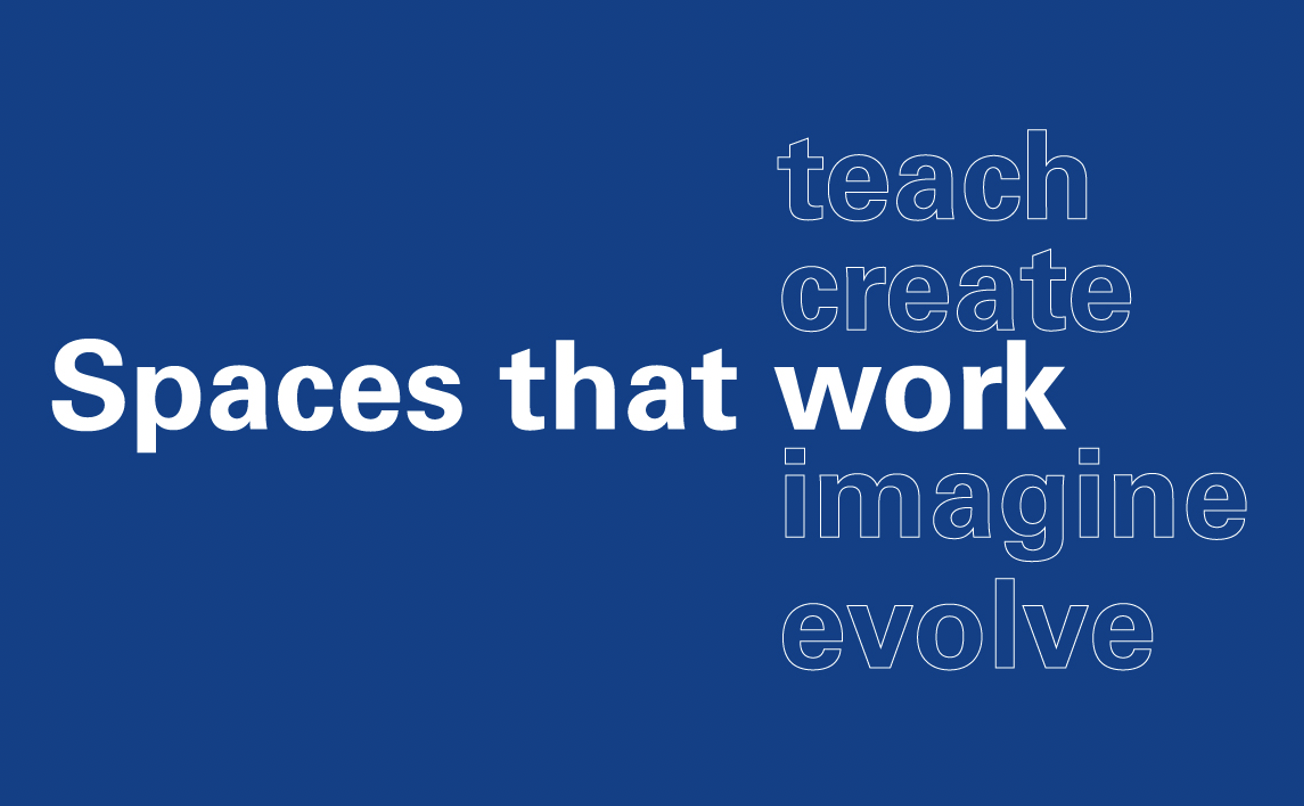
Brandlond has transformed Lopez Landa Interiors into a future-proof construction brand through Brand, Digital and Communication.
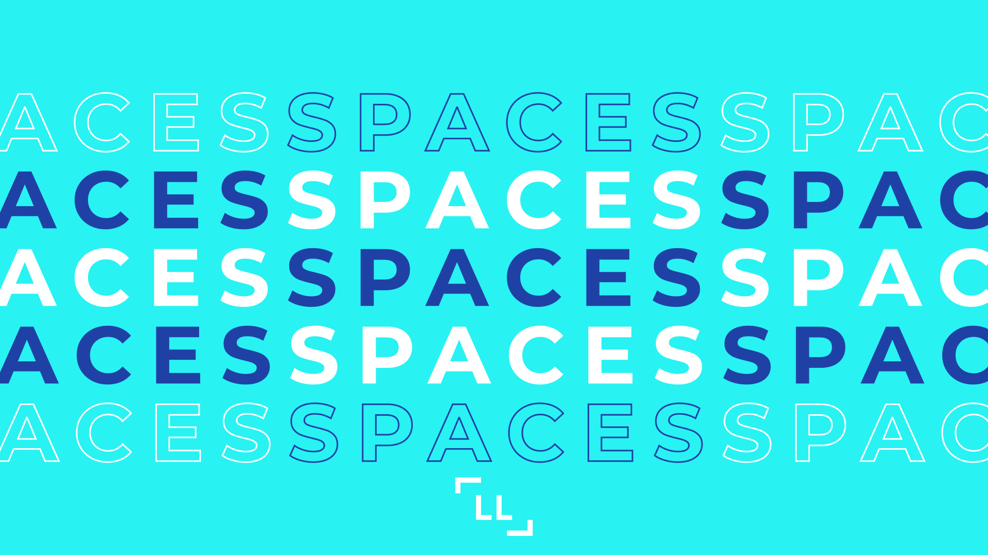
The new identity is a flexible and future proof design system that visually connects the brand more closely with the audience whilst providing them with enough visual expression to suit their respective necessities. Retail, Workplace and Residence.
Look how Brandlond equipped Lopez Landa Interiors with a new visual language and a robust brand strategy to support its rapid growth in the United Kingdom.
Learn more about our work with Lopez Landa Interiors in the Projects section of our website.


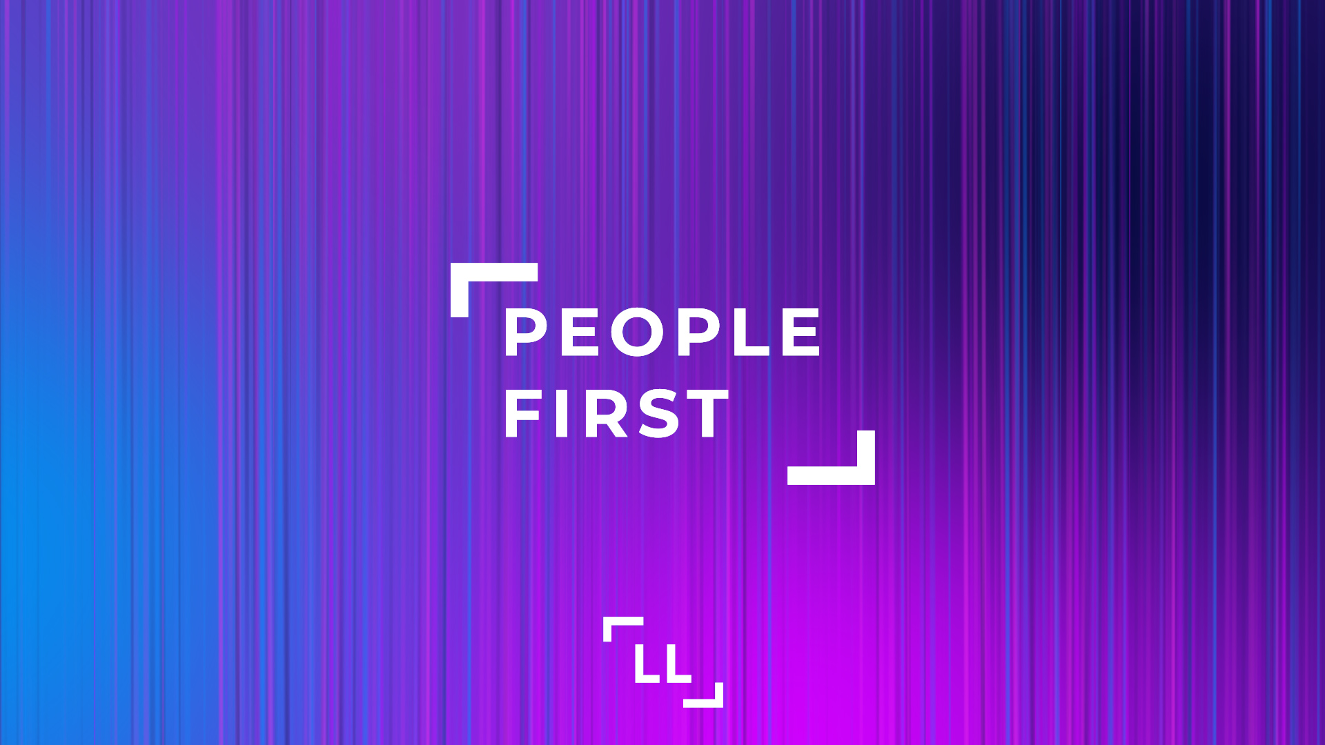
LOPEZ LANDA. People First.
En brandlond, estamos muy emocionados y orgullosos de que Lopez Landa Interiors haya elegido nuestro talento para el rediseño de marca de Lopez Landa Interiors. ¡Ven a probarlo!
Para construir las soluciones de marca que López Landa Interiors necesitaba para su próximo período de evolución, trabajamos junto con el equipo de la empresa para captar lo que la motivaba. Conectamos al personal de todos los departamentos y niveles de la organización para comprender los objetivos y puntos de vista del día a día. Nos sumergimos en su mundo, auditando la identidad visual y la experiencia del cliente, desde estudiar detenidamente el sitio web hasta probar su posicionamiento de marca.
Brandlond ha transformado Lopez Landa Interiors en una marca de construcción preparada para el futuro a través de su Marca, Digital y Comunicación.
La nueva identidad gráfica es un sistema de diseño flexible y preparado para el futuro que conecta visualmente a la marca más directamente con la audiencia al mismo tiempo que les brinda suficiente amplia expresión visual para satisfacer sus respectivas necesidades. Comercio, espacios de Trabajo y Residencial.
Descubre cómo Brandlond equipó a LL con un nuevo lenguaje visual y una sólida estrategia de marca para respaldar su progresión de crecimiento en el Reino Unido.
Conoce más sobre nuestro trabajo con Lopez Landa Interiors en la sección Proyectos de nuestro sitio web.


A brand new website to explore, discover, imagine, feel and inspire.
From awarded projects as ‘World Star of Packaging’ by World Packaging Organisation to ‘Gold Award’ by Pentawards, Lopez Landa Interiors to La Despensa de Palacio you’ll find a wide range of brand projects from which to draw inspiration. All these and more projects are now live on our brand new website.
Here you have a little piece of us, an example of some of our beloved projects, where our passion, freshness and rigorousness, join to create amazing brands.
We hope you like it!

UNIDO, SENCILLO, FÁCIL. SEGUIMOS AVANZANDO. SEGUIMOS EVOLUCIONANDO.
Una nueva web para explorar, descubrir, imaginar, sentir e inspirarse.
Desde proyectos galardonados como el ‘World Star of Packaging’ por la World Packaging Organisation hasta un ‘Gold Award’ de los Pentawards, Lopez Landa Interiors hasta La Despensa de Palacio, descubre una amplia gama de proyectos de ‘branding’ en los que inspirarse. Todos estos proyectos y más están ahora en vivo en nuestro nuevo sitio web.
Aquí tienes un poco de nosotros, un ejemplo de algunos de nuestros reconocidos proyectos, donde toda nuestra pasión, frescura y rigurosidad, se unen para crear marcas sorprendentes.
¡Esperamos que os guste!
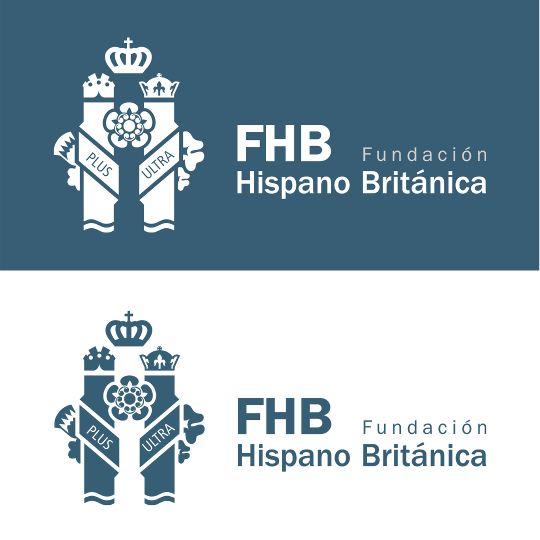
Con esta nueva identidad, ayudamos a la Fundación Hispano Británica a proyectar sus valores y a su notoria tarea de conectar comercio, cultura y sociedad entre España y el Reino Unido.
En este nuevo símbolo gráfico se funden las columnas herculianas de España y las flores del Reino Unido, simbolos de ambas culturas.
La flor nacional de Inglaterra es la rosa. La rosa fue adoptada como emblema de Inglaterra desde el tiempo de la Guerra de las Rosas – guerras civiles (1455 – 1485) entre la casa real de Lancaster, cuyo emblema era una rosa roja, y la casa real de York, cuyo emblema era una rosa blanca. El régimen de los York terminó con la derrota del Rey Ricardo III por parte del futuro Rey Enrique VII, en Bosworth, el 22 de Agosto de 1485, y las dos rosas fueron unidas a la rosa de Tudor (una rosa roja con un centro blanco) por Enrique VII cuando contrajo matrimonio con Elizabeth de York.
La flor nacional de Irlanda del Norte es el trébol. El trébol es una planta de tres hojas que se dice fue usada por San Patricio para ilustrar la doctrina de la Santísima Trinidad.
La flor nacional de Escocia es el cardo. El cardo es una flor morada de hojas espinosas que fue usada inicialmente en el siglo XV como símbolo de defensa.
La flor nacional de Gales es el narciso. El narciso se porta tradicionalmente en el Día de San David. Sin embargo, el humilde puerro también es considerado como un emblema tradicional de Gales, posiblemente por sus colores, blanco sobre verde.
La inscripción Plus Ultra de las columnas de Hércules. Debemos remitirnos a la mitología griega, concretamente a los doce célebres trabajos de Heracles. En el décimo de sus trabajos, Hércules debía matar al gigante Gerión y robar su ganado. Para viajar hasta la tierra de los geriones , Hércules separó dos grandes rocas que dificultaban su paso, colocando a ambos lados, dos grandes columnas que separarían Europa de África, surgiendo de este modo el Estrecho de Gibraltar. Estas dos columnas, se convierten en frontera con el fin del mundo conocido por el hombre, indicando que no había tierra más allá, NON PLUS ULTRA. El lema surge en época del imperio romano; recordemos que el mundo giraba entonces en torno al mar Mediterráneo, el Mare Nostrum y, aunque algunos ya habían navegado por aquel temido océano, nunca lo hacían alejándose de la costa y siempre hacía el norte que los conducía a Finisterre.
Hasta 1492 los navegantes aseguraban que navegar hacia el oeste suponía encontrar una muerte segura, más allá del estrecho de Gibraltar solo existía la oscuridad. El cambio sobre el límite geográfico donde se situaba el fin del mundo, se produce cuando Cristóbal Colón descubre América.
Plus Ultra transmite un mensaje de entusiasmo, de audacia hacia sus súbditos, que afianzaría la presencia española en ese nuevo mundo. En definitiva, se trataba de enaltecer la intrepidez de aquellos navegantes que debían extender las fronteras, llevando la fe cristiana al mundo que se acababa de descubrir.
Sobre cada Columna de Hércules aparece una corona distinta. Sobre el pilar de la izquierda se representa la corona real y sobre la derecha, la imperial. Ambas aluden al concepto de monarquía e imperio presentes en la historia del Reino de España. La corona real británica se muestra en su parte superior.
FUNDACIÓN HISPANO BRITÁNICA IDENTITY
With this new identity, we help the Fundación Hispano Británica project its values and its notorious task of connecting trade, culture and society between Spain and the United Kingdom.
In this new graphic symbol, the Herculean columns of Spain and the flowers of the United Kingdom, symbol of both cultures, merge.

The national flower of England is the rose. The rose was adopted as the emblem of England from the time of the Wars of the Roses – civil wars (1455 – 1485) between the royal house of Lancaster, whose emblem was a red rose, and the royal house of York, whose emblem was a white rose. The York regime ended with the defeat of King Richard III by the future King Henry VII, at Bosworth, on August 22, 1485, and the two roses were joined to the Tudor rose (a red rose with a white centre) by Henry VII when he married Elizabeth of York.
The national flower of Northern Ireland is the shamrock. The clover is a three-leafed plant that is said to have been used by Saint Patrick to illustrate the doctrine of the Holy Trinity.
Scotland’s national flower is the thistle. The thistle is a purple flower with spiny leaves that was initially used in the fifteenth century as a symbol of defence.
The national flower of Wales is the daffodil, and the daffodil is traditionally carried on Saint David’s Day. However, the humble leek is also regarded as a traditional emblem of Wales, possibly because of its colours, white on green.
The Plus Ultra inscription of the Pillars of Hercules. We must refer to Greek mythology, specifically to the famous twelve labours of Heracles. In the tenth of his labours, Hercules was to kill the giant Geryon and steal his cattle. To travel to the land of the Geryons, Hercules separated two large rocks that hindered his passage, placing two large columns on both sides that would separate Europe from Africa, thus giving rise to the Strait of Gibraltar. These two columns become the border with the end of the world known to man, indicating that there was no land beyond, NON-PLUS ULTRA. The motto arises at the time of the Roman Empire; Let us remember that the world then revolved around the Mediterranean Sea, the Mare Nostrum and, although some had already sailed through that dreaded ocean, they never did so away from the coast. They always headed north, which led them to Finisterre.
Until 1492, navigators claimed that sailing west meant finding certain death. Beyond the Strait of Gibraltar, there was only darkness. The change in the geographical limit where the end of the world was located, occurs when Columbus discovered America.
Plus Ultra transmits a message of enthusiasm, of audacity towards its subjects, which would strengthen the Spanish presence in that new world. In short, it was about extolling the intrepidity of those navigators who had to extend the borders, bringing the Christian faith to the world that had just been discovered.
A different crown appears on each Pillar of Hercules. The royal crown is depicted on the left pillar and the imperial crown on the right. Both allude to the concept of monarchy and empire present in the history of the Kingdom of Spain. The British royal crown is displayed on top of it.
