Torvehallerne, a mediterranean market in Denmark // Torvehallerne, un mercado mediterráneo en Dinamarca

BDCN_BannerAnaDEF-01

Since San Miguel Market in Madrid paved the way, there have been lots of places that have known how to transmit the mediterranean essence of a market: countless aromas, colors, and flavours in a exchange place not only of products and goods but also experiences.

And that is the way that Torvehallerne from Copenhagen shows itself to the world: a market with big aisles and neat stalls with a great offer of gourmet product, organic food from all around the world and natural cosmetics.

It is the biggest covered market from Copenhagen and it has 700sqm built in two parallel edifications made out of glass and steel that reminds us to the railway architecture of the industrial revolution of the mid-nineteenth century. In the middle of these buildings and close to some flowers, vegetables and take-away food stands we can find a place for gathering composed by tables and long benches, where we can share the food experience; which is another reference to the concept of sharing, turning a place of supply of goods to a meeting point.

In its origins, markets were hot spots for the supplying of perishable products, but due to the first industralization most of them lapsed into disuse because of the great competence of the labelled and packaged products. Nowadays we seek for the authentic and many supermarkets have broadened their fresh products offer by adding delightful traditional stalls.

Torvehallerne is a great example of these: display stands full of fresh and canned food, typical local products, gourmet and artisanal proposals, in the end a great diversity of stands and specializations that live together in harmony in a homogeneous scenary made out of natural materials, spot lighting and nordic furniture.

The warmth of natural wood –essential in Denmark- and a neat product placement show us the most sybarite side of this market. Every stall in the market is placed in a homogeneous and rhythmic pace under the same delicate communication plan. A real pleasure for the senses.

This is why covered markets are experiencing a good period being a showcase for local and global products where to admire, share, taste and buy, ultimately, where to live a very memorable culinary, tourism and leisure experience.

On one of our brandrid® retail tours, you are given the opportunity to experience and face the upcoming and new markets and trends within retail and brand positioning. A retail tour might be the next step to find inspiration and explore what possibilities your business can achieve, within customers needs, interests and shopping experience in the future.

Book a retail tour here and inspire your vision.

—-

Desde que el Mercado de San Miguel en Madrid abrió la veda, han sido muchos los espacios que han sabido transmitir la esencia mediterránea de un mercado: un sinfín de olores, colores, sabores y aromas en un lugar de intercambio de productos y mercancías pero también de experiencias y vivencias.

Y así se muestra al mundo Torvehallerne de Copenhague, un mercado de grandes pasillos y pulcros puestos con una gran oferta de producto gourmet, cocina ecológica y del mundo y cosmética natural.

Es el mayor mercado cubierto de Copenhague y sus 700 metros cuadrados se reparten en dos edificaciones paralelas de hierro y vidrio de estilo ferroviario que nos recuerdan a la arquitectura de la revolución industrial de mediados del siglo XIX. En el centro de éstas y flanqueada por puestos de flores, verduras y comida take away, nos encontramos con una zona de bancos corridos donde poder disfrutar de su oferta gastronómica, otro guiño al concepto de compartir que potencia la conversión de lugar de abastecimiento a punto de encuentro.

Los mercados en su origen fueron puntos clave para el aprovisionamiento de productos agrícolas perecederos pero debido a la primera industrialización muchos de ellos cayeron en desuso por la gran competencia que supusieron los productos etiquetados y empaquetados. Hoy en día se busca la vuelta a lo auténtico y muchos supermercados ya han ampliado su oferta de frescos añadiendo puestos tradicionales que son un placer para la vista y el paladar.

En Torvehallerne no podía ser menos: vitrinas repletas de productos frescos y conservas, propuestas de alimentos típicos y aperitivos para todos los gustos, productos gourmet y artesanales, en definitiva, una gran diversidad de puestos y especializaciones que conviven en un marco homogéneo de materiales naturales, iluminación puntual y mobiliario nórdico.

La madera y su calidez -que no podían faltar- y la cuidada disposición del producto muestran el lado más sibarita de este mercado que con un ritmo homogéneo y acompasado nos va mostrando cada puesto bajo una estratégica y delicada comunicación. Un paraíso para los sentidos.

Es por esto que los grandes mercados cubiertos viven un buen momento convirtiéndose en escaparates de producto local y global donde compartir, ver, probar y comprar, en definitiva donde vivir una experiencia culinaria, de turismo y de ocio memorable.

En un retail tour de brandrid® tienes la oportunidad de experimentar y afrontar las futuras tendencias y los nuevos mercados en materia de retail y posicionamiento de marca. Un retail tour es el siguiente paso para inspirarse y explorar qué posibilidades puede alcanzar tu negocio en el futuro, en el marco de las necesidades del usuario, sus intereses y su shopping experience.

Reserva un retail tour aquí e inspira tu visión de negocio

thecoffeecollective

https://coffeecollective.dk/the-coffee-collective-bars/torvehallerne/

ourwaytours

https://ourwaytours.com/?s=torvehallerne

combiwall

http://combiwall.com/portfolio-item/torvehallerne-kbh/

Eataly: Eat. Shop. Learn // Eataly: Come. Compra. Aprende.

EatalyExterior_680x300_web

Fuente imagen // Source: http://www.eataly.com

Eataly-NYC-bread

Fuente imagen // Source: http://www.echochamber.com/n2k/eatalynyc.html

Eataly-NYC-interior

Fuente imagen // Source: http://www.echochamber.com/n2k/eatalynyc.html

Eataly was born under the international movement of slow food, a philosophy created in Italy, which links pleasure and knowledge and contributes to the safeguarding of local cuisine traditions all over the world.

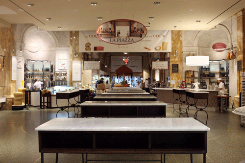
Built in an old factory in the Flatiron District in New York, this huge combination of market, supermarket and restaurant of 4.500 square meters devoted to Italian food is a great example of a new, different and successful business concept. A paradise for gourmands, home to different areas devoted to candies, desserts, meat, fruit and vegetables, charcuterie, fish, bread or cheese, among others, and of course to Italian pasta. Moreover, it also has bars, a gift shop and even a school.

“Eat. Shop. Learn. This is a store with stores. Here, you won’t just discover what you love, you’ll also learn about what you love”. This is Eataly’s manifesto, which clearly shows the intention of immersing the visitor in the experience of Italian food: touch it, smell it, eat it or even purchase it, and at the same time, learn about it.

Hundreds of labels throughout the store communicate the many stories about the food –its origin, how it is prepared, who prepares it, the brands and their commitment to quality and authenticity, and even quotes from celebrities, such as Sofia Loren, strategically placed in all areas–. Every detail has been carefully chosen in order to make the visit a memorable experience.

The design of the space and the products layout have been especially designed to call visitors’ attention. And, in fact, it all seems to have taken effect, as Eataly is currently one of the top ten tourist attractions in New York City.

If you wish to create a memorable experience, Brandcelona retail consulting can advise you on the highlights to design a flagship store. Do not hesitate to contact us at info@brandcelona.com  to study the best alternatives and plan how to carry them out in your business plan.

—-

Eataly nació bajo el movimiento internacional slow food, una filosofía ideada en Italia que combina el placer y el conocimiento y que opera en todos los continentes por la salvaguarda de las tradiciones gastronómicas regionales.

Construida en las instalaciones de una vieja fábrica del Flatiron District de Nueva York, esta inmensa combinación de mercado, supermercado y restaurante de 4.500m2 dedicados a la gastronomía italiana es un inmejorable ejemplo de concepto nuevo de negocio, diferente y de éxito. Un paraíso para los gourmets, que combina áreas dedicadas a los dulces, a la carne, la fruta y las verduras, los embutidos, el pescado, el pan o el queso, entre otros, y por supuesto, a la pasta italiana. Además, también cuenta con bares, una tienda de regalos e incluso una escuela.

“Come. Compra. Aprende. Ésta es una tienda llena de historias. Aquí no solo descubrirás lo que te gusta; aquí también aprenderás sobre lo que te gusta”. Éste es el manifiesto de Eataly, sumergir al visitante en la experiencia de la comida italiana: tocarla, olerla, comerla o incluso comparla, y a su vez aprender acerca de ella.

Cientos de etiquetas son las encargadas de comunicar las muchas historias sobre la comida –el origen de ésta, su preparación, quien la prepara, las marcas y el compromiso de éstas con la autenticidad y la calidad, e incluso citas de personajes célebres, tales como Sofía Loren, estratégicamente colocadas en cada sección–. Cada detalle ha sido cuidadosamente escogido para hacer de la visita una experiencia memorable.

El diseño, la disposición y la presentación del espacio y de los productos están especialmente pensados para atraer la atención de los visitantes. Y, de hecho, ello parece haber surtido efecto. Eataly es ya una de las atracciones turísticas top ten de la ciudad de Nueva York.

Si deseas crear una experiencia memorable, Brandcelona retail consulting te puede asesorar sobre los aspectos más destacados para diseñar una flagship store. No dudes en contactarnos en info@brandcelona.com para que estudiemos las mejores alternativas y planificar cómo llevarlas a cabo en tu plan de negocio.

Icho restaurant // Restaurante Icho

JferrandoFor a better understanding and to complete all those elements linked to the brand experience that influence the buying process, we will count with the collaboration of experts that will introduce concepts that will improve our business development, from different disciplines and points of view. Today we are pleased to introduce a new text of Josep Ferrando, architect.

Icho Restaurant bears the name of a Japanese symbolic tree. Located in one of the most prestigious neighbourhoods in Barcelona, this innovative restaurant presents a refined image, which combined with an accurate and rigorous Japanese cuisine, applies contemporary touches and a Mediterranean spirit, and does honour to one of the leitmotifs the restaurant professes: “Totally Japanese. Completely Mediterranean.”Its privileged location allows natural light into the restaurant, providing the tables placed near the façade with perfect lightning. This asset gives the restaurant’s interior a pleasant atmosphere, along with a feeling of comfort and well-being, and the lightning becomes a key element of decoration. Furthermore, to ensure the privacy of the users, the façade is covered with a stainless steel mesh curtain.
A perimeter of irregular shape surrounds 330 square metres of premises with ash-grey walls that evoke neutrality. Such a feature helps to divide the restaurant into two well differentiated areas: the kitchen, a stainless steel case that unifies and resolves hygiene issues, and the main dining room, where the inverted topography handles acoustic and lightning problems.

To differentiate and to extend its range of services, Icho places a bar, where the user can taste small plates in a more informal way. A storage cupboard for small items placed right in the middle of the main dining area, beside the connecting doors between the main room and the kitchen, gives a new geometry to the area.

The decoration is relaxing, elegant and cosy, with a minimalist styling and a Zen inspired beauty, and the spirit of innovation that best defines the city of Barcelona. A perfect colour harmony achieved by the use of white and brownish tones, together with wood, marble and high quality materials, ensure a fine balance and an impeccable interior design.

Designed by Esteve Terradas Architects and architect Josep Ferrando Bramona, Icho Restaurant is a one of a kind place that introduces a little known concept of Japanese cuisine, by means of innovation, equilibrium and harmony.

—-

Para completar y entender mejor todos los elementos vinculados a la experiencia de marca que inciden en el proceso de compra, contaremos con la colaboración de expertos que nos irán introduciendo, desde distintas disciplinas y visiones, conceptos que nos ayudarán a construir mejor nuestro negocio. Hoy estamos encantados de presentaros un nuevo texto de Josep Ferrando, arquitecto.

El restaurante Icho debe su nombre a un simbólico árbol japonés. Situado en uno de los barrios más prestigiosos de la ciudad, Icho es un restaurante insólito e innovador que, mediante su diseño, muestra una imagen elegante que, combinada con una cultura culinaria que respeta la tradición japonesa y que aplica toques contemporáneos y espíritu mediterráneo, hace honor a uno de los leitmotifs con el que el restaurante se autodefine: “Totalmente japonés. Completamente mediterráneo.”

Su situación privilegiada permite la entrada de luz natural a las mesas situadas cerca de la fachada. Con este recurso se intenta dotar de una atmósfera acogedora el interior y la iluminación se convierte en un elemento clave para ambientar las diferentes estancias. Además, para garantizar la privacidad de los usuarios, la fachada queda cubierta con una malla de acero inoxidable a modo de cortinas; esto permite observar el exterior sin perder la intimidad.

Un perímetro de geometría irregular envuelve una superficie de 330 m2 con paredes color gris ceniza que evocan neutralidad. Esta característica distribuye el restaurante en dos partes bien diferenciadas: la cocina, una caja de acero inoxidable que unifica y resuelve la higiene, y la sala principal, donde una topografía invertida resuelve la acústica y la iluminación.

Para diversificar su oferta, Icho apuesta por una barra donde ofrece la degustación de pequeños platos de forma más informal. En el medio de la sala, un mueble de almacenamiento de piezas pequeñas se sitúa al lado de las puertas de comunicación sala-cocina, otorgando una nueva geometría a estos pasos.

La decoración es relajante, elegante e íntima, con un estilo minimalista y de inspiración próxima a la belleza Zen y al espíritu innovador que tan bien define la ciudad de Barcelona. La excelente armonía cromática que tonos marrones y blancos consiguen, y el predominio de la madera y de materiales nobles, a su vez combinados con el mármol, brindan un perfecto balance seductor y equilibrado y un interiorismo perfectamente cuidado.

El Restaurante Icho, obra de Esteve Terradas Arquitectos y del arquitecto Josep Ferrando Bramona, se convierte en un espacio único que presenta un concepto menos conocido de la cocina nipona mediante una expresión innovadora, equilibrada y armónica.

1317659324-jfb-restaurante-icho-foto-construido-04-528x616

 1317659340-jfb-restaurante-icho-planta-982x10001317659317-jfb-restaurante-icho-foto-construido-03-666x10001317659311-jfb-restaurante-icho-foto-construido-02

Hot Paper Restaurant, enveloping leitmotif // Hot Paper Restaurant, leitmotif envolvente

Hot Paper restaurant in Tczew via http://www.archdaily.com

Hot Paper restaurant in Tczew via http://www.archdaily.com

Hot Paper restaurant in Tczew via http://www.archdaily.com

Last February was inaugurated in the Polish city of Tczew the urban restaurant Hot Paper under the leitmotif of newspapers and information, perhaps as a symbol of openness to an  increasingly cosmopolitan and modern environment.

On the walls blend 2 textures: a wallpaper of newspapers cuttings and a purple geometric shape made ​​of milled rock tiles. The combination is accentuated by the subtle lighting of the edges which creates two distinct planes, remembering the sound and image of a paper cut by hand. In addition, natural oak wood and colored milled rock tiles are incorporated to neutralize and give more prominence to the leitmotif, too.

In front of the kitchen, there is a small bar counter that recreates the concept three-dimensionally, making a game of lights, shapes and colors, thanks to the shelves where drinks are displayed.

The restrooms also maintain the concept and even seek a way to interact with the visitor, as the background music teaches words and phrases in other languages​​, as part of the cosmopolitan experience of the place.

The leitmotif of a space will help to articulate the type and style of the experience that we want the visitor remember, that’s why it’s so important to work it in all spaces and media of a business so long as it’d be enveloping, and specially, genuine and memorable.

Brandcelona retail consulting can advise you on the highlights to structure corporate identities through enveloping messages, as the leitmotif. Do not hesitate to contact us at info@brandcelona.com  to study the best alternatives and plan how to carry them out in your business plan.

—-

El pasado febrero se inauguró en la ciudad polaca de Tczew el restaurante urbano Hot Paper bajo el leitmotif de los periódicos y la información, quizás como símbolo de apertura a un entorno cada vez más cosmopolita y moderno.

En las paredes se mezclan 2 texturas: el papel de pared con recortes de periódico y unas formas geométricas de color violeta hechas de piedra molida. La combinación se acentúa gracias a la sutil iluminación de los bordes que crea dos planos diferenciados, recordando el sonido e imagen de un periódico recortado a mano. Además, la madera natural de roble y los azulejos de roca molida de colores se incorporan para neutralizar y a la vez, darle más protagonismo al leitmotif.

Frente la cocina, se sitúa una pequeña barra de bar que recrea el concepto tridimensionalmente, haciendo un juego de luces, formas geométricas y colores, gracias a las estanterías donde se coloca la bebida.

Los lavabos también mantienen el concepto e incluso, buscan una forma de interactuar con el visitante, pues el hilo musical enseña palabras y frases en otros idiomas, como parte de la experiencia cosmopolita del lugar.

El leitmotif de un espacio ayudará a articular el tipo y estilo de la experiencia que queremos que el visitante recuerde, por eso es tan importante trabajarla en todos los espacios y soportes de un negocio con tal de que sea envolvente y, sobre todo, genuína y memorable.

Brandcelona retail consulting te puede asesorar sobre los aspectos más destacados para estructurar identidades corporativas a través de mensajes envolventes, como el leitmotif. No dudes en contactarnos en info@brandcelona.com para que estudiemos las mejores alternativas y planificar cómo llevarlas a cabo en tu plan de negocio.

Fàbrica Moritz: tradition and modernity // Fàbrica Moritz: tradición y modernidad

Fàbrica Moritz in Barcelona via http://www.com-elisava.com

Fàbrica Moritz in Barcelona via http://www.barcelona-metropolitan.com

Fàbrica Moritz in Barcelona via brillat-savarin.blogspot.com

Fàbrica Moritz in Barcelona via http://www.barcelona-metropolitan.com

Brompton by Moritz in the «M» Store in Barcelona via lamevabcn.blogspot.com

By the end of 2011, after seven years of rehabilitation, Moritz opened the door to a unique space that recovers the origins of its artisan production steeped in the iconography of Barcelona. The space of 4,500 m2 has been redesigned by the hand of Jean Nouvel and divided by spaces dedicated to the brewery and Moritz link to the culture and leisure of Barcelona.

In the borough of Sant Antoni, the space highlights for its many possibilities. In the cellar there is a microbrewery originally built in 1856 in which you can observe the process and make free guided tours. On the main floor, we found the brewery and restaurant as well as the «M» Store, Sala 39, the Daily Zone and the Bar à vins.

The restaurant has a menu of Catalan and Alsatian food (homeland of the founder Louis Moritz), designed to match with the varieties of beer Moritz. The «M» Store, that will be open in October, invites you to see the merger of the beer iconography with other brands such as Brompton, which was the first to submit the bike model Brompton by Moritz. This space is open to products and events related to the design and creativity. The Sala 39 is open to leisure and cultural events in which creativity and genuine modernity create a unique club in the city. The Daily Zone is a space in which to read new magazines of design, culture, art and cuisine that also offers an assortment of artisan breads and the possibility of filling a glass of fresh non-pasteurized beer. This recovers the ancestral origin of the beer as «liquid bread». Finally, the Bar à vins, which will officially open its doors on September 18, wants to be a wine tasting room with over 400 references available by weight, glass or bottle accompanied by specialized sommeliers.

Its commitment to leading the brewing industry of the city and its link with the design and creativity presents endless options and future projects as a cuisine classroom, an atelier and the Moritz Think Tank. Should be added that the company’s offices are located over all this great meeting place for beer, culture and design, making it clear that the entire building and its surroundings breathe the environment and the brand identity.

—-

A finales del 2011, después de 7 años de rehabilitación, Moritz abrió las puertas de un espacio único con el que recupera los orígenes de su elaboración artesana impregnados de la iconografía barcelonesa. El espacio de 4.500 m2 ha sido rediseñado de la mano de Jean Nouvel y se divide por espacios dedicados a la cervecería y al vínculo de Moritz con la cultura y ocio de Barcelona.

En pleno barrio de Sant Antoni, el espacio destaca por sus múltiples posibilidades. En el  sótano se presenta una microcervecería de 1856 en la que se puede observar el proceso de elaboración, así como hacer visitas guiadas gratuitas. En la planta principal, encontramos la cervecería y restaurante, así como la «M» Store, la Sala 39, la Zona Daily y el Bar à vins.

El restaurante presenta una carta de comida catalana y alsaciana (tierra de origen del fundador Louis Moritz), ideada para combinar con las variedades de cerveza Moritz. La «M» Store, que se inaugurará en octubre, invita a conocer la fusión de la iconografía de la cerveza con otras marcas como Brompton, que fue la primera en presentar su modelo de bicicleta Brompton by Moritz. Este espacio queda abierto a productos y eventos relacionados con el diseño y la creatividad. La Sala 39 queda abierta a eventos de ocio y culturales en los que la creatividad y la modernidad crean una sala genuina en la ciudad. La Zona Daily es un espacio en el que hojear las nuevas revistas de diseño, cultura, arte y gastronomía que además ofrece un surtido de panes artesanos y la posibilidad de llenarse un vaso de cerveza fresca sin pasteurizar. Así se recupera el origen ancestral de la cerveza como «pan líquido». Por último, el Bar à vins, que abrirá oficialmente sus puertas el 18 de septiembre quiere ser un espacio de degustación de vinos con más de 400 referencias disponibles por peso, copa o botella acompañado por someliers especializados.

Su apuesta por liderar el sector cervecero de la ciudad y su vínculo con el diseño y la creatividad abre a la marca infinitas opciones y futuros proyectos como una aula gastronómica, un atelier y el Moritz Think Tank. Cabe añadir, que las oficinas de la empresa están situadas sobre todo este gran espacio de encuentro de la cerveza, la cultura y el diseño, por lo que es evidente que el edificio entero y sus alrededores respira el ambiente y la imagen de la marca.

Modern tranquility for sweets // Tranquilidad moderna para los dulces

Higashiya Man in Tokio via http://www.higashiya.com

Ori Higashiya in Tokio via http://www.higashiya.com

Hirashiya Ginza in Tokio via http://www.higashiya.com

Japanese interior design has always stood out for its simplicity and harmony, achieving an environment full of tranquility, privacy and hospitality. If we add the delicious taste with whom they like to delight sweets and we place it in the modern times, we fully understand the philosophy of Higashiya. This Japanese company is focused on creating and selling Japanese sweets and accessories. It has 3 locations in Tokyo (Ginza, Ori and Man), each one proposes a different interior solution but fully coherent with the image, experience and philosophy of the brand, shared even in their online store.

Higashiya Ginza: besides the display and sales area, there is a traditional Japanese tea room for 50 people. The white and light wood invade the space, ordered by geometric shapes and delicately lit with natural light in the counter and tiny touches of light along the proposed route to follow until the tea room.

Ori Higashiya: known for its glass facade and a wall with a mosaic of geometrically folded waxed paper. It has a bar with wide stools and an area where they sell waxed paper to decorate boxes or to write messages of courtesy when sweets are given on special occasions.

Higashiya Man: a small kiosk surrounded by luxury stores with a cut curtain that shows the logo waved in the wind. Notable for its small format and harmonious use of all linear, neatly organized with the help of wooden crates.

The company strives to create a elegant and artisanal packagings and accessories, emphasizing its clear intention of preserving the beauty of tradition with modern simplicity. Impregnates with delicacy and love all the sweets, boxes, memorial cards and spaces, and manages to convey it in their online store. A sweet pleasure that Josep Ferrando has recommended to us.

—-

El interiorismo japonés siempre ha destacado por su sencillez y armonía, consiguiendo ambientes llenos de tranquilidad, privacidad y hospitalidad. Si lo sumamos al gusto exquisito con el que les gusta deleitar dulces y lo enmarcamos en la modernidad, entendemos perfectamente la filosofía de Higashiya. Esta compañía japonesa se centra en la creación y venta de dulces japoneses y accesorios. Dispone de 3 locales en Toquio (Ginza, Ori y Man), cada uno propone una solución de interiorismo distinta pero totalmente coherente con la imagen, experiencia y filosofía de la marca, compartida incluso en su tienda online.

Higashiya Ginza: además de la zona de muestra y venta, dispone de un salón de té tradicional japonés para 50 personas. El blanco y la madera clara invaden el espacio, ordenado por formas geométricas y iluminado delicadamente con luz natural en el mostrador y con pequeños toques de luz a lo largo del recorrido que propone seguir hasta el salón de té.

Ori Higashiya: destaca por su fachada de cristal y por su pared con un mosaico de papel encerado doblado geométricamente. Dispone de una barra de anchos taburetes y de una zona en la que venden papel encerado para decorar las cajas o bien, para escribir mensajes de cortesía al entregar dulces en una ocasión especial.

Higashiya Man: un pequeño quiosco rodeado de grandes tiendas de lujo con una cortina cortada que muestra el logotipo ondeado por el viento. Destaca por su reducido formato y el aprovechamiento armonioso de todo el lineal, organizado cuidadosamente con la ayuda de cajones de madera.  

La compañía se esfuerza en crear unos packagings y complementos elegantes y artesanales, enfatizando su clara vocación por preservar la belleza de lo tradicional junto a la simplicidad de lo moderno. Impregna de delicadeza y cariño todos sus dulces, cajas, tarjetas conmemorativas y espacios, y logra transmitirlo en su tienda virtual. Un placer muy dulce que Josep Ferrando nos la haya recomendado.

Higashiya sweets via higashiya-shop.com

Normalize the veggie // Normalizar lo vegetariano

Teresa Carles Restaurant in Barcelona via esadir.blogspot.com

Teresa Carles Restaurant in Barcelona via laflorinata.com

Teresa Carles Restaurant in Barcelona via pimientarosa.com

Teresa Carles Restaurant in Barcelona via pimientarosa.com

It is true that, as Núria Coll said, for many years, vegetarianism and business aligned with it, have kept the identity and values of the 70’s and the hippy movement. In recent years, concern and awareness about our planet and its resources have been addressed through multiple alternatives of lifestyle and philosophy.

However, many of the businesses involved in responsible management of the planet, are emulating alternative and exotic locations that stigmatize their akin audience, without trying to expand their vision to users unfamiliar with their cause. Therein lies the key to sensitization, not only unite the profiles involved but attract those who are not. To do this, we must create standardized and integrated establishments in the space and in the market, capable of being leaders in sectors also unconcerned about the sustainability and facilitate the transition to a more responsible and efficient scheme.

Under this conception, Teresa Carles restaurant in Barcelona combines modernity with vegetarianism naturally and standardized. Its interior and the exhibition of products appeal to all audiences regardless of their beliefs in food, enjoy alike! Enhance healthy breakfasts and Manhattan style brunches in large tables and sofas to spend the early hours of the morning working in a friendly atmosphere. Breaking taboos in relation to the offer of alcohol, they present an excellent selection of wine and beer as well as they elaborate juices, teas and homemade mixings. A good bet to boost consumption of local and vegetable products.

—-

Es cierto que, como bien dijo Núria Coll, durante muchos años el vegetarianismo y los comercios alineados con él han mantenido la identidad y los valores de los años 70 y el movimiento hippy. Desde hace unos años, la preocupación y sensibilización por nuestro planeta y sus recursos se han abordado mediante múltiples alternativas de estilo de vida y filosofía.

No obstante, muchos de los comercios implicados en una gestión responsable del planeta, siguen emulando lugares exóticos y alternativos que estigmatizan a su público más afín, sin intentar expandir su visión a usuarios desconocedores de su causa. Ahí reside la clave de la sensibilización: no sólo unir a los perfiles comprometidos sino atraer a aquellos que no lo estén. Para ello, debemos crear establecimientos normalizados e integrados en el espacio y en el mercado, capaces de ser líderes también en sectores despreocupados por la sostenibilidad y facilitar la transición hacia un esquema más responsable y eficiente.

Bajo esa concepción, el restaurante barcelonés Teresa Carles combina la modernidad con el vegetarianismo de forma natural y normalizada. Su interiorismo y exhibición de productos atraen a todos los públicos sin importar sus creencias en alimentación; disfrutan por igual! Potencian los desayunos y brunchs sanos al estilo Manhattan en grandes mesas y sofás en los que pasar las primeras horas de la mañana trabajando en un ambiente agradable. Rompen los tabúes en relación a la oferta de alcohol presentando una excelente carta de vinos y cervezas además de elaborar diferentes zumos, infusiones y combinados caseros. Una buena apuesta para impulsar el consumo de productos locales y vegetales.

Places to go with the tribe // Lugares para ir con la tribu

Mammaproof Sticker via tiendagluck.blogspot.com

Ruta Mmmp via naifmagazine.com

Mammaproof Workshop via mammaproof.com

Last April 23 (Sant Jordi) was presented in Barcelona the MmmpTour promoted by Mammaproof.org, a citizenship and collaborative initiative that distinguishes the best places in the city for a family. A guide of places in Barcelona, Madrid, Tarragona and Santiago de Chile – and ready to move into new cities-, that invites mothers, fathers, sons and daughters to enjoy their visit and share it with others.

The Mammaproof sticker ensures that the place has changing tables, high chairs, good will and a friendly service. To do this, they not only analyze the physical and economic resources of the space, but the efforts of the establishment and its workers to provide a comfortable and fun vibe for restless parents and children. Moreover, is taking into account the offer of adapted areas for kids with games, books and/or animations (such as Peek-A-Boo). They can also include places that just have some care for kids, an  ideal location  or an excellent deal.

While in its origins was limited to restaurants and bars, today we can find the sticker in places of different sectors: outdoor familiar spaces, stores, trips, bars to drink something or places to go for a walk. Their Mmmp agents introduce new places and recommendations based on the African quote «to raise a child it takes a whole tribe,» as to ensure a good education and quality of life requires that we all have in mind the needs of the little ones and of those who care for them. It is not about infantilizing establishments but of trying to conceive them from the perspective of parents and children, avoiding the rush and stress with laughter and fun and to identify and to value those establishments that reach the «mamma test.» From Brandcelona we encourage you to visit their guide and find new places and even to create them!

Brandcelona retail consulting can advise you on the highlights to design and develop friendly spaces that pass «the mamma test». Do not hesitate to contact us at info@brandcelona.com to study the best alternatives and plan how to carry them out in your establishment. 

—-

El pasado 23 de abril (Sant Jordi) se presentó en Barcelona la RutaMmmp impulsada por Mammaproof.org, una iniciativa ciudadana y colaborativa que distingue los mejores lugares de la ciudad para ir en familia. Una guía de espacios en Barcelona, Madrid, Tarragona y Santiago de Chile – y dispuesta a introducirse en nuevas ciudades- que invita a que madres, padres, hijos e hijas disfruten de su visita y lo compartan con los demás.

El distintivo Mammaproof garantiza que el local dispone de cambiadores, tronas, buena voluntad y un trato amable. Para ello, no sólo analizan los recursos físicos y económicos del espacio, sino la voluntad del establecimiento y de sus trabajadores de ofrecer un espacio cómodo y divertido para padres e hijos inquietos. Además, se tiene en cuenta la oferta de áreas adaptadas para los más pequeños con juegos, libros y/o animaciones (como tiene Peek-A-Boo). También pueden incluirse lugares que simplemente tengan un detalle con los pequeños, una ubicación ideal o bien, un trato excelente.

Aunque en sus orígenes su distintivo se limitaba a la restauración, hoy ya podemos encontrar opciones de diferentes sectores: espacios familiares al aire libre, tiendas para ir de compras, escapadas, bares en los que tomar algo o lugares en los que dar un paseo. Sus agentes Mmmp introducen nuevos lugares y recomendaciones basándose en la cita africana «para criar a una criatura hace falta una tribu entera”, pues para asegurar una buena educación y calidad de vida hace falta que todos tengamos en cuenta las necesidades de los más pequeños y de los que cuidan de ellos. No se trata de infantilizar los establecimientos sino de tratar de concebirlos desde la óptica de los padres y de los niños, esquivando las prisas y el estrés con sonrisas y diversión e identificar y poner en valor todos aquellos establecimientos a «prueba de mamá». Desde Brandcelona os animamos a visitar su guía y a colaborar en la búsqueda de nuevos lugares e incluso, a crearlos!

Brandcelona retail consulting te puede asesorar sobre los aspectos más destacados para diseñar y concebir espacios amables «a prueba de madres». No dudes en contactarnos en info@brandcelona.com para que estudiemos las mejores alternativas y planificar cómo llevarlas a cabo en tu establecimiento. 

Architecture & Retail: two restaurants in the same space // Arquitectura & Comercio: dos restaurantes en un mismo espacio

For a better understanding and to complete all those elements linked to the brand experience that influence the buying process, we will count with the collaboration of experts that will introduce concepts that will improve our business development, from different disciplines and points of view. Today we are pleased to introduce a text of Josep Ferrando, architect.

Today I’d like to describe the exercise of architecture and interiorism carried out with the restaurants El Lluçanès and Els Fogons in the remodeled market of the Barceloneta (Barcelona).

Two restaurants with different concepts together united in the same space divided in two floors: the ground floor with a more casual aesthetic which continues the market square (Els Fogons) and the first floor a restaurant of fine gamma (El Lluçanès).

The proposal for Els Fogons was to create an open door between the market and the square that invites to whet the appetite with an attractive assortment of creative tapas. This was planned to be local with a large opening in front in which the user could interact with the space always having visual access to the kitchen and the square.

The restaurant El Lluçanès, awarded with a Michelin star, proposed a more intimate and sealed space around a luminous kitchen. The 300 square meters are dedicated to offering a gastronomic show to its 40 clients, contrasting their rural origins of creative cuisine in a high-tech scenario.

The use of industrial materials like steel and concrete reinforced the industrial character of the market and so its color range of grays and blacks. Lighting played a key role to interact with users: more intense and wide when the user was standing and more intimate and focused for when he is sitting.

A clear example of integrating two different spaces in the same environment in which users and kitchen concepts are targeted. The project was carried out with the contribution of Christian Sintes, Roman Ortega, and Ferran Laguna. Photography is by Adrià Goula.

—-

Para completar y entender mejor todos los elementos vinculados a la experiencia de marca que inciden en el proceso de compra, contaremos con la colaboración de expertos que nos irán introduciendo, desde distintas disciplinas y visiones, conceptos que nos ayudarán a construir mejor nuestro negocio. Hoy estamos encantados de presentaros un texto de Josep Ferrando, arquitecto.

Hoy describo el ejercicio de arquitectura e interiorismo que llevé a cabo con los restaurantes El Lluçanès y Els Fogons en el remodelado mercado de la Barceloneta (Barcelona).

Dos restaurantes con conceptos distintos unidos en un mismo espacio aunque divididos en dos plantas: la planta baja con una estética más informal (Els Fogons) que da continuidad a la plaza del mercado y la planta superior para un restaurante de alta gamma (El Lluçanès).

La propuesta de Els Fogons consistía en crear una puerta abierta entre el mercado y la plaza que invitara a saciar el apetito con un surtido atractivo de tapas de mercado. Para ello se proyectó un local de fachada transparente en el que el usuario pudiera interactuar con el espacio teniendo siempre acceso visual a la cocina y a la plaza.

El restaurante El Lluçanès, con estrella Michelín, proponía un espacio más íntimo y hermético alrededor de una cocina luminosa. Los 300 metros cuadrados se dedicaban a ofrecer un espectáculo gastronómico a sus 40 comensales, contrastando su cocina creativa de orígenes rurales con un escenario de high-tech.

La utilización de materiales industriales como el acero y el hormigón reforzaba el carácter industrial del mercado, así como su gama cromática de grises y negros. La iluminación jugaba un papel esencial mediante la cual se interactuaba con los usuarios: más intensa y amplia  cuando el usuario estaba de pie y más íntima y enfocada para cuando estuviera sentado.

Un claro ejemplo de integración de dos espacios distintos en un mismo entorno en el que se segmentan usuarios y conceptos de cocina. El proyecto fue llevado a cabo con la contribución de Christian Sintes, Roman Ortega y Ferran Laguna. La fotografía es de Adrià Goula.