
A personal brand with soul, purpose, and strategy.
In the world of high-risk sports — where authenticity is not constructed but lived — personal branding has become an undeniable strategic asset. Now more than ever, those with deep expertise, proven track records, and vision require an identity that not only represents them but elevates them on a global stage.
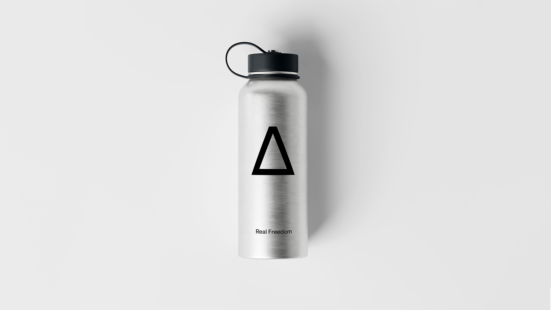
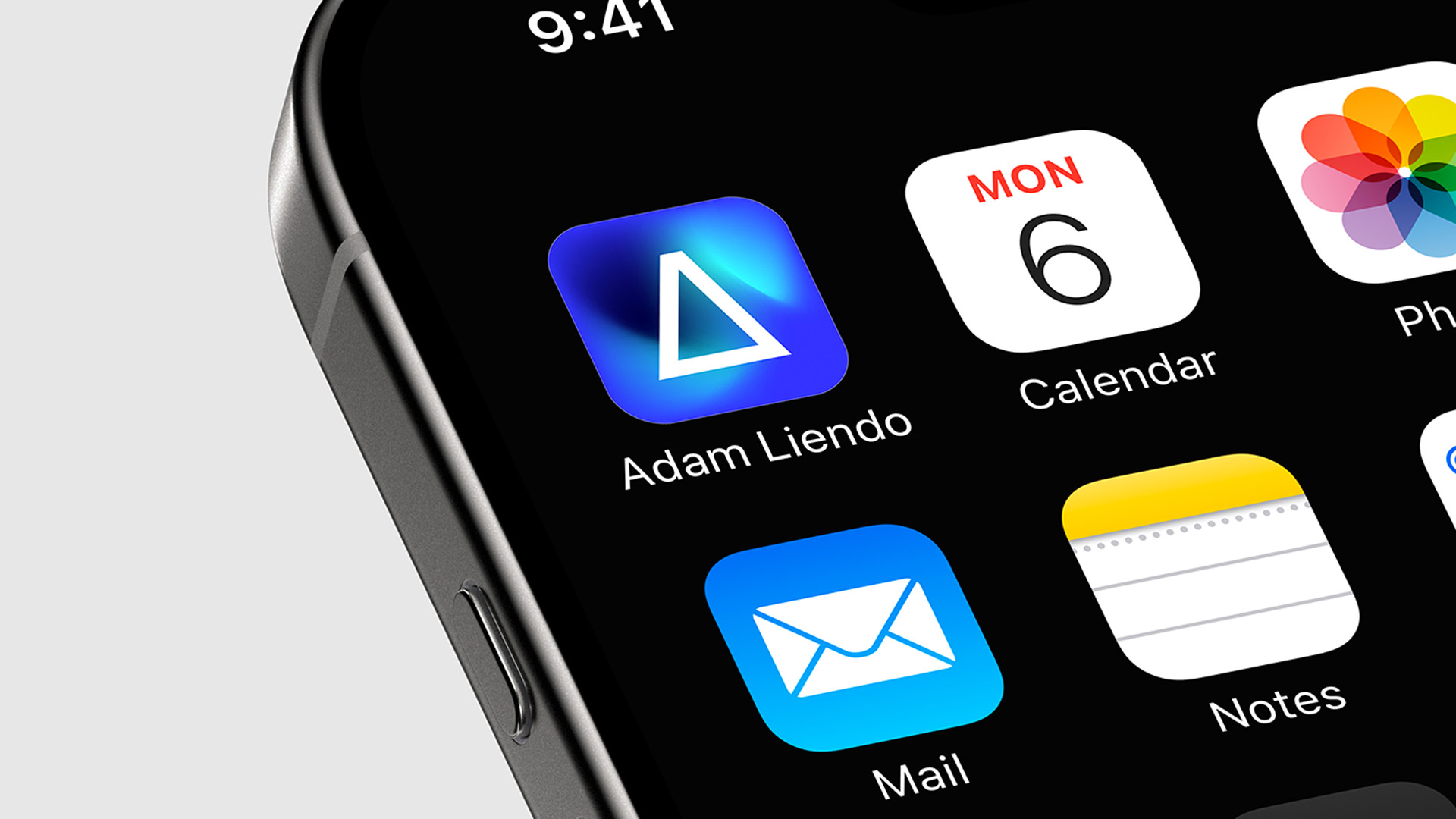
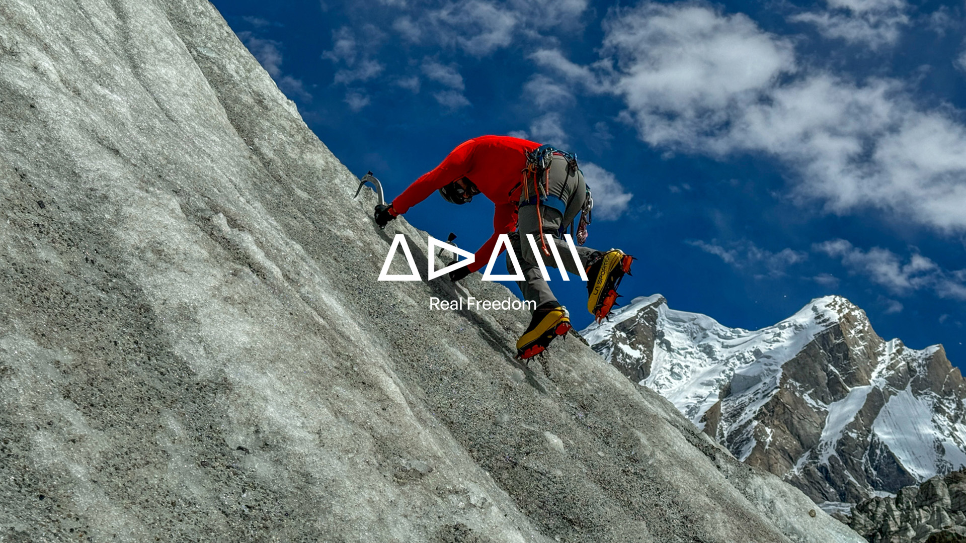
Adam Liendo | Real Freedom is born of this very need: communicating from the soul, connecting through truth, and standing out through difference.
At brandlond®, we have crafted this new personal branding project with a solid, distinctive strategy, profoundly aligned with the essence of the individual. Every element has been meticulously designed to reflect his spirit: free, non-conformist, and passionately connected to mountain sports.
The brand breathes adventure, determination, and a vital impulse that transcends convention. One of its most powerful and defining features is the custom-designed typography — a visual code that not only communicates but becomes the symbolic identity of Adam. This integration of form and content, of message and design, transforms the logo into a signature — one of character and authenticity.
Real Freedom is more than a motto; it is a lifestyle expressed in every detail of the visual identity, brand narrative, and digital presence. The brand has been strategically designed to establish a strong position in the ‘outdoor lifestyle’ and mountain sports sphere, resonating with a community that thrives on nature, calculated risk, and the constant pursuit of personal excellence.
In a context where partnerships between individuals and brands are becoming ever more relevant, possessing a strong and differentiated personal brand is key to generating impact and trust. Companies are not only searching for technical talent — they seek ambassadors, storytellers, and community leaders. And that is where branding becomes a bridge: between experience and opportunity, between personal history and the strategic visibility of talent.
This brand does not merely identify Adam Liendo, it amplifies him. It positions him as a genuine reference in the outdoor world, while also establishing him as a strategic partner for brands seeking coherence, values, and real connection with an increasingly discerning audience.
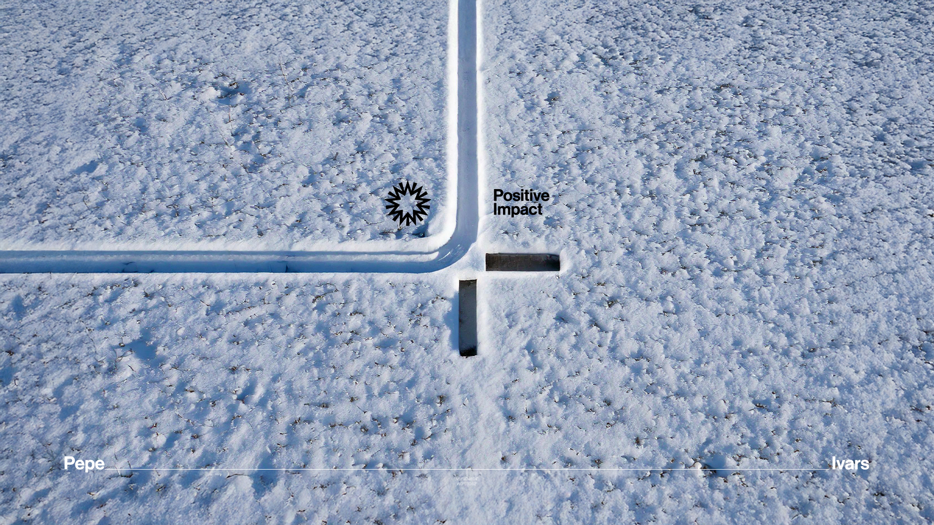
In a saturated market of products, personal brands offer aspirational models of action. They become beacons for communities looking to stand out with legitimacy and build a legacy of high ethical impact.
This is branding with soul, purpose, and strategy.


Marca personal con alma, propósito y estrategia.
En el universo de los deportes de alto riesgo, donde la autenticidad no se construye, se vive, la marca personal se ha convertido en un activo estratégico incuestionable. Hoy más que nunca, quienes poseen un alto nivel de especialización, trayectoria y visión necesitan una identidad que no solo los represente, sino que los proyecte globalmente.
Adam Liendo | Real Freedom nace desde esta necesidad: comunicando desde el alma, conectando desde la verdad y posicionándose desde la diferencia.
En Brandlond®, hemos diseñado este nuevo proyecto de marca personal con una estrategia de branding sólida, diferencial y profundamente alineada con la esencia del individuo. Cada elemento ha sido cuidadosamente concebido para reflejar su espíritu: libre, inconformista y apasionado por los deportes de montaña.
La marca respira aventura, decisión y un impulso vital que trasciende lo convencional. Uno de los elementos más potentes y distintivos es la tipografía creada en exclusiva para la marca, que no solo comunica, sino que construye el símbolo identitario de Adam. Esta integración visual refleja la fusión entre forma y fondo, entre mensaje y diseño. No es solo un logotipo, es una firma visual de carácter y autenticidad.
Real Freedom es más que un leitmotiv, es un estilo de vida plasmado en cada detalle de su identidad visual, en su narrativa de marca y en su presencia digital. La marca ha sido concebida estratégicamente para posicionarse con fuerza en el ámbito del ‘outdoor lifestyle’ y los deportes de montaña, conectando con una comunidad que vibra con la naturaleza, el riesgo calculado y la búsqueda constante de superación personal.
En un contexto donde las alianzas entre personas y marcas son cada vez más relevantes, contar con una marca personal sólida y diferencial es clave para generar impacto y confianza. Las empresas no buscan únicamente talento técnico; buscan embajadores, narradores, líderes de comunidad. Y es ahí donde el branding se convierte en puente, entre la experiencia y la oportunidad, entre la historia personal y la visibilidad estratégica del talento.
Esta marca no solo identifica a Adam Liendo, lo amplifica. Lo posiciona como un referente genuino en el mundo ‘outdoor’, y al mismo tiempo como un partner estratégico para marcas que buscan coherencia, valores y conexión real con su cada vez más exigente audiencia.
En un mercado saturado de productos, las marcas personales nos ofrecen modelos de actuación aspiracionales. Se convierten en referentes para comunidades que desean diferenciarse con legitimidad y construir un legado de alto impacto ético.
Esto es branding con alma, propósito y estrategia.