LA DESPENSA DE PALACIO. SEVILLA.

La Despensa de Palacio is a Spanish traditional desserts and sweet foods brand that represents one of the most special social moments in Spain: “la sobremesa”. At brandlond we had the chance to redesign its packaging and branding, updating the brand with a contemporary look, without losing its real essence.

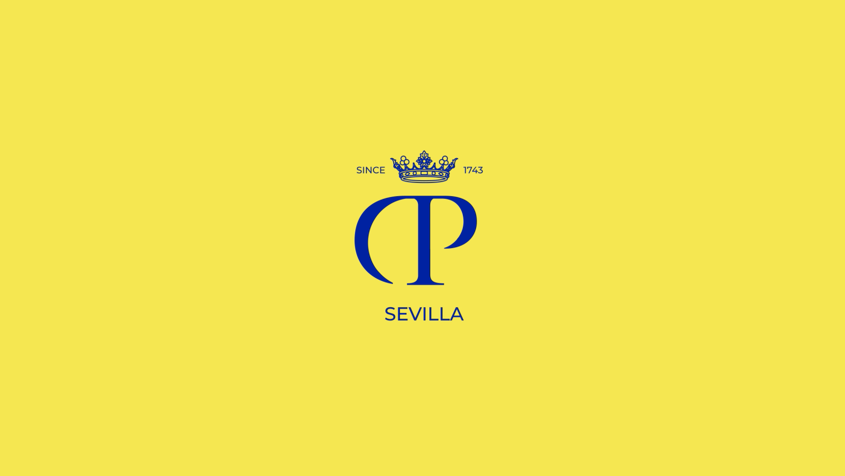
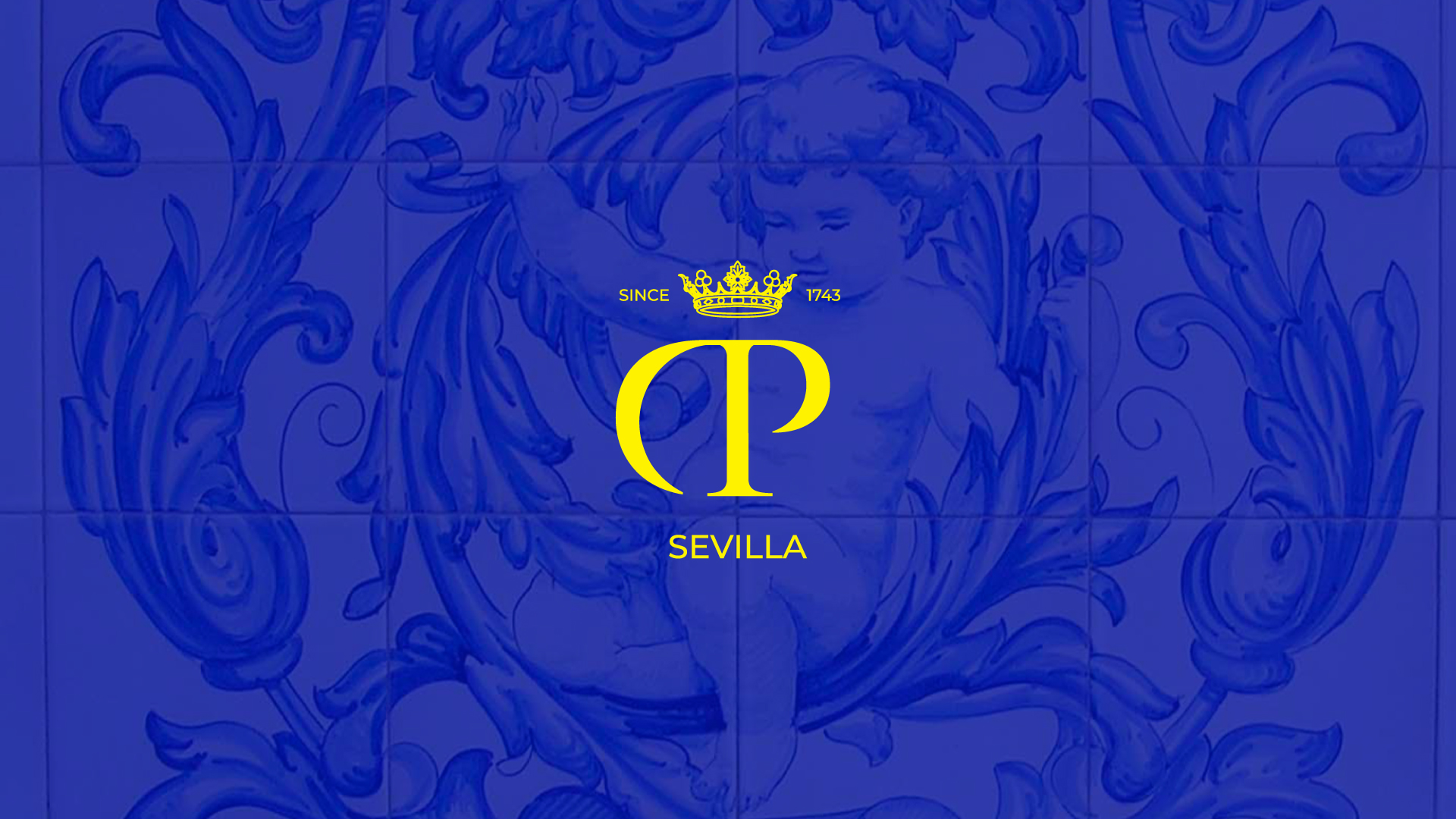
One of our challenges was to reconnect the brand with its territory, transferring the Seville values through a proper identity. Thus, we reinterpreted the regional symbols, maintaining the iconic images and patterns but with a fresh approach through the colours. We adapted the iconic DP symbol, the crown, and we incorporated the ‘motto’ “The taste of your memories”, an expression that reflects the most authentic Andalusian spirit: the ultimate know-how and the optimal combination of skill and class. In the same way, we introduced the marques crown through an up-to-date representation.

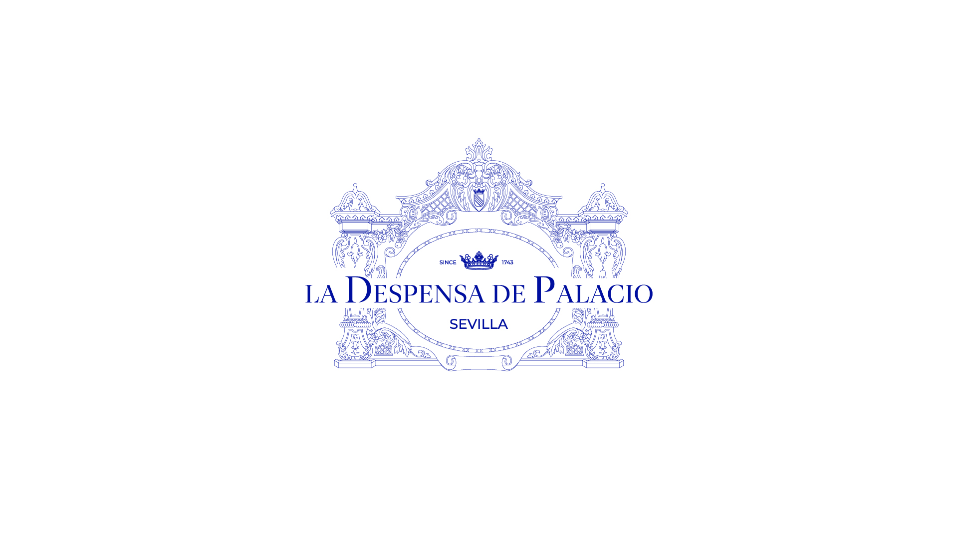
Our creative team reimagined La Despensa de Palacio iconic logo into a neater, more straightforward, and recognisable version that encapsulates its authenticity, quality, and heritage values.

Brandlond® worked in this amazing new design to capture the essence of the brand values and deliver a brand experience that could support their ambitions for national and international expansion.

La Despensa de Palacio was founded in1743 with a simple aim: to raise the standard of Seville culture and make works of bakery and chocolate available to all. Today, it is home to over a hundred numerous traditional sweets, chocolates, cookies and waffles. La Despensa de Palacio serves an invaluable role in educating and energising new generations of bakers and chocolate makers.

The wide range of services that we have designed for La Despensa de Palacio include: Brand Strategy, Brand Architecture, Verbal Identity, Visual Identity, Brand Design, Internal Brand Engagement and User Experience.

brandlond® designs brands for organisations through its innovative strategic branding tools and the registered Cyclical Branding® methodology. For more information, write to manager@brandcelona.com. Learn more about our work with La Despensa de Palacio in the Projects section of our website.

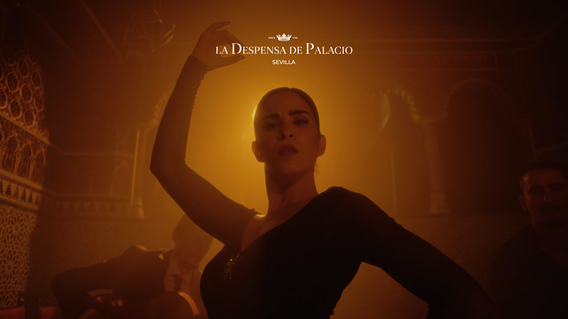
La Despensa de Palacio es una marca española de postres y dulces tradicionales que representa uno de los momentos sociales más especiales de España: “la sobremesa”. En brandlond tuvimos la oportunidad de rediseñar su ‘packaging’ y branding,’ actualizando la marca con un look contemporáneo, sin perder su verdadera esencia.

Uno de nuestros retos era reconectar la marca con su territorio, trasladando los valores de Sevilla a través de una identidad propia. Así, reinterpretamos los símbolos de la región, manteniendo las imágenes y patrones icónicos pero con un enfoque fresco a través de los colores. Adaptamos el icónico símbolo de DP, la corona, e incorporamos el ‘leitmotiv’ “El sabor de tus recuerdos”, una expresión que refleja el más auténtico espíritu andaluz: el saber hacer supremo y la combinación óptima de habilidad y clase. Del mismo modo, presentamos la corona del marquesado a través de una representación actualizada.

Nuestro equipo creativo rediseñó el logotipo icónico de La Despensa de Palacio en una versión más clara, sencilla y reconocible que encapsula su autenticidad, calidad y valores patrimoniales.

Brandlond® ha trabajado en este increíble nuevo diseño para capturar la esencia de los valores de la marca y brindar una experiencia de marca que pudiera respaldar sus ambiciones de expansión nacional e internacional.

La Despensa de Palacio fue fundada en 1743 con un objetivo sencillo: elevar el nivel de la cultura sevillana y poner al alcance de todos los trabajos de panadería y chocolatería. Hoy alberga más de un centenar de dulces tradicionales, chocolates y galletas. La Despensa de Palacio cumple un papel invaluable en la educación y energización de las nuevas generaciones de panaderos y chocolateros.

La amplia gama de servicios que hemos diseñado para La Despensa de Palacio incluye: Estrategia de marca, Arquitectura de marca, Identidad verbal, Identidad visual, Diseño de marca, Formación interna de marca y Experiencia de usuario.

brandlond® diseña marcas para organizaciones a través de sus innovadoras herramientas estratégicas de branding y la metodología de trabajo registrada Cyclical Branding®. Para ampliar cualquier información escríbenos a manager@brandcelona.com. Conoce más sobre nuestro trabajo con La Despensa de Palacio en la sección Proyectos de nuestro sitio web.

SEFAC. Liderando la excelencia

SEFAC tiene el objetivo de aportar innovación, formación y aprendizaje práctico al sector de la farmacia comunitaria. En este liderazgo de la excelencia y la distinción, SEFAC trabaja bajo la clara idea de «Acompañar al profesional de la farmacia». Como consecuencia de este objetivo, esta sociedad científica es el puente entre los farmacéuticos y los profesionales especializados en la diversidad de servicios que ayudan a crecer la oferta y la eficacia de las farmacias.

El liderazgo de la excelencia es una ardua tarea que nace de la curiosidad, la vocación de servicio y la innovación. SEFAC solicitó a nuestro equipo creativo una nueva forma de identificarse estratégicamente con su público objetivo, donde la principal tarea era mostrar su forma de proceder, más fresca y ágil, con la misión de mostrar a las nuevas generaciones de farmacéuticos comunitarios una visión más actual y conectada a las necesidades de la sociedad de lo que es hoy una farmacia y todos los servicios que engloba.

CYCLICAL BRANDING AUDIT // AUDITORÍA CYCLICAL BRANDING

Llevamos la visión del diseño y el pensamiento estratégico más allá de sus límites estéticos, pretendemos mediante nuestra manera de pensar, actuar y trabajar creando una visión de diseño, en el que éste se interprete de una manera diferente, certera, con impacto y sobre todo que sea un agente del cambio.

Somos fieles creyentes que el diseño debe ser el puente entre la sociedad y los negocios, esta disciplina es el medio que entiende la visión de las personas y las convierte en soluciones que se ven materializadas en experiencias.

Con más de 15 años de experiencia en el sector de las marcas, creándolas, diseñándolas y gestionándolas, sabemos que una buena marca, es simplemente el resultado lógico de un proceso bien gestionado, y sabemos de sobra que la única manera de llegar a esto es estableciendo un hilo conductor coherente entre objetivos reales que se puedan ejecutar.

En este camino llevamos más de 6 años trabajando, perfeccionando y poniendo a prueba nuestra metodología en formatos como proyectos en activo, clases y talleres en universidades a nivel internacional y consultorías estratégicas para diversas entidades de carácter público y privado. El transcurso de todo este tiempo y experiencias nos ha permitido recoger una gran cantidad de conocimiento para llegar al punto en el que estamos ahora mismo, en el que estamos presentando nuestra nueva modalidad de auditorías estratégicas basadas enteramente en nuestra metodología Cyclical Branding® y sobre todo nuestra experticia en el sector de la creación, diseño, gestión y ahora de auditorías para experiencias de marca.

Objetivo.

Las auditorías del Cyclical Branding®  tienen el objetivo de obtener un valor cuantificado acerca de la experiencia de una marca. Este resultado lo obtenemos del análisis en detalle de medir 8 áreas con 8 ejercicios específicos, son 30 ejes que los componen con 104 factores que se ponen en estado de estudio los cuales permiten analizar y promediar la efectividad de la experiencia de marca según la estrategia que se esté desarrollando.

Beneficio.

El proceso de auditoría es un sistema estadístico de medición que permite mediante nuestro algoritmo, promediar los ejes y obtener un resultado numérico reflejado en porcentaje, en un rango de 0 a 100%. Donde las marcas se clasifican de manera consecuente según sea el resultado obtenido.

Conclusiones.

Todo este proceso de auditoría concluye en dos etapas, la primera es un resultado matemático que nos da el algoritmo según los datos valorados e insertados. Después de este primer análisis, el auditor vuelve a recopilar los datos, muestras y material de la auditoría para hacer un análisis de coherencia entre todo lo propuesto y ejecuta la fase final de la auditoría en base a su experiencia y casos prácticos en el desarrollo de proyectos. Esto nos permite tener un doble enfoque en el desarrollo de las conclusiones expuestas en el informe final, además que nos va permitir tener un hilo conductor coherente de cara a la presentación de soluciones para los escenarios encontrados.

La auditoría Cyclical Branding®  nos permite como empresa gestora en experiencias de marca, medir de manera certera y con un hilo conductor coherente el medio desde el cual podemos abordar cada proyecto, estableciendo un equilibrio entre inversión y objetivos, dando de esta manera una operativa medida y ajustada a las necesidades de cada caso en particular, ofreciendo un enfoque claro, competitivo y coherente.

Si quieres saber más acerca del proceso de auditoría, envíanos un email a manager@brandcelona.com para obtener más información.


We bring design’s vision and strategic thinking beyond its aesthetical limits, pretending through our way of thinking, acting and working to create a design vision, where this is understood differently, truthful, astonishing and most of all, it has to be a change agent.


We are loyal believers that design has to be a channel between society and businesses. Being this discipline the way to understand people’s vision and turn them into solutions known as experiences.


With more than fifteen years of experience in the branding field, creating brands, designing and managing them, we can tell that a good brand, is simply the logical result of a well-managed process. We also know perfectly that the only way to get these results is by establishing a consistent common thread between real goals that can be achieved.


We’ve been working in this field for more than six years now, getting better and testing our methodology on active projects such as classes, university workshops at an international level, and strategic consultancies for various entities of both public and private character. All this time and experience allowed us to get a lot of knowledge to get where we are now, presenting our new branch of strategic audits based entirely on our Cyclical Branding methodology and of course in our expertise in creation, design and management and now audits for brand experiences fields.

Objectives
Cyclical Branding® audits have the priority to obtain a quantified value about a brand experience. This result can be accomplished from the following detailed analysis: measuring 8 areas with 8 specific exercises, that are 30 axes compounded by 104 factors that lead to a study that allows us to analyse and get the effectivity of the brand experience according to the strategy developed.

Benefits
The audit process it’s a statistic measuring system. This system helps, through our algorithm, to average out the axis and get a numeric result written as a percentage from 0% to 100%. This way, each brand gets classified in a consequent way depending on their result.

Conclusions
This audit process can be explained in two stages. The first stage is a mathematic result that gives us the algorithm according to the inserted data. After this analysis, the auditor takes the material to do a consistent analysis from all that’s proposed. Later on, executes a final phase of the audit based on the experience and practical cases (gotten from the development of all projects). All this allows us to have a double focus in developing conclusions exposed in the final report, and it also allows us to have a common thread for the presentation of solutions for the found scenarios.


Cyclical Branding® Audits allow us as a business and managers of brand and experiences, to measure in a truthful way and with a consistent common thread from which we can address each project. We can establish an equilibrium between investment and objectives, giving this way an operative and adjusted measure to all needs of each case, in particular, offering a clear, competitive and consistent focus.

If you wish to know more about this process of the Cyclical Branding Audits, write us at
manager@brandcelona.com to get more information.

Farmacia América. Grupo Vensalud. We take care of your life: Intangibles, emotions and expectations // Farmacia América. Grupo Vensalud. Cuidamos tu vida: Intangibles, emociones y expectativas

WhatsApp Image 2019-03-13 at 1.12.54 PM

WhatsApp Image 2019-03-13 at 1.12.56 PM

WhatsApp Image 2019-03-13 at 1.12.55 PM

From brandcelona® we are happy to share one of the latest developed projects: Farmacia América, through our Cyclical Branding® methodology.

This project located on Avenida Galicia in Oviedo, is characterized by being a pharmacy where human value is the main concept. Taking into account that in the XXI century the needs are replaced more than with products, with intangibles, this pharmacy generates an experience of attention to the user, thus changing the role of the pharmacist of the past.

«Man has a beautiful gift: life; and this, from all perspectives, must be taken care of and preserved so that humanity can follow with firm steps in this world. »

Farmacia América is part of the Vensalud Group, a group of pharmacies born with a vocation of care and delivery to the innate patient, who after several decades of work is embodied in three spaces for the care of our life in the province of Asturias.

Each of the spaces shares the same vision of generating an experience beyond the tangible, in order to transform the concept of health into something much more transversal and profound than the acquisition of medicines. That is why these brand values have been transferred to the corporate strategy, focusing efforts on six care perspectives in order to offer a 360º experience: natural, infant, sports, integral, nutritional and dermocosmetic care.

Through a unique materialization and the application of different materials, unconventional when speaking of pharmacies, we have created a close and trusting atmosphere with the user, which invites us to enjoy the global experience.

The space is divided into three areas differentiated by uses. We welcome an original table-workshop framed in a space reserved to enjoy all kinds of experiences related to cosmetics, beauty and comprehensive care. Here the experts share their knowledge, time and dedication unlinked any promotional intention.

This product-free space gives all the prominence to the professional and its rigor and also has a personalized service desk where you can personally attend each case and look for the most appropriate care solution.

The central skeleton of the space is conveyed by a careful product exhibition that favors the self-service allowing the user to have freedom of movement, thus facilitating the purchase is agile and versatile. If we continue to enter the space, the experience culminates with a large collection counter and medication dispensing, which favors the user’s rotation avoiding the annoying queues.

As was typical of the past, the pharmaceutical market focused clearly on the product, including quantity and quality. However, despite the fact that it is still relevant today, the use of elements that separate us from this mercantilist activity has evolved the concept of buying and selling, relating it much more to the individual’s own experience and emotions. And without a doubt, this cross between the promise of the brand and the expectation of the user will be the final factor of loyalty.

You can find more information about Farmacia América:

https://www.grupovensalud.com/

@grupovensalud

Brandcelona® retail consulting structures and executes working methods through consulting and the brand experience in commercial spaces. For any further information, please contact us by email at manager@brandcelona.com.

___

Desde brandcelona® estamos felices de compartiros uno de los últimos proyectos desarrollados: Farmacia América, a través de nuestra metodología Cyclical Branding®.

Este proyecto ubicado en la Avenida Galicia de Oviedo, se caracteriza por ser una farmacia donde el valor humano es el concepto principal. Teniendo en cuenta  que en el s.XXI las necesidades se suplen más que con productos, con intangibles, esta farmacia genera toda una experiencia de atención al usuario, cambiando así el rol del farmacéutico del pasado.

“El hombre posee un hermoso don: la vida; y ésta, desde todas las perspectivas, debe ser cuidada y preservada con lo cual la humanidad podrá seguir con pasos firmes por este mundo”.

Farmacia América forma parte del Grupo Vensalud, un grupo de farmacias que nace con una vocación de cuidado y entrega al paciente innato, que tras varias décadas de trabajo se plasma en tres espacios para el cuidado de nuestra vida en la provincia de Asturias.

Cada una de los espacios comparte la misma visión de generar una experiencia más allá de lo tangible, para así transformar el concepto de salud en algo mucho más transversal y profundo que la adquisición de medicamentos. Es por esto que dichos valores de marca se han trasladado a la estrategia corporativa, focalizando esfuerzos en seis perspectivas de cuidado con el fin de poder ofrecer una experiencia 360º: cuidado natural, infantil, deportivo, integral, nutricional y dermocosmética.

A través de una materialización única y la aplicación de diferentes materiales, poco convencionales cuando de farmacias se habla, hemos creado una atmósfera cercana y de confianza con el usuario, que invita a disfrutar de la experiencia global.

El espacio se divide en tres áreas diferenciadas por usos. Nos da la bienvenida una original mesa-taller enmarcada en un espacio reservado para disfrutar de todo tipo de experiencias vinculadas a la cosmética, la belleza y el cuidado integral. Aquí los expertos nos comparten sus conocimientos, tiempo y dedicación, desvinculando cualquier intención promocional.

Este espacio exento de producto da todo el protagonismo al profesional y su rigor y también cuenta con una mesa de atención personalizada donde poder atender personalmente cada caso y buscar así la solución de cuidado más adecuada.

El esqueleto central del espacio está vehiculizado por una exposición de producto cuidada que favorece el autoservicio permitiendo que el usuario tenga libertad de movimiento, facilitando así que la compra sea ágil y versátil. Si seguimos adentrándonos en el espacio, la experiencia culmina con un gran mostrador de cobro y dispensación de medicamentos, que favorece la rotación del usuario evitando las molestas colas de espera.

Como era típico del pasado, el mercado farmacéutico se enfocaba netamente en el producto, incluyendo cantidad y calidad. Sin embargo, a pesar de que hoy en día sigue siendo relevante, el uso de elementos que nos desvinculen de esa actividad mercantilista ha evolucionado el concepto de compra-venta relacionándolo mucho más a la experiencia propia del individuo y sus emociones. Y sin lugar a duda, este cruce entre la promesa de la marca y la expectativa del usuario será el factor definitivo de fidelización.

En los siguientes links podréis encontrar más información sobre Farmacia América https://www.grupovensalud.com/

@grupovensalud

Brandcelona® retail consulting estructura metodologías de trabajo y actuación junto con el asesoramiento y la experiencia de marca en el espacio comercial. Para ampliar cualquier información al respecto, contacte con nosotros a través del email manager@brandcelona.com.

Wow effect SONOS FLAGSHIP STORE

Untitled

Fuente//Source: https://thenextweb.com/gadgets/2016/07/12/sonos-first-flagship-nyc-store-makes-apple-store-look-boring-got-early-tour/#.tnw_dDbwBCUs

bfx

Fuente//Source: https://www.engadget.com/2016/07/12/sonos-store-new-york-city/

zdb

Fuente//Source: https://www.theverge.com/2016/7/12/12157512/sonos-nyc-first-retail-store-photos

bdzvd

Fuente//Source: http://brandchannel.com/2016/11/02/sonos-sennheiser-pop-ups-110216/

The Wow Effect is the reaction that produces a space, where we live a unique and memorable brand experience. It’s an emotional rush that invades your senses and makes you want to return there. 

Who & WhereSonos, 101 Greene St, Soho, New York.

About the products and services: Sonos is a wireless home speakers brand that allows you to listen to music or watch television creating an atmosphere to your taste through Wi-Fi or Bluetooth.

Their products can connect to a lot of streaming music services and it has an app available so that you can control the audio devices by rooms and also configure musical alarms.

How: Located in the New York’s Soho, the Sonos’ flagship store is the perfect example of a user experience brand’s interest and its retail is designed following this ground. In it we find two comfortable lounges, expositors that work at the same time as art pieces, for example a sculpture formed by all their products, and seven cubicles that represent the typical house rooms, each one with different backgrounds and decorations to help the user experience and listen to music as in its own home, having also the possibility of changing the position of the devices to their liking.

Many of the walls have micro perforations to gain better acoustics and the feeling of being at home is strengthened thanks to the virtual chimney displays. The Sonos’ staff makes no pressure to the users but helps them to solve questions and gives them useful information.

Sonos understands the experience as a fundamental part of the buying process that empowers the users to interact with the products and makes them wish they had them.

Wow effect: 9/10

El efecto WOW es la reacción que nos produce un espacio en el que vivimos una experiencia de marca única y memorable. Es un ajetreo emocional que nos invade los sentidos y hace que queramos volver.

Quién y dóndeSonos, 101 Greene St, Soho, New York.

Sobre los productos y servicios: Sonos es una marca de altavoces para el hogar que te permiten tanto escuchar música como ver la televisión mediante Wi-Fi o Bluetooth creando una atmósfera a tu gusto.

Sus productos se pueden conectar con una gran cantidad de servicios de música en streaming, y disponen de una aplicación que permite controlar los dispositivos por habitaciones y configurar alarmas musicales.

Cómo: Situada en el Soho de Nueva York, la flagship store de Sonos es un ejemplo perfecto del interés de una marca por la experiencia de usuario y su retail ha sido diseñado partiendo de esta base. En ella encontramos dos cómodos lounges, expositores que a su vez funcionan como obras de arte, como por ejemplo una escultura formada por el catálogo de sus productos, y siete cubículos que representan típicas zonas de una casa, cada una con diferentes ambientes y decoraciones para que el usuario entre en la experiencia de vivir y escuchar música como en su propio hogar, disponiendo además de la opción de cambiar la posición del altavoz según el gusto de cada uno. Muchas de las paredes están microperforadas para obtener una mejor acústica y la sensanción de hogar se refuerza gracias a las pantallas que proyectan chimeneas virtuales. El staff de Sonos no aplica presión sobre el usuario sino que actúa más como una ayuda para resolver sus dudas o aportar información de valor.

Sonos entiende la experiencia como una parte fundamental de la compra, que permite al usuario interactuar con el producto y desear hacerlo suyo.

Efecto Wow: 9/10

Hey India! // नमस्ते इंडिया!

bdcn_preitycollabrator-final-03

For a better understanding and to complete all those elements linked to the brand experience that influence the buying process, we will count with the collaboration of experts that will introduce concepts that will improve our business development, from different disciplines and points of view. Today we are pleased to introduce a text of Preityjain, designer for commercial spaces.

INDIA, a country where nothing can be forgotten nor overlooked, a home for more than 1.25 billion people. Needs or wants are the grounds of today’s market that has to be not just fulfilled but also has to satisfy the people s greed. The Indian market has shown quite a big change to fulfill the need of people in various different ways over the decade. With its online shopping rising from 35% according to the Associated Chambers of Commerce and Industry of India and the importance of brands racing up, India has been largely studied by its positive growth relating to the product and its preference. With millions of products and variety to choose, what is that one aspect that makes a consumer to pick a product from the wide variety of buffet that is displayed in the retail or commercial outlet? India could be called a cocktail which consists of a variety of different mixes that makes India what it is. Why a cocktail?

Because each mix that is poured is unique and cannot be replaced. Likewise, each state in India has its own delicacy and culture which cannot be replaced or compensated for. The question comes then, what is the ground that a product should hold that is acceptable for all the 28 mixes, that can be served to all the social, demographical, cultural, technological, economic, political and the geographical necessities of India? The product that attracts a consumer, creates interest, urges desire, creates confirmation to pay and also being loyalty and satisfaction to the product. Branding which had to go through a peer pressure of something like BRAIN-DING that includes mythologies and strategies.

A brand is a story in itself, that is being unwound. If the product does not impose a strong identity-brand, then the product is just another commodity, which can be replaced with another one sooner than it is known by the consumer.

A brand makes a product not just a preference to buy but also gives and takes loyalty from consumers and to the consumer. Consumers are the ones who make the brands come alive. A multi-cultural and diverse country like India is a battle arena for products. For example, one of the famous brands in India, Amul-The taste of India, has a remarkable brand journey -through the eyes of prominent users and strategy. The brand not being too descriptive about the butter (the product) is the youth becoming more central in the national discourse, concerns over women’s safety – and traces how the lovable little girl in polka dots has kept pace with all of that and stands stronger than before. Connecting between an emotional backdrop and the brand brings advantages to the brand. Another very diverse and incredible brand that has a remarkable journey that changed the story of millions of common people in India serving their needs through tourism is Incredible India. Featuring incredible idea transformed one of the oldest cultures in the world into a vivacious, rich, colourful, international tourist hotspot, narrative local craftsman, artist to reveal their art and letting them be the brand ambassador of their state has let an emotional attachment to the brand. Co-Branding with iconic Indian economical and brands and campaigns aimed for uplifting India like Swachh Bharat (clean India) and Make in India – has made an excellent brand story and connected with people. Positioning India as an incredible world-class tourist destination by highlighting her many moods: exotic, spiritual, wild, beautiful, and colourful. This strategy was successfully executed as it is evident right from the exclamation mark after Incredible India to the brilliant ads that intrigue and illuminate. Every place tells its own fascinating story, leaving the tourist with one dominant feeling: the feeling of having visited an incredible country. A brand that carries both national security as well as how the nation is developing. A brand and a campaign that gathered the disparate cultures of 28 states, 7 union territories, distilled the essence to showcase to the world a single big brand called Incredible India.

The foundation of any brand is to be differentiated and to make an emotional connection with the customer, which is very important in any market. A successful brand’s strategy will show how it stands out, increases awareness of the brand, creates customer loyalty and power profits. Brands in any concept of shopping, retail, consumer derived products or any product that is displayed in the shop or commercial does not behave like commodities, they behave as stories that relate to the consumer and as a name that has its own value and ethics. Incredible India did not only fashioned how India looked but also increased the foreign exchange earnings and India became the darling of global tourist magazines. The importance of any brand is to emphasize on the values and the ethics that it claims to hold.

Brain-ding a therapy of giving an identity and place in the market narrating stories and value. Together with all the aspects branding includes the name, leitmotiv, logo, online services, approach, and lots of other knowledgeable actions like a puzzle that are put together with various strategies, mythologies and perceptions.

Preityjain

—-

भारत एक ऐसा देश है जहां कुछ भी नहीं भूल न ही अनदेखा किया जा सकता, अधिक से अधिक 1.25 अरब लोगों के लिए एक घर। जरूरत है या करना चाहता है, कि आज के बाजार के आधार सिर्फ पूरा नहीं किया जा सकता है लेकिन यह भी लोगों को लालच को पूरा करने के लिए है कि कर रहे हैं। भारतीय बाजार काफी बड़ा परिवर्तन दिखाया गया है एक दशक में विभिन्न विभिन्न तरीकों से लोगों की जरूरत को पूरा करने के लिए। अपनी ऑनलाइन शॉपिंग के वाणिज्य एसोसिएटेड चैंबर्स और भारत के उद्योग और ऊपर से दौड़ ब्रांडों के महत्व के अनुसार 35% से बढ़ रहे हैं, भारत की गई मोटे तौर पर इसके सकारात्मक उत्पाद और अपनी पसंद के संबंध में वृद्धि से अध्ययन किया गया है। उत्पादों और क्या है कि एक पहलू यह है कि एक उपभोक्ता बनाता बुफे की व्यापक विविधता है कि खुदरा या वाणिज्यिक दुकान में प्रदर्शित किया जाता है से एक उत्पाद लेने के लिए चयन के लिए विभिन्न प्रकार के लाखों लोगों के साथ? भारत एक कॉकटेल यह क्या है भारत में आता है कि विभिन्न घोला जा सकता है की एक किस्म के होते हैं जो कहा जा सकता है। क्यों एक कॉकटेल?

क्योंकि प्रत्येक मिश्रण है कि डाल दिया है अद्वितीय है और बदला नहीं जा सकता। इसी तरह, भारत में हर राज्य की अपनी विनम्रता और संस्कृति है जो बदला नहीं जा सकता या के लिए मुआवजा दिया है। सवाल तो आता है, जमीन है कि एक उत्पाद धारण करना चाहिए कि सभी 28 घोला जा सकता है, कि भारत के सभी सामाजिक जनसांख्यिकीय, सांस्कृतिक, तकनीकी, आर्थिक, राजनीतिक और भौगोलिक आवश्यकताओं को परोसा जा सकता है के लिए स्वीकार्य है क्या? उत्पाद है कि एक उपभोक्ता को आकर्षित करती है ब्याज बनाता है, इच्छा का आग्रह, भुगतान करने के लिए पुष्टि बनाता है और यह भी वफादार और उत्पाद को संतुष्ट किया जा रहा है। ब्रांडिंग जो मस्तिष्क डिंग की तरह कुछ है कि पौराणिक कथाओं और रणनीतियों शामिल की एक साथियों के दबाव के माध्यम से जाने के लिए किया था।

एक ब्रांड के लिए अपने आप में एक कहानी है, कि खुला हुआ जा रहा है। उत्पाद एक मजबूत पहचान-ब्रांड लागू नहीं करता है, तो उत्पाद सिर्फ एक अन्य वस्तु जो जल्दी से यह उपभोक्ता से जाना जाता है एक दूसरे के साथ प्रतिस्थापित किया जा सकता है। एक ब्रांड के एक उत्पाद नहीं है, बस एक प्राथमिकता खरीदने के लिए बनाता है, लेकिन यह भी देता है और उपभोक्ताओं से और उपभोक्ता के प्रति वफादारी लेता है। उपभोक्ताओं को जो ब्रांडों जिंदा आ बनाने वाले हैं। भारत जैसे एक बहु सांस्कृतिक और विविधतापूर्ण देश उत्पादों के लिए एक युद्ध के मैदान है।

उदाहरण के लिए, भारत में प्रसिद्ध ब्रांडों में से एक, अमूलभारतकेस्वाद, एक उल्लेखनीय ब्रांड यात्रा प्रमुख उपयोगकर्ताओं और रणनीति की आँखों है। ब्रांड का मक्खन (उत्पाद) के बारे में भी वर्णनात्मक नहीं किया जा रहा है युवाओं को राष्ट्रीय बहस में अधिक केंद्रीय होता जा रहा है, महिलाओं की सुरक्षा को लेकर चिंता – और निशान कैसे पोल्का डॉट्स में प्यारा सा लड़की है कि सभी के साथ तालमेल रखा और मजबूत की तुलना में खड़ा किया गया है पहले। एक भावनात्मक पृष्ठभूमि और ब्रांड के बीच कनेक्ट ब्रांड के लिए लाभ लाता है।

 एक और बहुत ही विविध और अविश्वसनीय ब्रांड एक उल्लेखनीय यात्रा, भारत पर्यटन के माध्यम से उनकी आवश्यकताओं की सेवा में आम लोगों के लाखों लोगों की कहानी बदल गया है, अतुल्य भारत है। अविश्वसनीय विचार के लिए एक फुर्तीला, अमीर, रंगीन, अंतरराष्ट्रीय पर्यटन स्थल, कथा स्थानीय शिल्पकार, कलाकार में दुनिया के सबसे पुराने संस्कृतियों में से एक में तब्दील उनकी कला प्रकट करने की विशेषता है और दे उन्हें अपने राज्य का ब्रांड एंबेसडर बनने के लिए एक भावनात्मक लगाव देना है ब्रांड। को-ब्रांडिंग प्रतिष्ठित भारतीय किफायती और ब्रांड / स्वच्छभारत की तरह भारत के उत्थान (स्वच्छभारत) के लिए उद्देश्य से है और भारत में निर्मित अभियानों के

साथ – एक उत्कृष्ट ब्रांड कहानी बना दिया है और लोगों के साथ जुड़ा हुआ है। विदेशी आध्यात्मिक, जंगली, सुंदर, और रंगीन: भारत उसे कई मूड पर प्रकाश डाला द्वारा एक अविश्वसनीय विश्व स्तरीय पर्यटन स्थल के रूप में स्थिति। इस रणनीति को सफलतापूर्वक मार डाला गया था के रूप में यह अतुल्य भारत के बाद शानदार विज्ञापन करने के लिए कि साज़िश और रोशन विस्मयादिबोधक चिह्न से स्पष्ट सही है। हर जगह अपने आप ही दिलचस्प कहानी बताता है, एक प्रमुख भावना के साथ पर्यटन छोड़ने: एक अविश्वसनीय देश का दौरा कर रही है की भावना। एक ब्रांड के दोनों राष्ट्रीय सुरक्षा के साथ-साथ कैसे राष्ट्र विकसित कर रहा है कि वहन। एक ब्रांड और एक अभियान है कि 28 राज्यों, 7 केंद्र शासित प्रदेशों की अलग संस्कृतियों इकट्ठे हुए, दुनिया को दिखाने के लिए एक भी बड़ा ब्रांड अतुल्य भारत बुलाया सार आसुत।

किसी भी ब्रांड की नींव विभेदित हो सकता है और ग्राहक है, जो किसी भी बाजार में बहुत महत्वपूर्ण है के साथ एक भावनात्मक संबंध बनाने के लिए है। एक सफल ब्रांड की रणनीति दिखाएगा कि यह कैसे बाहर खड़ा है, ब्रांड के बारे में जागरूकता बढ़ जाती है, ग्राहकों के प्रति वफादारी और सत्ता मुनाफा पैदा करता है। खरीदारी, खुदरा, उपभोक्ता व्युत्पन्न उत्पादों या किसी भी उत्पाद है कि दुकान में प्रदर्शित किया जाता है या वाणिज्यिक वस्तुओं की तरह व्यवहार नहीं करता है के किसी भी अवधारणा में ब्रांड, वे किस्से हैं जो उपभोक्ता के लिए और एक नाम अपने स्वयं के मूल्य और नैतिकता है कि के रूप में संबंधित है के रूप में व्यवहार करते हैं।

अतुल्य भारत केवल फैशन नहीं था कि कैसे भारत देखा लेकिन यह भी वृद्धि की विदेशी मुद्रा आय और भारत वैश्विक पर्यटन पत्रिकाओं के प्रिय बन गए। किसी भी ब्रांड के महत्व मूल्यों और नैतिकता है कि यह धारण करने के दावों पर जोर देना है। ब्रेन-डिंग एक पहचान है और बाजार में जगह कहानियों और मूल्य narrating देने का एक चिकित्सा।सभी पहलुओं को ब्रांडिंग के साथ मिलकर नाम भी शामिल है, मकसद, लोगो, ऑनलाइन सेवाओं, दृष्टिकोण, और एक पहेली है कि विभिन्न रणनीति, पौराणिक कथाओं और धारणा के साथ एक साथ रखा जाता है जैसे अन्य जानकार कार्यों के बहुत करते हैं।

प्रीतिजैन

himalya

Image source: http://incredibleindiacampaign.com/

taj

Image source: http://incredibleindiacampaign.com/