EL BIERZO A BOCADOS ¡Nos gusta lo local!

Celebrando la autenticidad berciana.

En brandcelona® Healthcare nos sentimos profundamente orgullosos de acompañar el movimiento nutricional El Bierzo a Bocados ¡Nos gusta lo local!, fundado por Marta Rodríguez Tato. Más que un proyecto, es una declaración de propósito: poner en valor lo local, los productos de proximidad y la riqueza de su tierra natal, El Bierzo.

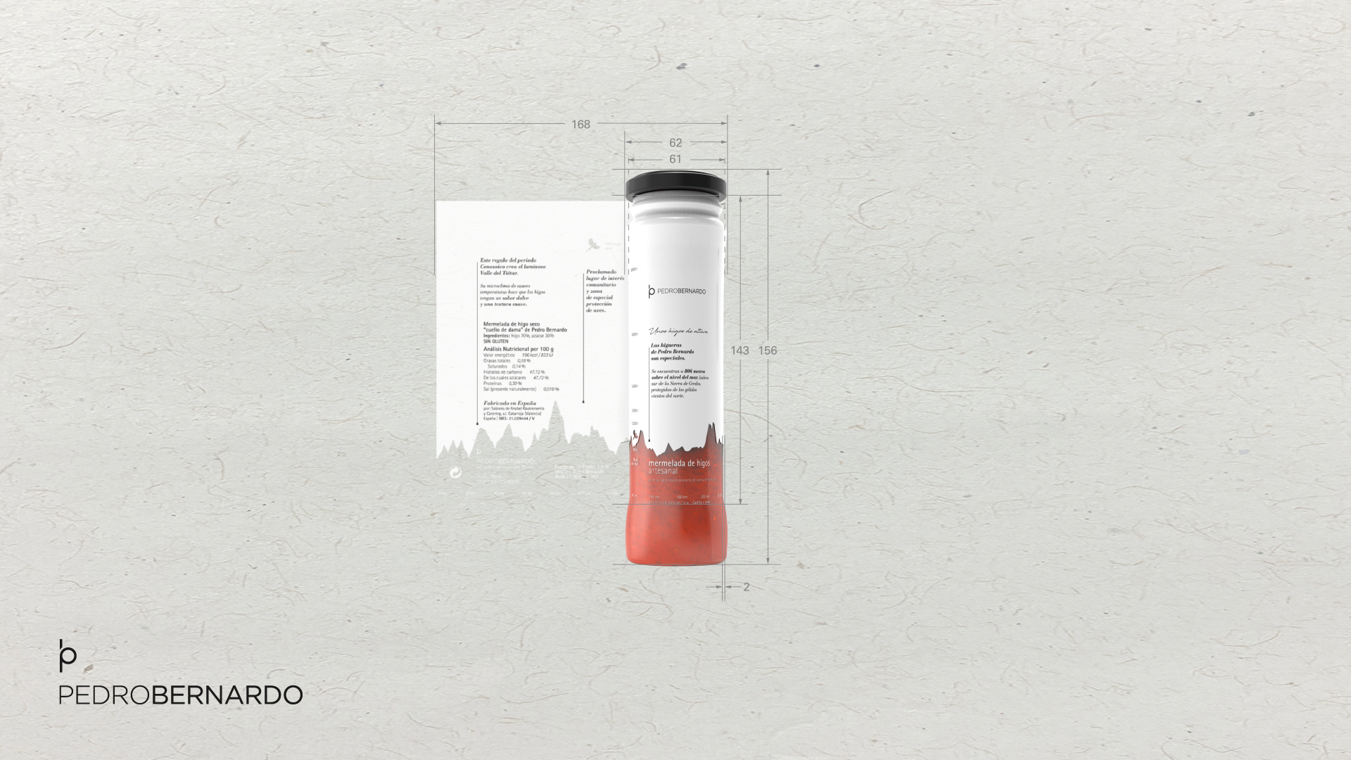
Cada producto, cada detalle y cada espacio de esta experiencia están diseñados para transmitir la autenticidad del Bierzo: ingredientes de cercanía, productores locales y sabores que relatan historias de cuidado, tesón y tradición. Esta temporada amplifica la filosofía del movimiento con el concepto ¡Nos gusta lo local!, combinando estrategias de co-branding con productores locales, interesantes experiencias de conocimiento y una comunicación directa, inteligente y cercana que conecta con toda su comunidad.

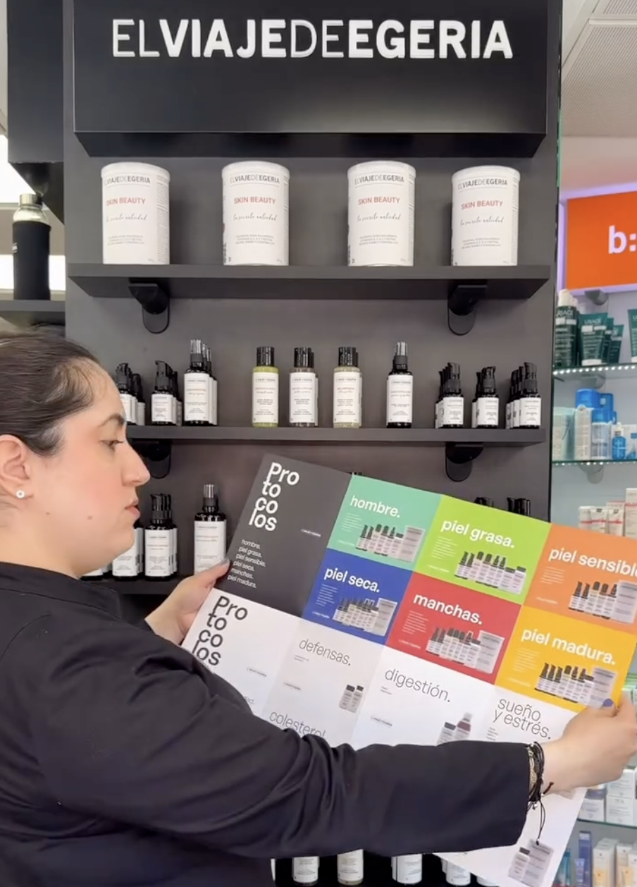
En brandcelona® Healthcare hemos trabajado desde la estrategia de marca hasta la experiencia sensorial del cliente, creando un universo de branding completo: naming, identidad visual, comunicación digital, retail y co-branding con marcas locales. El objetivo es claro: diseñar ecosistemas de marca que no solo vendan productos, sino que conecten con su comunidad a través del concepto de “producto perfecto”. Cada interacción refuerza la experiencia de autenticidad, de confianza y posiciona la marca del movimiento como un referente en nutrición consciente y sostenible.

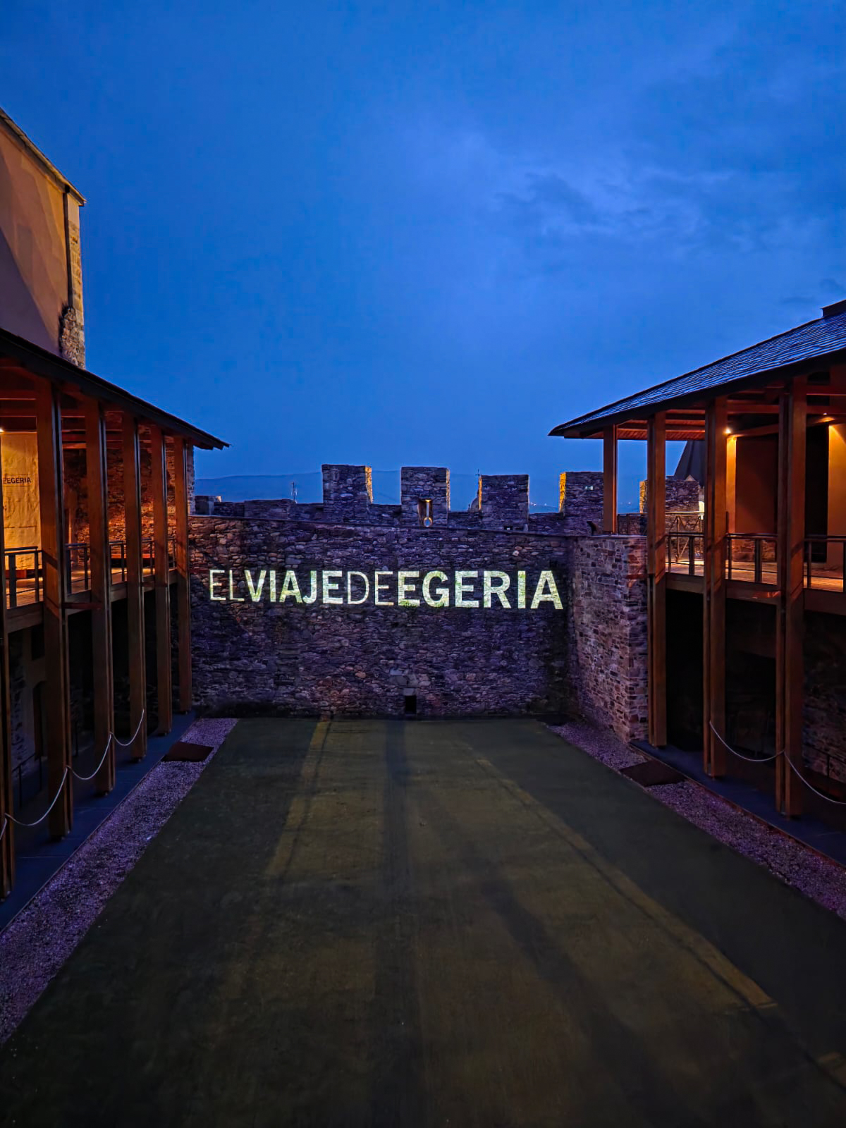
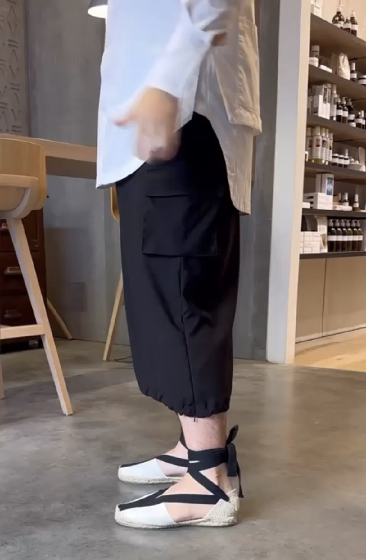
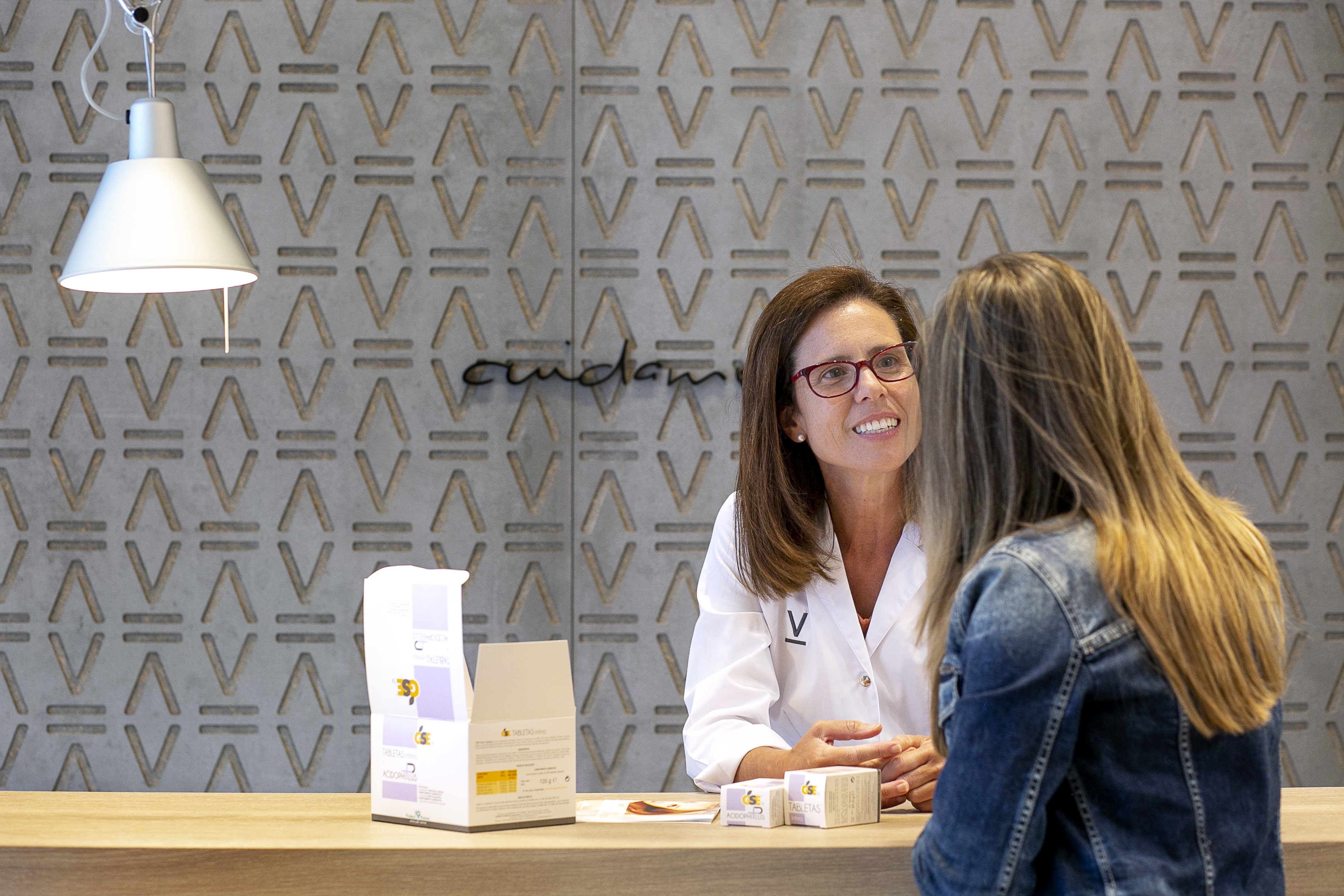
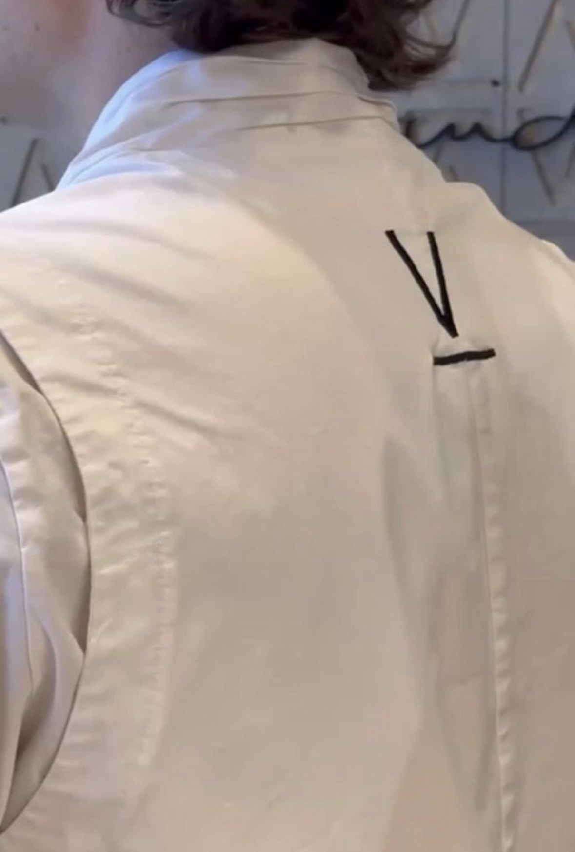
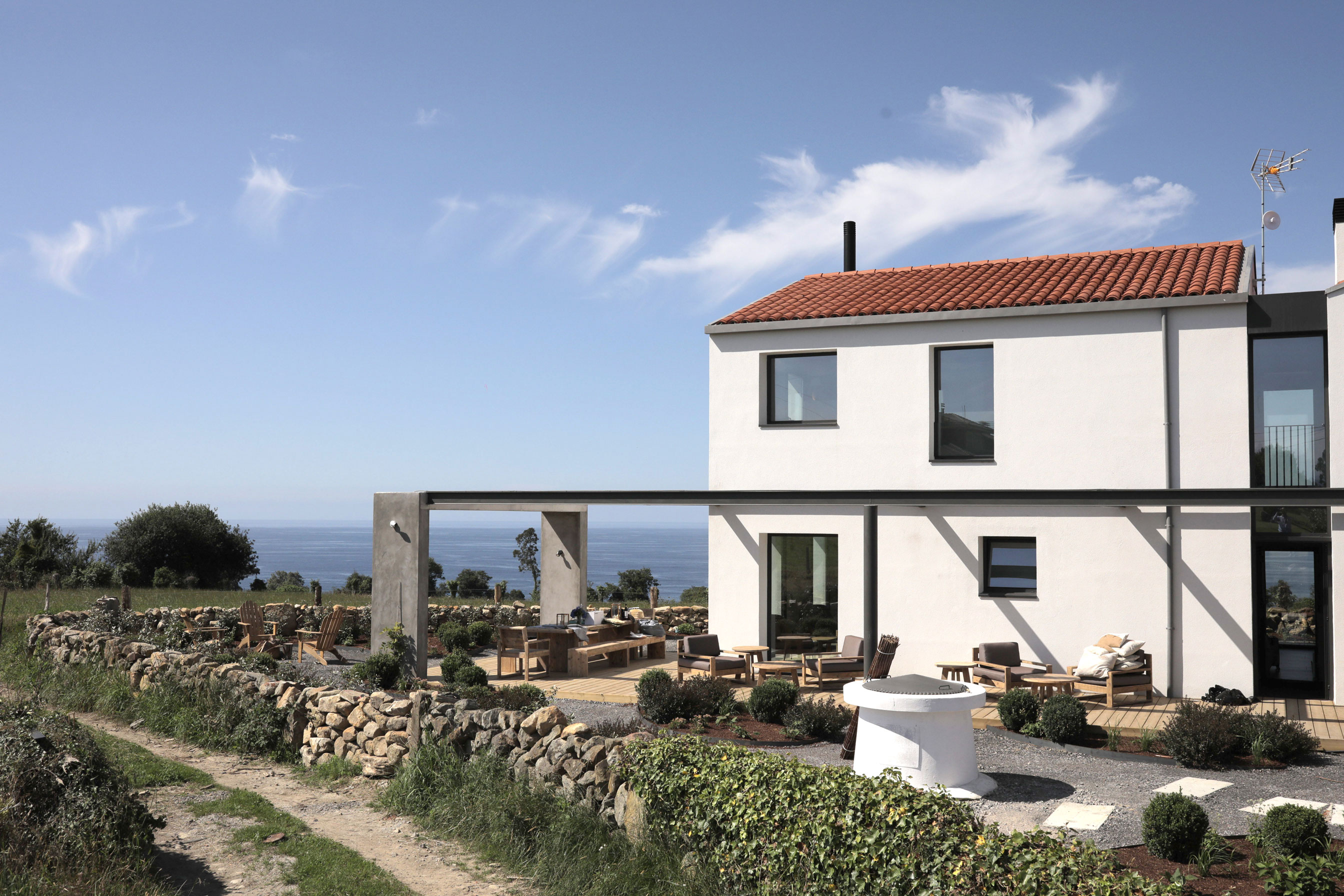
El Bierzo no es solo un territorio; es un relato vivo de cuidado, audacia y cultura local. Cada corner saludable, cada packaging y cada punto de contacto digital han sido cuidadosamente diseñados para reflejar esta historia, generando una experiencia de usuario que conecta emocionalmente con la comunidad, al mismo tiempo que impulsa la diferenciación en el competitivo sector de farmacia.

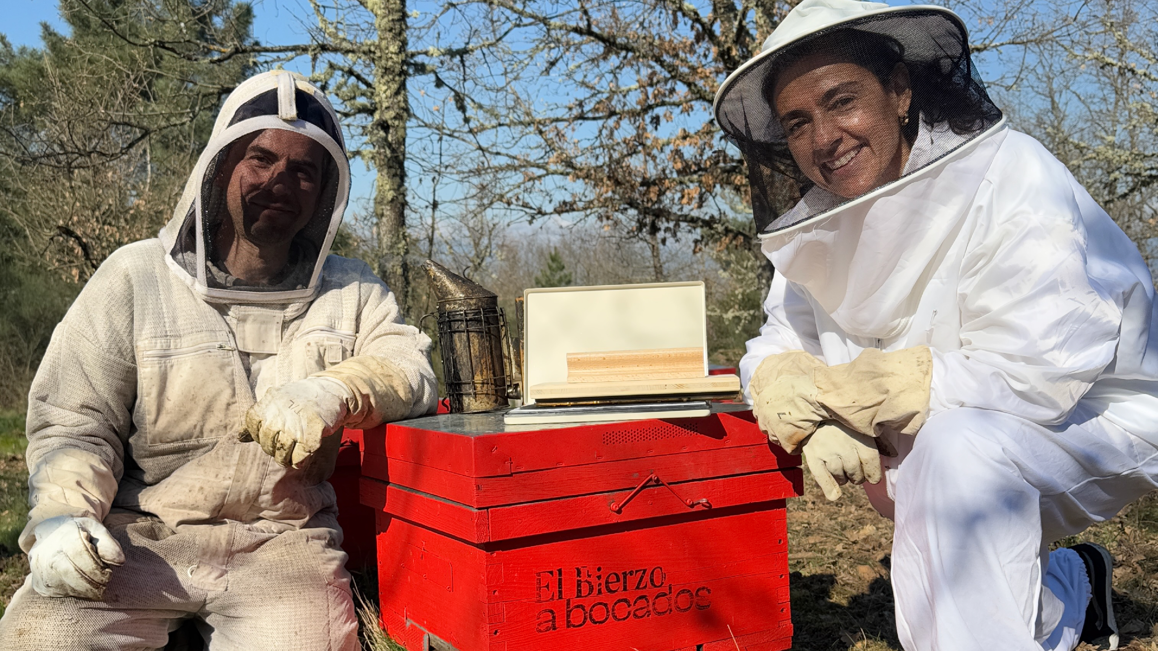
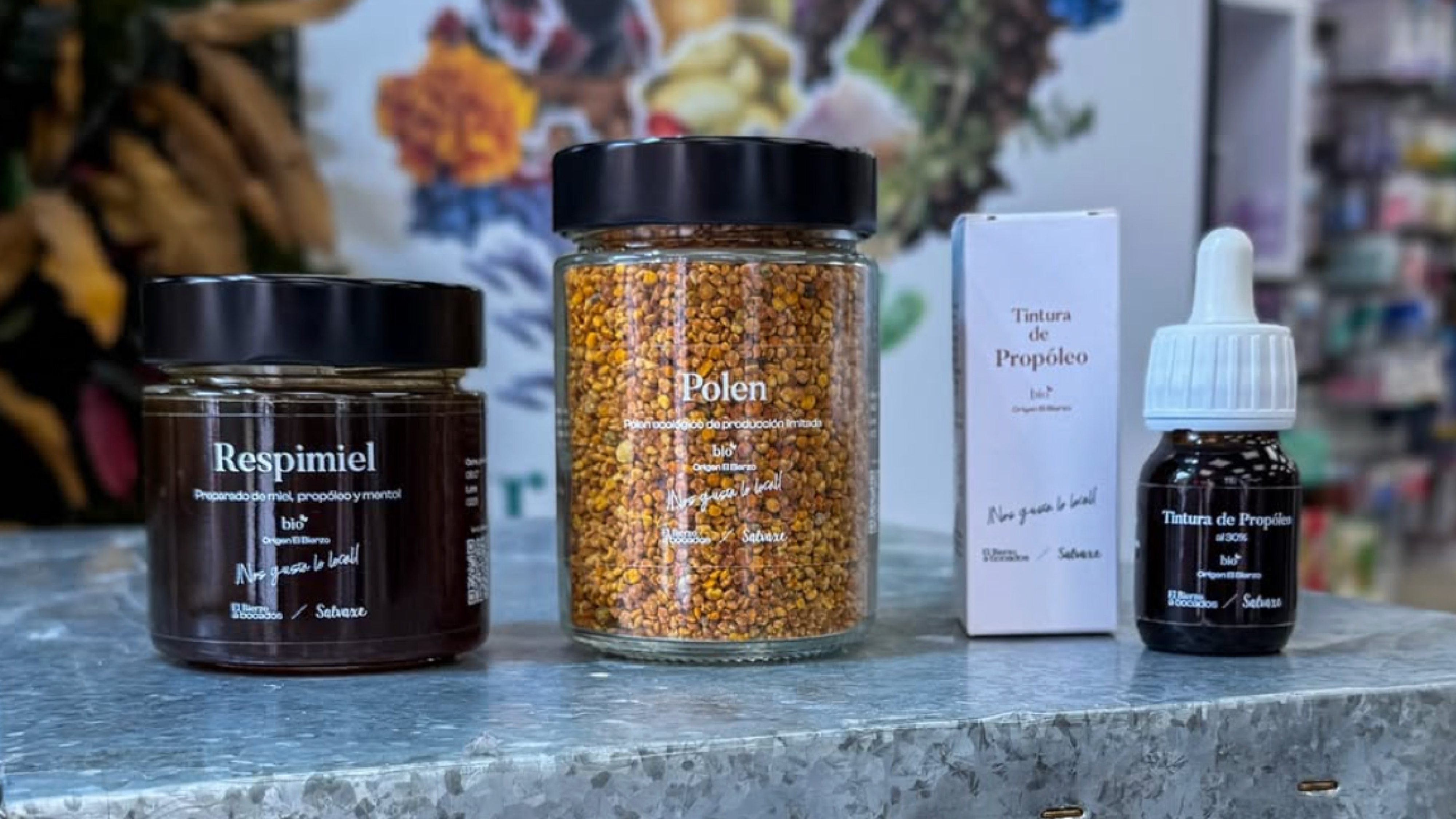
Los contenidos de El Bierzo a Bocados ¡Nos gusta lo local! son enérgicos, directos e inteligentes, y se encuentran en todo el espectro de comunicación de la marca: digital, retail y packaging. Los productos orgánicos, la colaboración con productores locales y la narrativa de conocimiento detrás de cada bocado crean un relato coherente y aspiracional que resuena con clientes que valoran la autenticidad, la salud y la sostenibilidad.

Con este movimiento, Marta Rodríguez Tato y brandcelona® refuerzan una idea central: lo local no es solo origen, es identidad, experiencia y compromiso con la comunidad. 

El Bierzo a Bocados ¡Nos gusta lo local! se convierte así en un referente de cultura nutricional consciente, donde cada detalle refleja historia, territorio y pasión por lo auténtico con  el compromiso de quienes hacen de lo local una experiencia genuina. Entre Troncos, Salvaxe, Artesanos de Luneza, Agrimor, Hermanos Balboa, Sagra y Carlos, Verónica Ortega, Prada, Finca El Castro y Olibier transforman cada producto en un verdadero reflejo de la cultura y la identidad berciana. 

Descubre la nueva temporada y déjate inspirar por la autenticidad de lo local. 

Celebrating Bercian Authenticity.

At brandcelona® Healthcare, we are deeply proud to support the nutritional movement El Bierzo a Bocados ¡Nos gusta lo local!, founded by Marta Rodríguez Tato. More than a project, it is a declaration of purpose: to value local products, proximity, and the richness of her native land, El Bierzo.

Every product, every detail, and every space in this experience are designed to convey the authenticity of El Bierzo: locally sourced ingredients, regional producers, and flavours that tell stories of care, perseverance, and tradition. This season, the movement amplifies its philosophy with the concept ¡Nos gusta lo local!, combining co-branding strategies with local producers, engaging knowledge-sharing experiences, and direct, intelligent, and approachable communication that connects with the entire community.

At brandcelona® Healthcare, we have worked from brand strategy to the customer’s sensory experience, creating a complete branding universe: naming, visual identity, digital communication, retail, and co-branding with local brands. The goal is clear: to design brand ecosystems that not only sell products but also connect with their community through the concept of the “perfect product.” Each interaction reinforces authenticity, builds trust, and positions the movement’s brand as a benchmark in conscious and sustainable nutrition.

El Bierzo is not just a territory; it is a living story of care, courage, and local culture. Every healthy corner, every packaging, and every digital touchpoint has been carefully designed to reflect this story, creating a user experience that emotionally connects with the community while enhancing differentiation in the competitive pharmacy sector.

The content of El Bierzo a Bocados ¡Nos gusta lo local! is energetic, direct, and intelligent, spanning the brand’s full communication spectrum: digital, retail, and packaging. Organic products, collaborations with local producers, and the knowledge-based narrative behind each bite create a coherent and aspirational story that resonates with customers who value authenticity, health, and sustainability.

Through this movement, Marta Rodríguez Tato and brandcelona® Healthcare reinforce a central idea: local is not just origin—it is identity, experience, and commitment to the community.

El Bierzo a Bocados ¡Nos gusta lo local! thus becomes a reference in conscious nutritional culture, where every detail reflects history, territory, and a passion for authenticity, alongside the commitment of those who turn local into a genuine experience. Entre Troncos, Salvaxe, Artesanos de Luneza, Agrimor, Hermanos Balboa, Sagra y Carlos, Verónica Ortega, Prada, Finca El Castro, and Olibier, each product becomes a true reflection of Bercian culture and identity.

Discover the new season and let yourself be inspired by the authenticity of local.

LA EXPERIENCIA DE ‘EL VIAJE DE EGERIA’.

Una experiencia holística de cuidado personal.

En Brandcelona® Healthcare nos sentimos muy orgullosos de liderar, curar y diseñar el branding y la arquitectura de marca de Marta Rodríguez Tato, farmacéutica berciana, innovadora y emprendedora referente en salud, belleza y bienestar.

Desde su reconocida Farmacia El Bierzo, Marta impulsa su línea de cosmética ecológica de autor El Viaje de Egeria y su colección de complementos nutricionales, transmitiendo una experiencia holística de cuidado personal. A través del movimiento de cultura nutricional El Bierzo a Bocados, también abraza a su comunidad y promueve un estilo de vida saludable profundamente arraigado a su querido paisaje local, El Bierzo.

El completo diseño estratégico de su marca de cosmética ecológica y de proximidad El Viaje de Egeria, junto con la comunicación de su relato, ha dado forma a una identidad construida sobre valores intrínsecos, lejos de los clichés recurrentes del sector farmacéutico.

Marta Rodríguez Tato se erige en el sector con una marca personal genuina, comprometida con su gente y su tierra, que proyecta a través de la creación de su propia línea de producto ‘El Viaje de Egeria’.

Farmacia El Bierzo es uno de nuestros diseños emblemáticos del sector retail de farmacias en brandcelona®, un sincero homenaje a los orígenes de su fundadora y a su ética creativa.

Nuestro enfoque estratégico en branding permite tomar decisiones corporativas clave en producto, servicios y comunicación, asegurando que cada interacción de la farmacia, al situar la marca en el centro de la estrategia, sea coherente, personalizada y positiva.

Con pasión y rigor, se ha cuidado cada detalle de El Viaje de Egeria, formulando productos con ingredientes naturales de El Bierzo, una región de biodiversidad única y rica herencia cultural.
Partiendo de la ética de su fundadora, se entiende El Bierzo no solo como territorio, sino como una historia de cuidado, tesón y audacia. 

Hemos diseñado una estrategia de marca con El Viaje de Egeria que convierte a El Bierzo en el eje central de un relato de belleza, bienestar y salud, capaz de conectar con su comunidad y resaltar el carácter genuino de sus paisajes.

En brandcelona® Healthcare, nos sentimos profundamente agradecidos por la oportunidad de fusionar historia, naturaleza y diseño en una marca que resuena con sus raíces y con quienes buscan autenticidad en cada detalle de sus notas de cuidado.
Porque diseñar una marca es diseñar una manera de entender el mundo.

A holistic experience of personal care.

At brandcelona® Healthcare, we are deeply proud to lead, curate, and design the branding and brand architecture of Marta Rodríguez Tato, an innovative pharmacist from El Bierzo — a true entrepreneur and a benchmark in health, beauty, and well-being.

From her renowned Farmacia El Bierzo, Marta leads her signature eco-conscious cosmetics line, El Viaje de Egeria, along with her collection of nutritional supplements, offering a holistic experience of personal care. Through the nutritional culture movement El Bierzo a Bocados, she also embraces her community and promotes a healthy lifestyle deeply rooted in her beloved local landscape, El Bierzo.

The comprehensive strategic design of her artisanal and locally inspired cosmetics brand, El Viaje de Egeria, together with the storytelling that defines it, has given rise to an identity built on intrinsic values, far removed from the recurring clichés of the pharmaceutical sector.

Marta Rodríguez Tato stands out in her field with a genuine personal brand, committed to her people and her land, embodied through the creation of her own product line, ‘El Viaje de Egeria’.

Farmacia El Bierzo is one of our emblematic retail pharmacy designs at brandcelona®, a sincere tribute to the origins of its founder and her creative ethos.

Our strategic approach to branding enables key corporate decisions in product, service, and communication strategies, ensuring that every interaction within the pharmacy, by placing the brand at the heart of the business, remains coherent, personalised, and positive.

With passion and precision, every detail of El Viaje de Egeria has been carefully crafted using natural ingredients sourced from El Bierzo, a region of unique biodiversity and rich cultural heritage. Guided by the ethics of its founder, El Bierzo is understood not merely as a territory, but as a story of care, perseverance, and courage.

We have built a brand strategy through El Viaje de Egeria that positions El Bierzo as the central axis of a narrative of beauty, well-being, and health — one that connects deeply with its community and highlights the authentic character of its landscapes.

At Brandcelona® Healthcare, we are sincerely grateful for the opportunity to fuse history, nature, and design into a brand that resonates with its roots and with those who seek authenticity in every detail of their care.
Because designing a brand is designing a way of understanding the world.

TERRANEA BOOK — SLOW CARE.

Una celebración del Slow Care: el nuevo libro de Terranea.

Hay momentos en los que un libro es más que un conjunto de páginas encuadernadas: se convierte en una filosofía, en una forma de vivir.

El nuevo volumen de Terranea, curado y diseñado por brandcelona® Healthcare, es precisamente eso: una invitación a abrazar el arte del Slow Care, inspirado en los ritmos de Almería y dedicado a la búsqueda intemporal del bienestar y la belleza.

Basado en la sabiduría de la belleza natural, las notas de cuidado y los delicados rituales de la vida cotidiana, este libro ofrece un viaje hacia un mundo donde el cuidado no tiene prisa, donde la belleza se encuentra en la sencillez y donde la salud se cultiva con intención. Es, al mismo tiempo, un reflejo de la herencia de Terranea y una visión de una vida en armonía con la naturaleza.

En sus páginas, el lector descubrirá inspiraciones estacionales, prácticas conscientes y reflexiones holísticas que evocan los serenos paisajes de Almería — la fuerza silenciosa del aloe vera, la resistencia de las chumberas bajo el sol del desierto y la suave elegancia de una vida modelada por la luz mediterránea. Cada capítulo encarna la esencia del Slow Care: restauradora, serena y profundamente humana.

Más que una guía, este es un libro para atesorar — un compañero para quienes desean alinear su estilo de vida con valores de sostenibilidad, equilibrio y belleza consciente. Es un testimonio de la creencia de que cuidarnos a nosotros mismos y al mundo natural son actos de amor inseparables.

Ya disponible en tiendas Terranea y online, este libro es la expresión de la filosofía de Otilia Mena: que el verdadero bienestar se cultiva lentamente, suavemente, con belleza.

A celebration of Slow care: The New Book from Terranea.

There are moments when a book becomes more than pages bound together — it becomes a philosophy, a way of living. 

The new volume from Terranea, designed and curated by brandcelona® Healthcare, is precisely that: an invitation to embrace the art of Slow Care, inspired by the rhythms of Almería and dedicated to the timeless pursuit of wellbeing and beauty.

Drawing upon the wisdom of organic beauty, natural notes, and the gentle rituals of daily life, this book offers a journey into a world where care is unhurried, where beauty is found in simplicity, and where health is nurtured with intention. It is both a reflection of Terranea’s heritage and a vision for a life lived in harmony with nature.

Within its pages, readers will discover seasonal inspirations, mindful practices, and holistic insights that echo the serene landscapes of Almeria — the quiet strength of aloe vera, the resilience of prickly pears beneath the desert sun, and the soft elegance of life shaped by the Mediterranean light. Each chapter carries the essence of Slow Care: restorative, graceful, and profoundly human.

More than a guide, this is a book to be cherished — a companion for those who seek to align their lifestyle with values of sustainability, balance, and conscious beauty. It is a testament to the belief that caring for ourselves and for the natural world are inseparable acts of love.

Now available in Terranea stores and online, the book is an expression of Otilia Mena’s philosophy — that true wellbeing is cultivated slowly, gently, beautifully.

TERRANEA POP-UP STORE. SLOW CARE.

Terranea, el Encuentro de la Comunidad Slow Care.

Su presencia es efímera, la experiencia inolvidable. En brandcelona® Healthcare nos enorgullece presentar uno de nuestros últimos proyectos de brand vibe: el pop-up store de Terranea en Rodalquilar, Almería.

Durante el verano, la marca visionaria Terranea, con sus productos de cuidado y belleza OM Otilia Mena, ha desplegado un espacio temporal que condensa el espíritu de la estación veraniega y ofrece a su creciente comunidad una experiencia de estilo de vida única. Una boutique efímera, inmersiva y situada en un escenario singular que despierta renovadas emociones y redefine nuevamente la forma de relacionarse con sus clientes.

En esta ocasión, el espacio ha vestido esta icónica localización de Almería en un ejercicio magistral de co-branding con su marca propia OM. Una experiencia con fecha de caducidad que, lejos de ser pasajera, se convierten en un memorable punto de encuentro entre marca y comunidad.

Esta Terranea Pop-Up Store se ha diseñado como herramientas de comunicación y venta, una auténtica palanca de marketing brand-to-human, donde lo efímero, lo local y lo experiencial se combinan para redescubrir el ADN de la marca y convertirlo en todo un momento IRL “In-Real-Life” – social, compartible y aspiracional.

Cuando el público están en entornos relajados, desenfadados y disfrutando de un entorno de placer, su predisposición de relación con las marcas tambien cambia. Este estado de ánimo convierte a los pop-ups en una oportunidad estratégica para ofrecer una versión diferente de la marca, más ligera, más cercana, más emocional, sin perder la coherencia con su identidad permanente.

En brandcelona® interpretamos la proyección de Terranea a través de tres claves de identidad que hacen de su pop-up un referente:

  • Exclusividad seductora: un espacio con fecha de caducidad aprovecha la psicología del tiempo, atrayendo a la comunidad con la promesa de algo único e irrepetible.
  • Narrativa de temporada: el verano, los beach clubs y el mar ofrecen un escenario de ocio, bienestar y relax. El entorno perfecto para desplegar la esencia de Terranea y reforzar su core brand desde nuevas perspectivas.
  • Conocimiento de la comunidad: estas activaciones permiten observar de cerca los hábitos, preferencias y aspiraciones de su audiencia, generando un aprendizaje invaluable que fortalece su conexión futura.

El pop-up de Terranea no es solo un espacio temporal. Es una declaración de intenciones: un recordatorio de que una marca de farmacia contemporánea, cuando está bien diseñada y curada, puede trascender sus límites tradicionales para convertirse en un destino cultural de bienestar.

Terranea, the Gathering of the Slow Care Community.

Fleeting in presence, unforgettable in experience. At brandcelona® Healthcare we are proud to unveil one of our latest brand vibe projects: the Terranea pop-up store in Rodalquilar, Almería.

This summer, the visionary brand Terranea, together with its beauty and care line OM Otilia Mena, has brought to life a temporary space that encapsulates the very spirit of the season. A boutique both ephemeral and immersive, set against a singular backdrop that awakens fresh emotions and once again redefines the way in which the brand connects with its community.

For this occasion, the space has dressed this iconic enclave in Almería through a masterful co-branding exercise with its own OM line. An experience with an expiration date which, far from being transient, becomes a memorable meeting point between brand and community.

The Terranea Pop-Up Store has been conceived as both a communication and retail tool—an authentic lever of brand-to-human marketing—where the ephemeral, the local, and the experiential converge to rediscover the DNA of the brand, transforming it into a true In-Real-Life moment: social, shareable, and aspirational.

When audiences are immersed in relaxed, leisurely environments, their openness to engage with brands also shifts. This mood makes pop-ups a strategic opportunity to offer a lighter, more intimate, and more emotional version of the brand, without losing coherence with its enduring identity.

At brandcelona®, we interpret Terranea’s projection through three identity keys that elevate its pop-up into a benchmark:

  • Seductive exclusivity: A time-bound space that harnesses the psychology of urgency, enticing the community with the promise of something unique and unrepeatable.
  • Seasonal storytelling: Summer, beach clubs, and the sea create a landscape of leisure, wellbeing, and relaxation—the perfect stage to embody the essence of Terranea and reinforce its core brand from fresh perspectives.
  • Community insight: These activations allow the brand to observe first-hand the habits, preferences, and aspirations of its audience, generating invaluable knowledge that strengthens future connections.

The Terranea pop-up is not merely a temporary venue. It is a statement of intent: a reminder that a contemporary pharmacy brand, when thoughtfully designed and curated, can transcend its traditional boundaries to become a cultural destination of wellbeing.

LA VOZ DE TERRANEA. SLOW CARE.

Farmacia Terranea, la Voz de la Comunidad Slow Care.

En brandcelona® Healthcare estamos orgullosos de compartir noticias emocionantes desde Terranea, en Almería. Este verano hemos lanzado nuevos contenidos vinculados al estilo de vida Slow Care, junto con los últimos productos de Terranea y las novedades de la línea cosmética de Otilia Mena OM, elaborada con ingredientes autóctonos de Almería. Todo ello se presenta a través de un soporte de comunicación referente e innovador, que se integra en su icónico espacio de salud, belleza y bienestar.

«La Voz de Terranea» ofrece estos contenidos de alto valor informativo en un formato atractivo, convirtiéndose en parte esencial de la experiencia de sus clientes. Este nuevo canal se fundamenta en el bienestar holístico y representa una propuesta diferenciadora, memorable y perfecta para llevar a casa.

La cultura profundamente arraigada de bienestar comunitario en Almería, que abarca desde la alimentación nutritiva hasta el poder de la vida al aire libre, convierte a este entorno en el hogar ideal para «La Voz de Terranea» y su filosofía Slow Care. Nos entusiasma formar parte de esta nueva etapa de información en bienestar, llevando nuestra visión de branding estratégico y curaduría vanguardista de marca a un soporte experiencial que marca una vez más la diferencia de Terranea dentro del sector retail farmacéutico.

Este nuevo diseño fortalece la conexión, el orgullo y el sentido de pertenencia de su comunidad global, convirtiéndose en un referente que genera un fuerte vínculo emocional y cultural con la marca, y desarrollando una oportunidad relacional que conecta con su comunidad a través de un relato profesional, riguroso y capaz de generar profundas conexiones significativas.

Gracias al equipo de Terranea por sumarse a esta visión junto a Otilia Mena. No podemos esperar para compartir nuevas ediciones con todos vosotros.

Terranea Pharmacy, the Voice of the Slow Care Community.

At brandcelona® Healthcare, we are proud to share exciting news from Terranea in Almería. This summer, we have launched new content aligned with the Slow Care lifestyle, alongside Terranea’s latest product releases and the newest additions to the Otilia Mena OM skincare line, crafted with locally sourced Almerian ingredients. All of this is presented through an innovative and leading communication platform seamlessly integrated into their iconic space dedicated to health, beauty, and wellbeing.

La Voz de Terranea delivers this high-value content in an engaging format, becoming an essential part of each client’s experience. This new channel is rooted in holistic wellbeing and represents a distinctive, memorable offering – perfect to take home and integrate into daily life.

The deeply rooted culture of community wellbeing in Almería – from nourishing cuisine to the power of life outdoors – makes it the ideal home for La Voz de Terranea and its Slow Care philosophy. We are thrilled to be part of this new chapter in wellbeing communication, bringing our strategic branding vision and pioneering brand curation to an experiential platform that, once again, sets Terranea apart within the pharmaceutical retail sector.

This new design strengthens connection, pride, and a true sense of belonging within its global community, becoming a benchmark that creates a powerful emotional and cultural bond with the brand, opening relational opportunities and connecting meaningfully with its community through a professional, rigorous narrative capable of fostering deep, genuine connections.

We extend our gratitude to the entire Terranea team for embracing this vision alongside Otilia Mena. We cannot wait to share the upcoming editions with all of you.

FARMACIA TERRANEA. SLOW CARE EXPERIENCE.

Farmacia Terranea, el Alma de la Comunidad Slow Care.

Farmacia Terranea es un espacio sensorial, diseñado por Brandcelona Healthcare, que nos transmite la energía de un mercado mediterráneo, que nos hace sentir conectados y vivos más allá de un simple punto de venta de farmacia; es el pulso vibrante que mantiene una comunidad global en movimiento. 

Su marca es la esencia misma de su carácter Slow Care, es el puente que conecta sus productos y servicios con su comunidad, y el factor clave que define su éxito y diferenciado posicionamiento a largo plazo. Comprender la importancia de la marca es fundamental para cualquier proyecto de retail farmacia que aspire a prosperar, diferenciarse y destacar en su sector.

Los proyectos de retail desarrollados por Brandcelona Healthcare son auténticas manifestaciones de visión, estrategia e implementación, materializadas en una colaboración creativa de su propósito. Nuestro objetivo es diseñar experiencias de marca tangibles, inolvidables y referentes.

Creemos en diseñar marcas y experiencias de marca para nuestros clientes con un sentido profundo de conexión, orgullo y pertenencia. Esto no solo fortalece la lealtad de sus usuarios, sino que también fomenta una comunidad global alrededor de su marca. Nuestros diseños se convierten en un punto de referencia, un lugar donde los usuarios no solo compran productos, sino que también desarrollan un fuerte vínculo emocional y cultural con la marca.

Nuestra larga colaboración con Farmacia Terranea, nos ha permitido convertir su retail de farmacia en algo más que un espacio de venta; es una gran experiencia de estilo de vida. En nuestros exclusivos diseños de branding desarrollamos una oportunidad para diseñar marcas con una historia de éxito, innovación y conexiones significativas. 

Desarrollar un buen branding en el sector farmacéutico, transforma tu espacio en el alma de una comunidad, donde las necesidades del farmacéutico encuentran soluciones, sus esfuerzos laborales encuentran recompensas y sus interacciones diarias encuentran significado a través de su experiencia de marca. Farmacia Terranea es toda una experiencia de comunidad, que nos permite participar de su espíritu de cuidado y de su estilo de vida Slow Care. ¡Disfruta de esta experiencia de marca Slow Care!

Terranea Pharmacy, the Soul of the Slow Care Community.  

Farmacia Terranea is a sensory space designed by Brandcelona Healthcare, inspired by the vibrant energy of a Mediterranean market. It goes far beyond being just a pharmacy retail point; it is the dynamic pulse that connects and breathes life into a global community in constant motion.  

Its brand embodies the very essence of its Slow Care philosophy. It serves as the bridge that unites its products and services with its community, acting as the key factor behind its success and its distinctive long-term positioning. Understanding the importance of branding is essential for any pharmacy retail project that aspires to thrive, stand out, and lead in its sector.  

The retail projects developed by Brandcelona Healthcare are authentic manifestations of vision, strategy, and implementation, materialized through creative collaboration aligned with the brand’s purpose. Our goal is to design tangible, memorable, and benchmark brand experiences.  

We believe in creating brands and brand experiences with a profound sense of connection, pride, and belonging. This approach not only strengthens user loyalty but also fosters a global community around the brand. Our designs are not just commercial spaces—they become reference points where users develop an emotional and cultural bond with the brand.  

Our long-standing collaboration with Farmacia Terranea has allowed us to transform its pharmacy retail space into much more than a place for transactions; it has become a lifestyle experience. Through our exclusive branding designs, we have built a story of success founded on innovation and meaningful connections.  

Effective branding in the pharmaceutical sector transforms your space into the heart of a community—a place where pharmacists’ needs find solutions, their efforts find rewards, and their daily interactions find meaning through the brand experience. Farmacia Terranea is far more than a pharmacy, it is a community experience that invites us to embrace its spirit of care and its Slow Care lifestyle philosophy. Discover and enjoy this unique Slow Care brand experience!  

VENSALUD. Brand Experience.

Eleva tu marca: El poder de la Experiencia de Marca en el sector farmacia.

Para nosotros, diseñar Experiencias de Marca exitosas es más que un simple ejercicio estético de diseño con el logotipo, se trata de diseñar el trayecto conmovedor que realiza el usuario con tu marca. Abarca todos los puntos de contacto, desde el primer encuentro digital hasta la experiencia física de su venta en «retail». Es la emoción, en sus elementos tangibles e intangibles, que deja una huella memorable en sus corazones y en sus mentes.

Brandcelona® Healthacre diseñó la marca y toda la experiencia de marca de Vensalud, para convertirla en una marca de farmacia muy reconocida y en uno de los espacios farmacéuticos más emblemáticos de España. Proveniente de Asturias, reconocido en España por su innovadora cultura sanitaria, el empresario Pelayo del Pozo junto con su hermano Fernando del Pozo, comenzaron a repensar un nuevo concepto de farmacia diez años atrás, después de asistir a uno de nuestros exclusivos #retailtourexperience en la ciudad de Nueva York.

¿Por qué eso importa? En el sector de la belleza, el bienestar y la atención sanitaria, inundado de opciones, la experiencia de marca es el hecho diferenciador. Es la experiencia de marca la que transforma a los clientes en embajadores leales. Va más allá de cumplir con las expectativas; se trata de crear momentos que perduren, forjando una conexión que trascienda lo transaccional. Una experiencia de marca notable es una promesa cumplida, una relación construida.

Diseñamos una amplia gama de soluciones de experiencia de marca basadas en la esencia original de la marca para crear un poderoso diseño que inspire el camino icónico de la marca, refuerce su liderazgo y amplíe su alcance internacional.

Nuestro posicionamiento creativo en este ícono de belleza, atención farmacéutica y bienestar fue «Cuidamos tu vida», basado en la autenticidad, relevancia y adaptabilidad. Expresamos todo esto evolucionando la paleta de gris oscuro y blanco en el corazón de la marca y refinando las formas fundamentales de Vensalud en línea con la pureza del diseño tradicional de materiales naturales. Al redefinir su espacio comercial, vestuario, campañas, el paisaje de marcas seleccionadas y la experiencia digital, pudimos mostrar la plenitud de la marca dentro de un sistema original y modular.

En brandcelona® diseñamos a través de Los Tres Pilares:

Coherencia: En todas las plataformas e interacciones, mantener una identidad de marca coherente es clave. Genera confianza y refuerza la personalidad de su marca.

Emoción: Comunica a través de las emociones a tu audiencia. Una marca que resuena emocionalmente se vuelve inolvidable.

Autenticidad: Se fiel a la historia de tu marca. La autenticidad genera credibilidad y confianza, creando una conexión genuina con tu audiencia.

Crear tu experiencia de marca como Brand Managers significa que no somos solo curadores; Somos los diseñadores de estas experiencias memorables y eso marca la gran diferencia. Cada detalle, desde los mensajes hasta las imágenes, contribuye a la narrativa de la marca. Se trata de diseñar oportunidades, anticipar necesidades y garantizar que cada encuentro sea un paso significativo en su viaje con tu marca.

En Vensalud diseñamos una marca de farmacia para convertirla en una experiencia que cautiva, resuena y perdura. Construimos una experiencia de marca que deja un legado duradero. ¡A Pelayo y Fernando les apasiona constantemente elevar la experiencia de la marca Vensalud, para crear viajes inolvidables!

Si quieres saber más sobre este u otros proyectos, te invitamos a visitar nuestro sitio web.

Elevate Your Brand: Unveiling the Power of Healthcare Brand Experience.

For us, designing successful Brand Experiences is more than just a simple design exercise with the logo, it’s about designing the soul-stirring journey that your audience takes with your brand. It encompasses every touchpoint, from the first digital encounter to the physical embrace of your retail. It’s the emotional resonance, the tangible and intangible elements that leave a lasting imprint on hearts and minds. 

Brandcelona® Healthacre designed the Vensalud branding and brand experience, to become a much-loved pharmacy brand and one of the most iconic pharmaceutical retails in Spain. Hailing from Asturias – renowned around Spain for its innovative healthcare culture – entrepreneur Pelayo del Pozo with his brother Fernando del Pozo started rethinking a new concept of pharmacy ten years ago, after attending one of our exclusive #retailtourexperience in New York City, 

Why Does it Matter? In the beauty, wellness and healthcare sector, inundated with choices, brand experience is the differentiator. It’s the brand experience that transforms customers into loyal ambassadors. It goes beyond meeting expectations; it’s about creating moments that linger, forging a connection that transcends the transactional. A remarkable brand experience is a promise delivered, a relationship built.

We designed a wide range of brand experience solutions to the original brand essence to create a powerful design to inspire the brand’s iconic path, reinforce its leadership and extend its international scope.

Our creative positioning of this beauty, healthcare and wellness icon was ‘Caring your life’ – grounded in authenticity but relevant and adaptable. We expressed this by evolving the dark grey and white palette at the heart of the brand and refining Vensalud’ fundamental shapes in line with the purity of traditional natural material design. By redefining the retail, clothing, campaigns and brand landscape of selected brands and digital experience, we were able to display the fullness of the brand within an original and modular system. 

At brandcelona® we design it through The Three Pillars:

Consistency: Across every platform and interaction, maintaining a consistent brand identity is key. It builds trust and reinforces your brand’s personality.

Emotion: Communicate through emotions to your audience. A brand that resonates emotionally becomes unforgettable.

Authenticity: Be true to your brand story. Authenticity builds credibility and trust, creating a genuine connection with your audience.

Crafting your brand experience as Brand Managers, means that we’re not just curators; we’re the designers of these memorable experiences, and it makes a big difference. Every detail, from messaging to visuals, contributes to the brand narrative. It’s about designing opportunities, anticipating needs, and ensuring each encounter is a meaningful step in their journey with your brand.

At Vensalud we designed a pharmacy brand into an experience that captivates, resonates, and endures. We built a brand experience that leaves a lasting legacy. Pelayo and Fernando are passionate constantly about elevating the Vensalud brand experience, to craft unforgettable journeys! 

If you want to know more about this or other projects, we invite you to visit our website.

PEDRO BERNARDO. The highest taste.

The highest taste.

At brandlond®, we partnered with Cooperativa San Isidro Labrador’s farmers to create a brand strategy and design that matches their mission to always provide the best that mountains in Sierra de Gredos in Spain has to offer. Pedro Bernardo is reconnecting to nature and its discerning consumers, with a thoughtful, stand-out design delivering the most exquisite standards in oil and figs. From their stunning liquid gold to their caring ethos, Pedro Bernardo is the highest taste.

The new branding and packaging design in the whole new lines of product is an immediate commitment to doing things elegantly and choicefully. We created a graphic system from the Sierra de Gredos mountain’s skyline that is introduced on the base of the packs and carried through on the side and back panels to celebrate the natural scale and recognisable shape of the mountains. When the products are displayed on-shelf, the pattern creates a landscape-like appearance.

The brand’s monogram is inspired by the name of the village symbol and the golden ratio, which suggests that the brilliance and infinite detail that naturally occurs in nature is the ideal standard for beauty. Accented in black and white, the monogram, the brand narrative, the different applied distinctive messages and the engravings on the packaging are evocative of the artisanal approach to harvesting olives and figs through the packaging design. The simple color palette and recognisable graphic details allow the design to go beyond the surface and reveal the true color and texture of the product through the packaging itself.

brandlond® Food and Beverages designs successful brands for businesses through innovative strategic branding tools and its own registered project methodology. For more information, get in touch with us.

Un sabor de altura.

En brandlond@ nos asociamos con los agricultores de la Cooperativa San Isidro Labrador para crear una estrategia y un diseño de marca que coincidiera con su misión de brindar siempre lo mejor que ofrecen las montañas de la Sierra de Gredos, España. Pedro Bernardo, conecta con la naturaleza y sus consumidores más exigentes, con un diseño pensado y destacado para ofrecer el estándar más exquisito en aceite e higos. Desde su deslumbrante oro líquido hasta su espíritu cooperativo, Pedro Bernardo es siempre un sabor de altura.

El nuevo diseño de marca y packaging en todas sus nuevas líneas de producto, es una apuesta por hacer las cosas con elegancia y diferenciación. Creamos un sistema gráfico a partir de la silueta de la Sierra de Gredos, que se presenta en la base de los envases y se traslada volumétricamente alrededor del propio envase, para celebrar la escala natural y la forma reconocible de sus montañas. Cuando los productos se exhiben en los estantes, el patrón crea una apariencia total de paisaje.

El monograma de la marca está inspirado en el nombre del símbolo del pueblo y la proporción áurea, evoca el brillo y el detalle infinito que ocurre naturalmente en la naturaleza, es el estándar ideal de belleza. Acentuado en blanco y negro el monograma, la narrativa de marca, los diferentes mensajes distintivos aplicados y los grabados del envase, son evocadores al enfoque artesanal de recolectar aceitunas e higos a través del diseño del empaque. La paleta de colores simple y los detalles gráficos reconocibles permiten que el diseño vaya más allá de la superficie y descubra el color y la textura reales del producto a través del propio envase.

brandlond® Food and Beverages, diseña marcas competitivas para negocios a través de innovadoras herramientas estratégicas de ‘branding’ y su metodología de proyectos registrada. Para ampliar cualquier información, escríbenos.

BRANDING FOR COMMERCIAL CAMPAIGNS. HEALTHCARE SECTOR

We create commercial campaigns at brandcelona® Healthcare through branding as a vehicle to generate links between brands and people. Through our strategic vision and our Cyclical Branding® methodology, we have the ability to design commercial campaigns that are structured into 3 fundamental groups, Services, Product and Lifestyle.

Every type of business must have a two-level communication strategy in mind: passive communication and active communication. Passive communication includes the daily actions that we generate that allow us to communicate the values ​​and essence of the brand. On the other hand, active communication is all those actions with great visual impact and a concrete message, which helps businesses to have a commercial benefit in the short term. These two levels of communication are necessary in a business, since they provide feedback, and in this way we obtain a good branding strategy that becomes a complete experience.

We strategically work 3 groups of campaigns that are divided into:

Services. This group specialises in making the user aware of the range of services that the brand offers, in a visual way and under a specific graph. This allows companies to quickly and visually communicate the different business areas they have, that is, their category management. Some practical examples of campaigns focus on services are «MeQuiero, Me Cuido» by Ibáñez Farmacia, «Som consells» by Farmacia Masquefa or Atarazana Farmacias.

Product. We promote the communication of a single product or customised products, offering value and visual impact with a clear intention, to communicate the product and all the strategic development behind the brand. Product launch campaigns such as Otilia Mena or El Viaje de Egeria are an example of this group.

Lifestyle. The intention of this group is to generate a whole movement under a specific lifestyle; we narrate a story that is dressed under an identity with its own character. From brandcelona® Healthcare we have developed some practical cases such as «Somos Colores» from Grupo Vensalud, «Almería defines me» from Farmacia Terránea, CCC from Farmacia Imperial or Primero mi Barrio from Farmacia Cruz.

Depending on the focus and objectives of each campaign, we draw up specific omnichannel strategies. We create brands and messages for people and their lifestyles.

brandcelona® Healthcare Strategic Brand Leadership designs smart brands for innovative businesses with strategic tools and the registered working methodology Cyclical Branding®. For further information please contact us at hola@brandcelona.com.

BRANDING PARA CAMPAÑAS COMERCIALES. SECTOR HEALTHCARE

En brandcelona® Healthcare creamos campañas comerciales por medio del branding como vehículo para generar vínculos entre marcas y personas. Por medio de nuestra visión estratégica y nuestra metodología Cyclical Branding® tenemos la capacidad de diseñar campañas comerciales que se estructuran en 3 grupos fundamentales, Servicios, Producto y Estilo de Vida.

Toda tipología de negocio tiene que tener contemplada una estrategia de comunicación en dos niveles, la comunicación pasiva y la comunicación activa. La comunicación pasiva son todas las acciones diarias que generamos que nos permiten comunicar los valores y la esencia de la marca. Por otro lado, la comunicación activa son todas aquellas acciones con gran impacto visual y un mensaje concreto, éstas ayudan a los negocios a tener un beneficio comercial a corto plazo. Estos dos niveles de comunicación son necesarios en un negocio, ya que se retroalimentan, y de esa manera obtenemos una buena estrategia de branding que se transforma en una experiencia completa.

Trabajamos estratégicamente 3 grupos de campañas que se dividen en:

Servicios. Este grupo se especializa en dar a conocer al usuario el abanico de servicios que la marca ofrece, de una manera visual y bajo una gráfica concreta. Esto les permite a las empresas comunicar de una manera rápida y visual las diferentes áreas de negocio que tienen, es decir su category management. Algunos ejemplos prácticos de campañas enfocadas en servicios son «Me quiero Me cuido» de Ibáñez Farmacia, «Som consells» de Farmacia Masquefa o Atarazana Farmacias.

Producto. Promovemos la comunicación de un producto o línea de productos propios ofreciendo valor e impacto visual con una intención clara, dar a conocer el producto y todo el desarrollo estratégico detrás de la marca. Campañas de lanzamiento de producto como Otilia Mena o El Viaje de Egeria son un ejemplo de este grupo.

Estilo de vida. La intencionalidad de este grupo es el de generar todo un movimiento bajo un estilo de vida concreto, narramos una historia que se viste bajo una identidad con carácter propio. Desde brandcelona® Healthcare hemos desarrollado algunos casos prácticos como «Somos Colores» de Grupo Vensalud, «Almería me define» de Farmacia Terránea, CCC de Farmacia Imperial o Primero mi Barrio de Farmacia Cruz.

Según el enfoque y objetivos de cada campaña, trazamos estrategias específicas de carácter omnicanal. Creamos marcas y mensajes en pro a las personas y a sus estilos de vida.

brandcelona® Healthcare Strategic Brand Leadership diseña smart brands para negocios de la nueva era a través de innovadoras herramientas estratégicas y la metodología de trabajo registrada Cyclical Branding®. Para ampliar cualquier información escríbenos a hola@brandcelona.com

EL FARO. UNKEMPT HOUSES.

Definiendo espacio a través de las emociones.

En brandcelona® creemos en nuestro trabajo como un vehículo que ayuda a explicar espacios sin palabras, donde las sensaciones y la experiencia son el principal impulso que ayuda a crear relaciones entre marcas y personas. 

Bajo esta idea de pensar y desarrollar nuestro trabajo, los hermanos Del Pozo, Pelayo, Fernando y Rafael, han decidido confiar en nosotros para desarrollar la esencia de marca de un nuevo proyecto que nace a partir de las emociones y las sensaciones de su tierra natal. Es aquí, donde damos inicio y hoy presentamos El Faro Unkempt, un proyecto que surge a través de la gran admiración por la naturaleza, el entorno y el estilo de vida del conocido pueblo asturiano de Tazones. 

El desarrollo para esta marca, debía iniciar y transmitir la esencia de este humilde y pintoresco pueblo ballenero, lleno de cultura, arte e historia. Esta marca nace como un homenaje a su esencia de vida creando una experiencia llena de sensibilidad y cercanía con el mar, donde construimos un espacio multisensorial que se enriquece gracias a la conexión de ambientes cálidos en contraste con la fuerza del mar cantábrico, un espacio que otorga paz. 

Nuestra estrategia de marca debía seguir unos valores muy claros, debíamos diseñar una marca que mantuviera un equilibrio y refleje paz, gracias a ello, construimos esta experiencia de forma sencilla y sincera, un forma básica es nuestro eje visual que debe cautivar el alma de la marca y de cada persona que quiera vivir la experiencia del Faro Unkempt Houses.

Un antiguo faro en el pueblo de Tazones, es nuestro espacio y el principal protagonista de toda esta estrategia de marca. Este edificio emblemático es un contenedor de una ambiente acogedor lleno de detalles que te invita a descubrir la riqueza de una zona en cada olor, textura, color y sabor.

Toda nuestra estrategia se ha enfocado en diseñar una marca a nivel actitudinal, hemos construido su storytelling el cual refleja el vínculo con el entorno, cada elemento gráfico y material tiene una historia que contar, cada aplicación gráfica refleja la historia de este sitio. Esta marca se ha diseñado buscando la simetría y el equilibrio que aporta serenidad. 

El faro es un concepto que se ha diseñado para definirse por sensaciones, no por palabras. 

Si quieres conocer más acerca de este u otros proyectos, te invitamos a visitar nuestra web

EL FARO. UNKEMPT HOUSES.

Defining space through emotions.

At brandcelona® we believe in our work as a channel that helps explain spaces without words, where sensations and experience are the purpose that help create a bond between brands and people.

Based on the idea of thinking about and building up our work, Del Pozo brothers, Pelayo and Fernando, decided to trust us to develop the brand essence of a new project born from emotions and sensations of their homeland. It is here where we start and present el Faro Unkempt, a project that arises through the great admiration for nature, environment and lifestyle of the well-known Asturian town Tazones.

The brand development should initiate and communicate the basis of this humble and picturesque whaling town, full of culture, art and history. The brand was born as a tribute to its essence of life by creating an experience full of sensitivity and closeness to the sea. We built a multisensory space enriched through the connection of warm environments in contrast to the Cantabrian Sea strength, being it a space that grants peace.

The brand strategy had to follow clear values. We had to design a brand with a balance and reflection of peace. Thanks to this, we built this experience in a simple and sincere way; a basic form is our visual axis that should captivate the soul of the brand and each person who wants to live the experience of El Faro Unkempt Houses. 

An old lighthouse located on the top of Tazones town, is our space and the main protagonist of this entire brand strategy. This emblematic building contains such cozy atmosphere full of details that invites you to discover the area and every smell, color and texture of it.

Our entire strategy has focused on designing a brand at an attitudinal level, building their storytelling which reflects the link with the environment. Each graphic and material element has a story to tell, and each graphical application reflects the history of this place. The brand has designed looking for the symmetry and balance that brings serenity.

Unkempt Houses is a concept designed to be defined by sensations, not words. 

If you want to know more about this or other projects, we invite you to visit our website