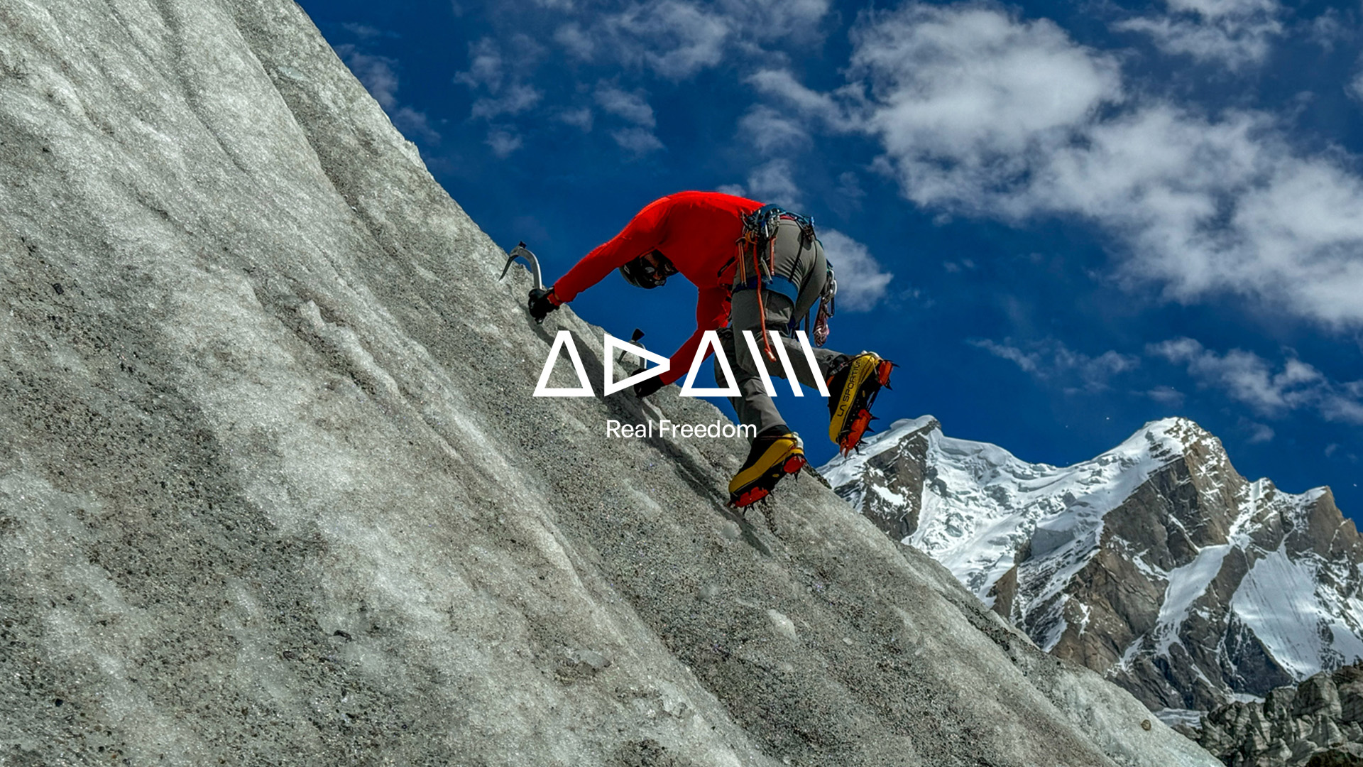
A personal brand with soul, purpose, and strategy.
In the world of high-risk sports — where authenticity is not constructed but lived — personal branding has become an undeniable strategic asset. Now more than ever, those with deep expertise, proven track records, and vision require an identity that not only represents them but elevates them on a global stage.
Adam Liendo | Real Freedom is born of this very need: communicating from the soul, connecting through truth, and standing out through difference.
At brandlond®, we have crafted this new personal branding project with a solid, distinctive strategy, profoundly aligned with the essence of the individual. Every element has been meticulously designed to reflect his spirit: free, non-conformist, and passionately connected to mountain sports.
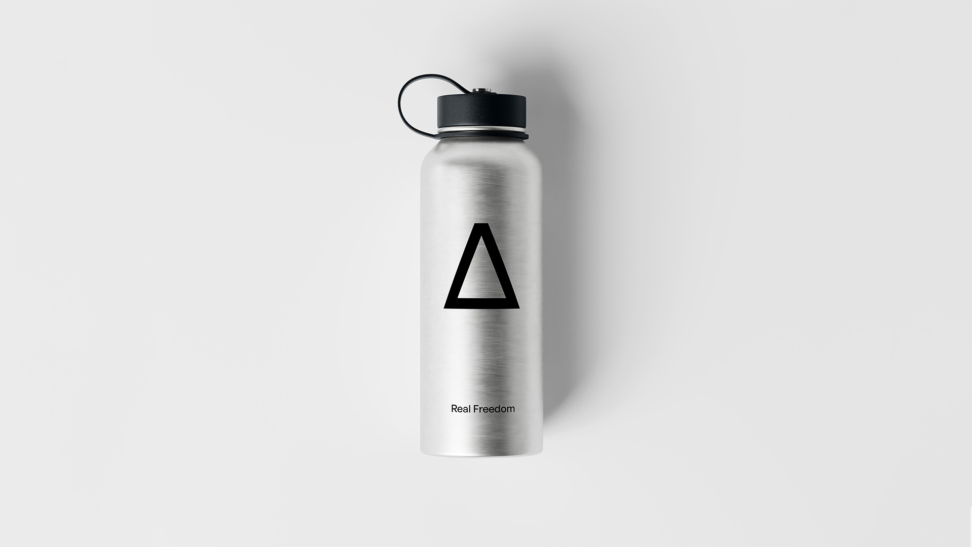
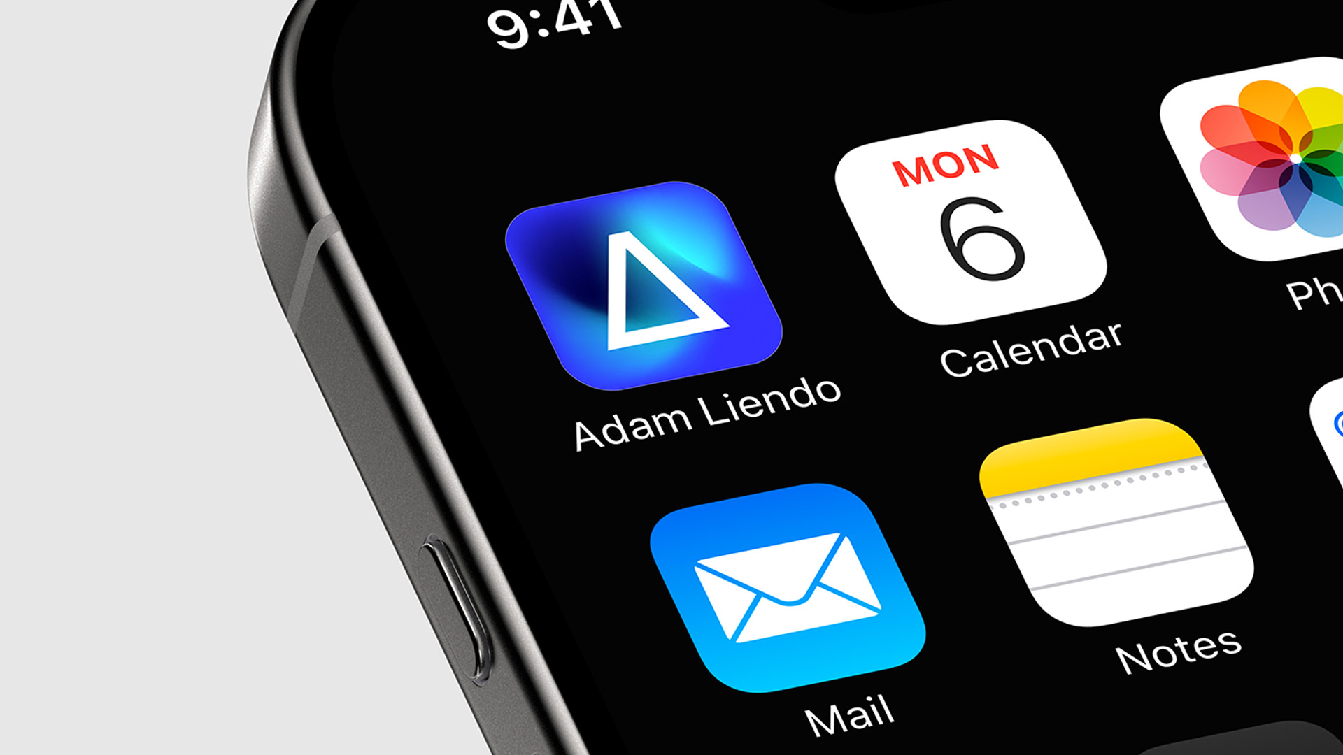
The brand breathes adventure, determination, and a vital impulse that transcends convention. One of its most powerful and defining features is the custom-designed typography — a visual code that not only communicates but becomes the symbolic identity of Adam. This integration of form and content, of message and design, transforms the logo into a signature — one of character and authenticity.
Real Freedom is more than a motto; it is a lifestyle expressed in every detail of the visual identity, brand narrative, and digital presence. The brand has been strategically designed to establish a strong position in the ‘outdoor lifestyle’ and mountain sports sphere, resonating with a community that thrives on nature, calculated risk, and the constant pursuit of personal excellence.
In a context where partnerships between individuals and brands are becoming ever more relevant, possessing a strong and differentiated personal brand is key to generating impact and trust. Companies are not only searching for technical talent — they seek ambassadors, storytellers, and community leaders. And that is where branding becomes a bridge: between experience and opportunity, between personal history and the strategic visibility of talent.
This brand does not merely identify Adam Liendo, it amplifies him. It positions him as a genuine reference in the outdoor world, while also establishing him as a strategic partner for brands seeking coherence, values, and real connection with an increasingly discerning audience.
In a saturated market of products, personal brands offer aspirational models of action. They become beacons for communities looking to stand out with legitimacy and build a legacy of high ethical impact.
This is branding with soul, purpose, and strategy.
Marca personal con alma, propósito y estrategia.
En el universo de los deportes de alto riesgo, donde la autenticidad no se construye, se vive, la marca personal se ha convertido en un activo estratégico incuestionable. Hoy más que nunca, quienes poseen un alto nivel de especialización, trayectoria y visión necesitan una identidad que no solo los represente, sino que los proyecte globalmente.
Adam Liendo | Real Freedom nace desde esta necesidad: comunicando desde el alma, conectando desde la verdad y posicionándose desde la diferencia.
En Brandlond®, hemos diseñado este nuevo proyecto de marca personal con una estrategia de branding sólida, diferencial y profundamente alineada con la esencia del individuo. Cada elemento ha sido cuidadosamente concebido para reflejar su espíritu: libre, inconformista y apasionado por los deportes de montaña.
La marca respira aventura, decisión y un impulso vital que trasciende lo convencional. Uno de los elementos más potentes y distintivos es la tipografía creada en exclusiva para la marca, que no solo comunica, sino que construye el símbolo identitario de Adam. Esta integración visual refleja la fusión entre forma y fondo, entre mensaje y diseño. No es solo un logotipo, es una firma visual de carácter y autenticidad.
Real Freedom es más que un leitmotiv, es un estilo de vida plasmado en cada detalle de su identidad visual, en su narrativa de marca y en su presencia digital. La marca ha sido concebida estratégicamente para posicionarse con fuerza en el ámbito del ‘outdoor lifestyle’ y los deportes de montaña, conectando con una comunidad que vibra con la naturaleza, el riesgo calculado y la búsqueda constante de superación personal.
En un contexto donde las alianzas entre personas y marcas son cada vez más relevantes, contar con una marca personal sólida y diferencial es clave para generar impacto y confianza. Las empresas no buscan únicamente talento técnico; buscan embajadores, narradores, líderes de comunidad. Y es ahí donde el branding se convierte en puente, entre la experiencia y la oportunidad, entre la historia personal y la visibilidad estratégica del talento.
Esta marca no solo identifica a Adam Liendo,lo amplifica. Lo posiciona como un referente genuino en el mundo ‘outdoor’, y al mismo tiempo como un partner estratégico para marcas que buscan coherencia, valores y conexión real con su cada vez más exigente audiencia.
En un mercado saturado de productos, las marcas personales nos ofrecen modelos de actuación aspiracionales. Se convierten en referentes para comunidades que desean diferenciarse con legitimidad y construir un legado de alto impacto ético.
Esto es branding con alma, propósito y estrategia.
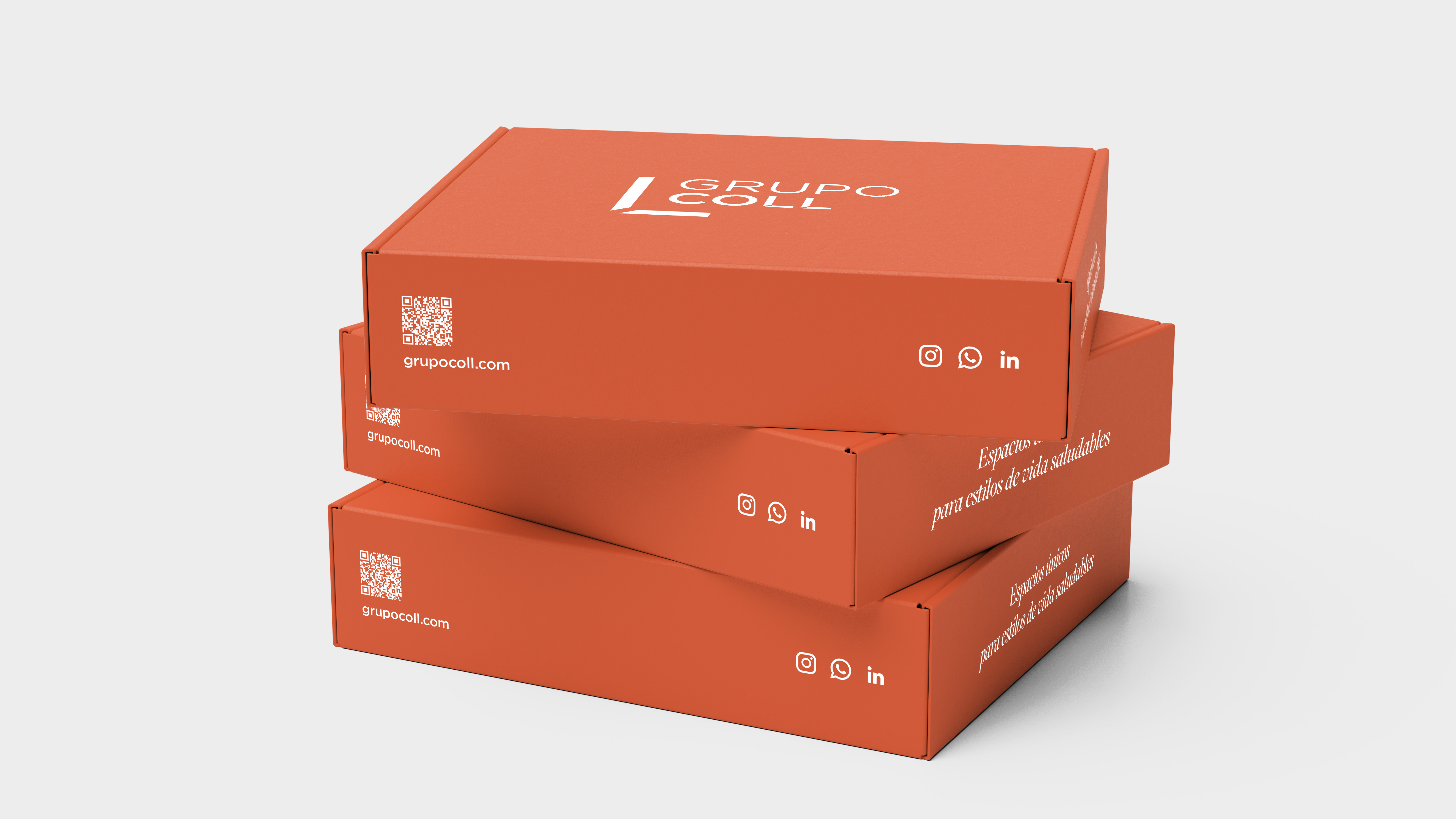
La familia Del Pozo, establecida en su compromiso de estar cerca de las personas y las comunidades, se enorgullece de presentar la nueva identidad de Grupo Coll, en colaboración con Brandcelona. Lanzamos a nivel global esta nueva propuesta que redefine el concepto y sector inmobiliario.
Este proyecto ha dado lugar a un nuevo símbolo gráfico, una arquitectura de marca innovadora y otros elementos de diseño que priorizan una nueva experiencia digital de usuario. Desde el diseño del símbolo corporativo, hasta la creación de un innovador universo de marca, cada cambio refleja su evolución hacia la experiencia omnicanal, sin perder la esencia de la empresa.
‘Espacios únicos para estilos de vida saludables.’ La nueva identidad de Grupo Coll, abarca sectores como retail, residencial, bienestar y hospitalidad. Este diseño facilita a los usuarios explorar las soluciones que ofrecemos a nivel global. Fernando del Pozo, Fundador y Presidente de Grupo Coll, destaca: «El nuevo universo gráfico y identidad corporativa se definen con sutileza, modernidad, exclusividad y pasión, manteniendo una claridad y atemporalidad que nos define».
Si quieres conocer más sobre este emocionante proyecto u otros, te invitamos a explorar nuestro sitio web.
Unique spaces for healthy lifestyles.
Del Pozo family, committed to being close to people and communities, is proud to present the new identity of Grupo Coll, in collaboration with Brandcelona. We are launching globally this new proposal, redefining the concept and real estate sector.
This project has resulted in a new graphic symbol, innovative brand architecture, and other design elements prioritising a new digital user experience. From graphic symbol design, to creating an innovative brand universe, each change reflects their evolution towards omnicahnnel experiences, without losing the company’s essence.
‘Unique spaces for healthy lifestyles.’ Grupo Coll’s new brand reaches sectors such as retail, residential, wellness and hospitality. This design enables users to explore the solutions we offer worldwide. Fernando del Pozo, Founder and President of Grupo Coll, emphasises: «The new graphic universe and corporate identity are defined with subtlety, modernity, exclusivity and passion, maintaining a clarity and timelessness, that defines us.»
If you want to learn more about this exciting project or others, we invite you to explore our website.
En brandcelona® Healthcare con el nuevo diseño de Farmacia Distrito 17 hemos redefinido la experiencia de compra en el sector retail de farmacia y hemos formalizado una novedosa experiencia de cliente ‘líquida’, reflejando en su carácter el espíritu de la ciudad.
El objetivo de diseño de nuestro branding era conectar con un nuevo estilo de vida urbano, fusionando el bienestar y la belleza contemporánea de una manera que resultara fresca, natural e inesperada. La marca y el espacio retail farmacéutico se han diseñado para cambiar percepciones y crear una narrativa visual donde Farmacia Distrito 17 pudiera conectar profundamente con su joven y vibrante comunidad, características de este barrio de Madrid.
El resultado es una cautivadora experiencia de branding. Los clientes rápidamente se sumergen en un espacio donde luces de neón, pantallas digitales y materiales en bruto se combinan perfectamente para crear una atmósfera atractiva, impactante y memorable. El diseño retail cuidado en todos los detalles y distintivo de la marca, maximiza el espacio sin comprometer el impacto de la experiencia de compra ni la calidad de los servicios ofrecidos.
Contenidos digitales incrustados en los los mostradores, referencias al patrimonio industrial local, hormigón en bruto y materiales naturales se combinan de manera exquisita para evocar un sentido de transgresión, emoción y cuidado.
La visión de Gerino García-Zabarte para su farmacia en el paisaje urbano de Madrid se refleja en esta nueva experiencia de marca, creando una experiencia de cliente orientada al futuro. La estrategia de comunicación utiliza la forma distintiva de la marca para reflejar el carácter único del barrio. El uso constante de esta identidad visual, tanto en el espacio físico como en la comunicación digital, guía a sus clientes a través de una experienciaholística de belleza urbana, bienestar y atención sanitaria.
Al diseñar el contenido digital de la farmacia desde su inicio, nos permite asegurar una comunicación flexible y visualmente dinámica en su comunicación, manteniendo el espacio de retail farmacéutico fresco, relevante y preparado de manera innovadora para los próximos retos corporativos.
An Urban Pharmacy.
At brandcelona® Healthcare, with the new design of Farmacia Distrito 17, we have redefined the retail pharmacy shopping experience and introduced an innovative ‘liquid’ customer experience, embodying the dynamic spirit of the city.
Our branding design objective was to connect with a new urban lifestyle, seamlessly blending wellness and contemporary beauty in a way that feels fresh, natural, and unexpected. The brand and retail space have been meticulously designed to shift perceptions and create a compelling visual narrative, allowing Farmacia Distrito 17 to deeply engage with its young and vibrant community; an essential characteristic of this Madrid neighbourhood.
The result is a captivating branding experience. Customers are immediately immersed in a space where neon lights, digital screens, and raw materials harmonise to create a striking, engaging, and memorable atmosphere. The carefully curated and distinctive retail design maximises space without compromising the impact of the shopping experience or the quality of services offered.
Embedded digital content, references to the local industrial heritage, raw concrete, and natural materials are exquisitely combined to evoke a sense of transgression, excitement, and care.
Gerino García-Zabarte’s vision for his pharmacy within Madrid’s urban landscape is brought to life through this new brand experience, creating a future-forward customer journey. The communication strategy leverages the brand’s distinctive shape to reflect the unique character of the neighbourhood. The cohesive use of this visual identity, across both the physical space and digital communication, guides customers through a holistic ecosystem of urban beauty, wellness, and healthcare.
By designing the pharmacy’s digital content from the outset, we have ensured a flexible and visually dynamic communication strategy, keeping the retail pharmacy space fresh, relevant, and prepared for future corporate challenges.
brandcelona® and brandlond® have a rich legacy of designing iconic brand narratives – shaping the elegance of leading branding and drawing inspiration from London’s timeless glamour in our designs. And so it continues with YELLOWERS, the newest tribute to our community and 20 years of design excellence from our inimitable team.
In close collaboration with our celebrated and influential global community, our Creative Team has envisioned a lifestyle-driven production, defining the narrative — one of discernment, poise, and quiet refinement.
Our workstyle has long been a canvas for storytelling through style, where branding is more than image — it is a language of power, intent, and persuasion. In YELLOWERS, the new stylish tribute to our community from our creative team led by our Founder & CEO Marc Guitart, this language is spoken with artful gratitude and precision. Set in a world of camaraderie and allegiances, our video unravels the story and workstyle of our team, an innovative creative force, deeply inspired by their roots in Barcelona and expansion into London. Amusing and atmospheric, the narrative is an exploration of loyalty and friendship.
The fusion of Spanish creativity and British style heritage at brandcelona® & brandlond® continue with YELLOWERS, where our workstyle becomes an extension of character and personality. Digital Brand Designer Christian Angel, celebrated for his ability to craft digital universes that define narrative and persona, worked in close collaboration with our acclaimed Strategic Brand Managers, Anna Albó and Júlia Gehrig, to create a ‘brandtastic’ visual story that speaks to the narrative’s restraint and control. The result is an aesthetic that is sophisticated, effortlessly stylish, and captivating.
For two decades, brandcelona® — and now brandlond® — have been at the forefront of branding innovation, shaping some of the most compelling identities for leading companies. In our designs, we curate trends that define the future of successful businesses with impeccable style. Our production in YELLOWERS reignites this principle, reinforcing the idea that in digital, as in life, true style is not simply seen—it is felt.
YELLOWERS launches worldwide on March 14th, an exclusive date for our inner circle, where you are invited to experience the convergence of creativity, design, and storytelling.
YELLOWERS! Veinte años de Branding y Estilo.
brandcelona® y brandlond® tienen una trayectoria incomparable en la creación de narrativas de marca icónicas — definiendo la elegancia del branding de alto nivel e inspirándonos en el glamour atemporal de Londres para dar forma a nuestros diseños. Ahora, con YELLOWERS, rendimos homenaje a nuestra comunidad y a 20 años de excelencia en el diseño.
En estrecha colaboración con nuestra influyente comunidad global, nuestro Equipo Creativo ha concebido una producción de estilo de vida, articulada en una narrativa de perspicacia, sofisticación y refinamiento.
Nuestro manera de trabajar ha sido siempre un lienzo para contar historias a través del estilo, donde el branding es mucho más que una imagen — es un lenguaje de poder, intención y persuasión. En YELLOWERS, el elegante tributo de nuestro equipo creativo, liderado por nuestro Fundador y CEO Marc Guitart, este lenguaje se expresa con arte, gratitud y precisión. Situado en un universo de camaradería y alianzas, nuestro video desvela la historia y la esencia de nuestro equipo: una fuerza creativa innovadora, profundamente enraizada en Barcelona y expandiéndose con determinación en Londres. Divertida y evocadora, la narrativa es una exploración de la lealtad y la amistad.
La fusión de la creatividad española con el legado estilístico británico sigue definiendo a brandcelona® & brandlond®, y YELLOWERS es la prueba de ello: un espacio donde nuestro estilo de trabajo se convierte en una extensión de nuestro carácter y personalidad. Nuestro Digital Brand Designer, Christian Angel, reconocido por su maestría en la creación de universos digitales que dan vida a la identidad de una marca, ha trabajado en estrecha colaboración con nuestras destacadas Strategic Brand Managers, Anna Albó y Júlia Gehrig, para crear una historia visual ‘brandtástica’ que refleja equilibrio y precisión narrativa. El resultado es una estética sofisticada, naturalmente elegante y cautivadora.
Durante dos décadas, brandcelona® — y ahora brandlond® — han liderado la innovación en branding, dando forma a algunas de las identidades más impactantes para empresas líderes. A través de nuestros diseños, curamos tendencias que definen el futuro de los negocios más exitosos con un estilo impecable. Nuestra producción en YELLOWERS reafirma este principio, recordándonos que, en el mundo digital, al igual que en la vida, el verdadero estilo no solo se ve — se siente.
YELLOWERS se lanza a nivel mundial el 14 de marzo, una fecha exclusiva para nuestro círculo más cercano. Te invitamos a ser parte de esta experiencia única, donde convergen creatividad, diseño y narrativa de marca.
At brandlond®, we believe that the best way to understand branding, customer experience, and retail excellence is to experience it firsthand. This philosophy was at the core of our third Retail Tour Experience in Chelsea, an exclusive event in collaboration with the Spanish Chamber of Commerce in the United Kingdom, designed to offer businesses valuable insights into the power of brand experiences in the UK market.
Retail is evolving rapidly, and brands that prioritise storytelling, sensorial retail, and immersive experiences stand out in today’s competitive landscape. Our Retail Tour Experience provided participants with key insights into brand differentiation, understanding how top brands create meaningful customer journeys that go beyond just selling products. We explored how brands build emotional connections through consumer engagement strategies and examined retail innovation through cutting-edge store designs, brand activations, and digital integrations. This experience also provided international brands with a strategic perspective on competitive positioning in the UK market.
For this third edition, we immersed ourselves in Chelsea, one of London’s most dynamic neighbourhoods for luxury, wellness, beauty, healthcare, and food & beverage. The tour was carefully curated to showcase how iconic brands design unforgettable retail experiences and establish strong emotional connections. The journey began at the iconic Harrods, where we explored its latest store refurbishments, luxury retail concepts, and exclusive pop-up activations. We then visited select flagship stores and boutiques in Knightsbridge and Chelsea, showcasing the art of brand storytelling, experiential retail, and innovation in service design. The experience concluded at the spectacular Battersea Power Station, one of London’s newest and most exciting retail destinations. This historic location, seamlessly blending heritage with modern retail, provided fascinating insights into how brands adapt to unique spaces while delivering cutting-edge experiences.
To wrap up the tour, we gathered at Brindisa, where our guests enjoyed light refreshments and engaged in insightful discussions on retail trends, brand positioning, and consumer behaviour. To maximise the impact of this immersive knowledge experience, we provided personalised brand consultancies to the participating companies, offering tailored insights drawn from our extensive expertise as brand consultants and university academics.
III LONDON RETAIL TOUR EXPERIENCE. CHELSEA. SPANISH CHAMBER OF COMMERCE IN THE UK.
En brandlond®, creemos que la mejor manera de comprender el branding, la experiencia del cliente y la excelencia en el sector retail es vivirlo de primera mano. Esta filosofía fue el eje central de nuestro tercer Retail Tour Experience en Chelsea, un evento exclusivo en colaboración con la Spanish Chamber of Commerce in the United Kingdom, diseñado para ofrecer a las empresas valiosos conocimientos sobre el poder de las experiencias de marca en el mercado británico.
El sector retail está evolucionando rápidamente, y las marcas que priorizan el ‘storytelling’, el ‘retail’ sensorial y las experiencias inmersivas destacan en el competitivo panorama actual. Nuestro Retail Tour Experience brindó a los participantes conocimientos clave sobre la diferenciación de marca, permitiéndoles comprender cómo las principales marcas crean viajes emocionales para sus clientes, que van mucho más allá de la simple venta de productos. Exploramos cómo las marcas generan conexiones emocionales a través de estrategias de ‘engagement’ con el consumidor y analizamos la innovación en retail a través de diseños de tiendas vanguardistas, activaciones de marca e integraciones digitales. Esta experiencia también ofreció a las marcas internacionales una perspectiva estratégica sobre el posicionamiento competitivo en el mercado británico.
En esta tercera edición, nos sumergimos en Chelsea, uno de los barrios más dinámicos de Londres en los sectores del lujo, bienestar, belleza, salud y alimentación & bebidas. El recorrido fue cuidadosamente diseñado para mostrar cómo las marcas icónicas crean experiencias de compra inolvidables y establecen conexiones emocionales sólidas. La experiencia comenzó en el icónico Harrods, donde exploramos sus últimas renovaciones, conceptos de lujo y exclusivas activaciones ‘pop-up’. Posteriormente, visitamos selectas ‘flagships’ y boutiques en Knightsbridge y Chelsea, destacando el arte del ‘storytelling’ de marca, el retail experiencial y la innovación en el diseño de servicios. La jornada concluyó en Battersea Power Station, uno de los destinos comerciales más nuevos y emocionantes de Londres. Este emblemático espacio, que combina la historia con el ‘retail’ moderno, ofreció una visión fascinante de cómo las marcas se adaptan a entornos únicos mientras brindan experiencias de vanguardia.
Para cerrar el tour, nos reunimos en Brindisa, donde nuestros invitados disfrutaron de un refrigerio y participaron en enriquecedoras conversaciones sobre tendencias en ‘retail’, posicionamiento de marca y comportamiento del consumidor. Para maximizar el impacto de esta experiencia de conocimiento, ofrecimos consultorías personalizadas a las empresas participantes, proporcionando información estratégica basada en nuestra amplia experiencia como consultores de marca y académicos universitarios.
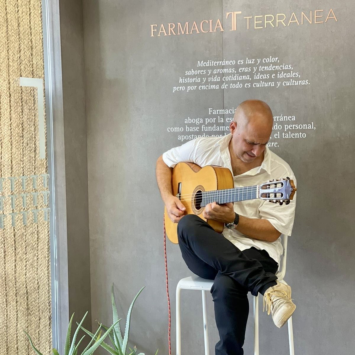
Farmacia Terranea, el Alma de la Comunidad Slow Care.
Farmacia Terranea es un espacio sensorial, diseñado por Brandcelona Healthcare, que nos transmite la energía de un mercado mediterráneo, que nos hace sentir conectados y vivos más allá de un simple punto de venta de farmacia; es el pulso vibrante que mantiene una comunidad global en movimiento.
Su marca es la esencia misma de su carácter Slow Care, es el puente que conecta sus productos y servicios con su comunidad, y el factor clave que define su éxito y diferenciado posicionamiento a largo plazo. Comprender la importancia de la marca es fundamental para cualquier proyecto de retail farmacia que aspire a prosperar, diferenciarse y destacar en su sector.
Los proyectos de retail desarrollados por Brandcelona Healthcare son auténticas manifestaciones de visión, estrategia e implementación, materializadas en una colaboración creativa de su propósito. Nuestro objetivo es diseñar experiencias de marca tangibles, inolvidables y referentes.
Creemos en diseñar marcas y experiencias de marca para nuestros clientes con un sentido profundo de conexión, orgullo y pertenencia. Esto no solo fortalece la lealtad de sus usuarios, sino que también fomenta una comunidad global alrededor de su marca. Nuestros diseños se convierten en un punto de referencia, un lugar donde los usuarios no solo compran productos, sino que también desarrollan un fuerte vínculo emocional y cultural con la marca.
Nuestra larga colaboración con Farmacia Terranea, nos ha permitido convertir su retail de farmacia en algo más que un espacio de venta; es una gran experiencia de estilo de vida. En nuestros exclusivos diseños de branding desarrollamos una oportunidad para diseñar marcas con una historia de éxito, innovación y conexiones significativas.
Desarrollar un buen branding en el sector farmacéutico, transforma tu espacio en el alma de una comunidad, donde las necesidades del farmacéutico encuentran soluciones, sus esfuerzos laborales encuentran recompensas y sus interacciones diarias encuentran significado a través de su experiencia de marca. Farmacia Terranea es toda una experiencia de comunidad, que nos permite participar de su espíritu de cuidado y de su estilo de vida Slow Care. ¡Disfruta de esta experiencia de marca Slow Care!
Terranea Pharmacy, the Soul of the Slow Care Community.
Farmacia Terranea is a sensory space designed by Brandcelona Healthcare, inspired by the vibrant energy of a Mediterranean market. It goes far beyond being just a pharmacy retail point; it is the dynamic pulse that connects and breathes life into a global community in constant motion.
Its brand embodies the very essence of its Slow Care philosophy. It serves as the bridge that unites its products and services with its community, acting as the key factor behind its success and its distinctive long-term positioning. Understanding the importance of branding is essential for any pharmacy retail project that aspires to thrive, stand out, and lead in its sector.
The retail projects developed by Brandcelona Healthcare are authentic manifestations of vision, strategy, and implementation, materialized through creative collaboration aligned with the brand’s purpose. Our goal is to design tangible, memorable, and benchmark brand experiences.
We believe in creating brands and brand experiences with a profound sense of connection, pride, and belonging. This approach not only strengthens user loyalty but also fosters a global community around the brand. Our designs are not just commercial spaces—they become reference points where users develop an emotional and cultural bond with the brand.
Our long-standing collaboration with Farmacia Terranea has allowed us to transform its pharmacy retail space into much more than a place for transactions; it has become a lifestyle experience. Through our exclusive branding designs, we have built a story of success founded on innovation and meaningful connections.
Effective branding in the pharmaceutical sector transforms your space into the heart of a community—a place where pharmacists’ needs find solutions, their efforts find rewards, and their daily interactions find meaning through the brand experience. Farmacia Terranea is far more than a pharmacy, it is a community experience that invites us to embrace its spirit of care and its Slow Care lifestyle philosophy. Discover and enjoy this unique Slow Care brand experience!
Lo que se hace con amor, lleva el cobijo y el calor de su lugar de su origen.
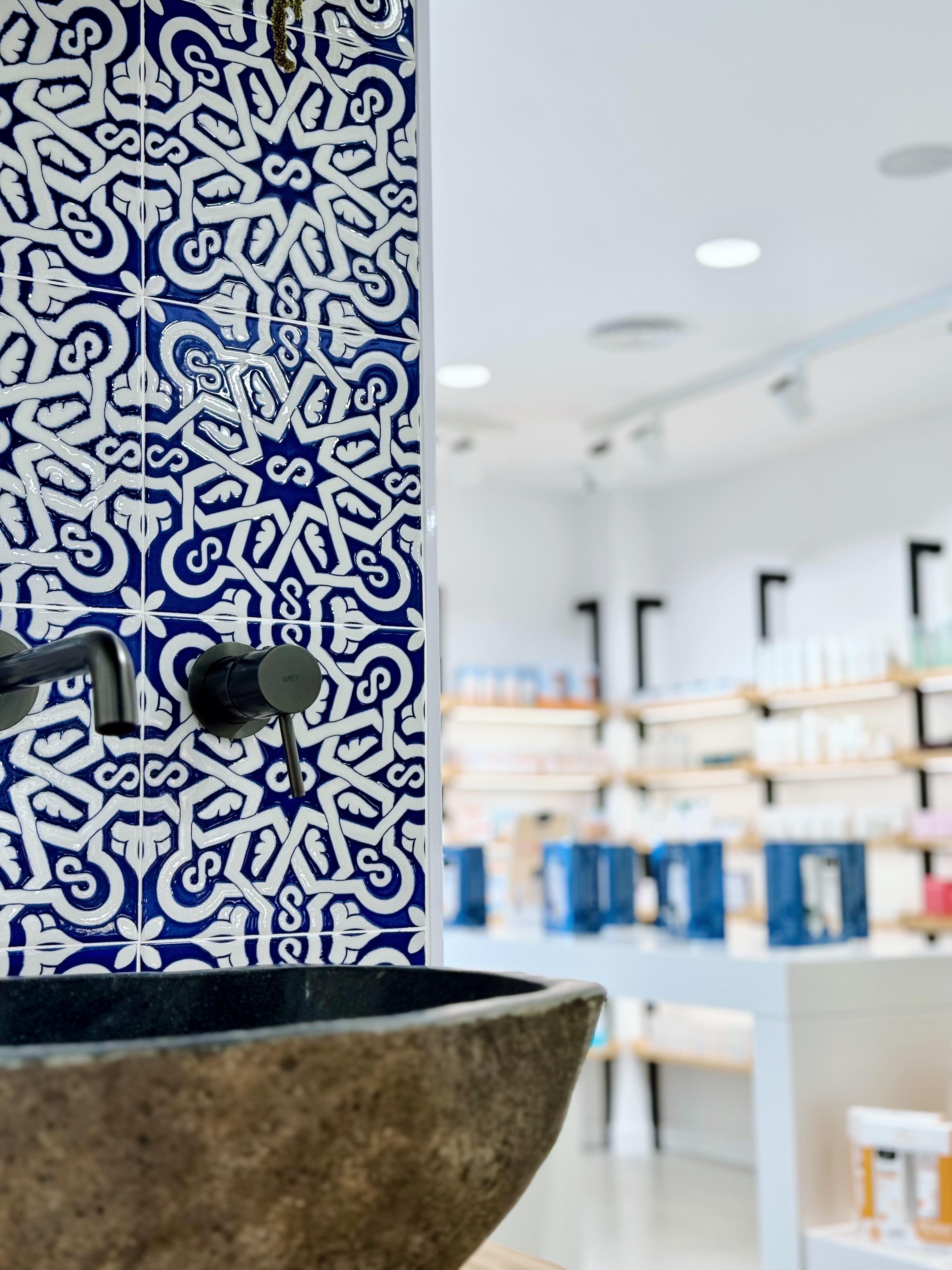
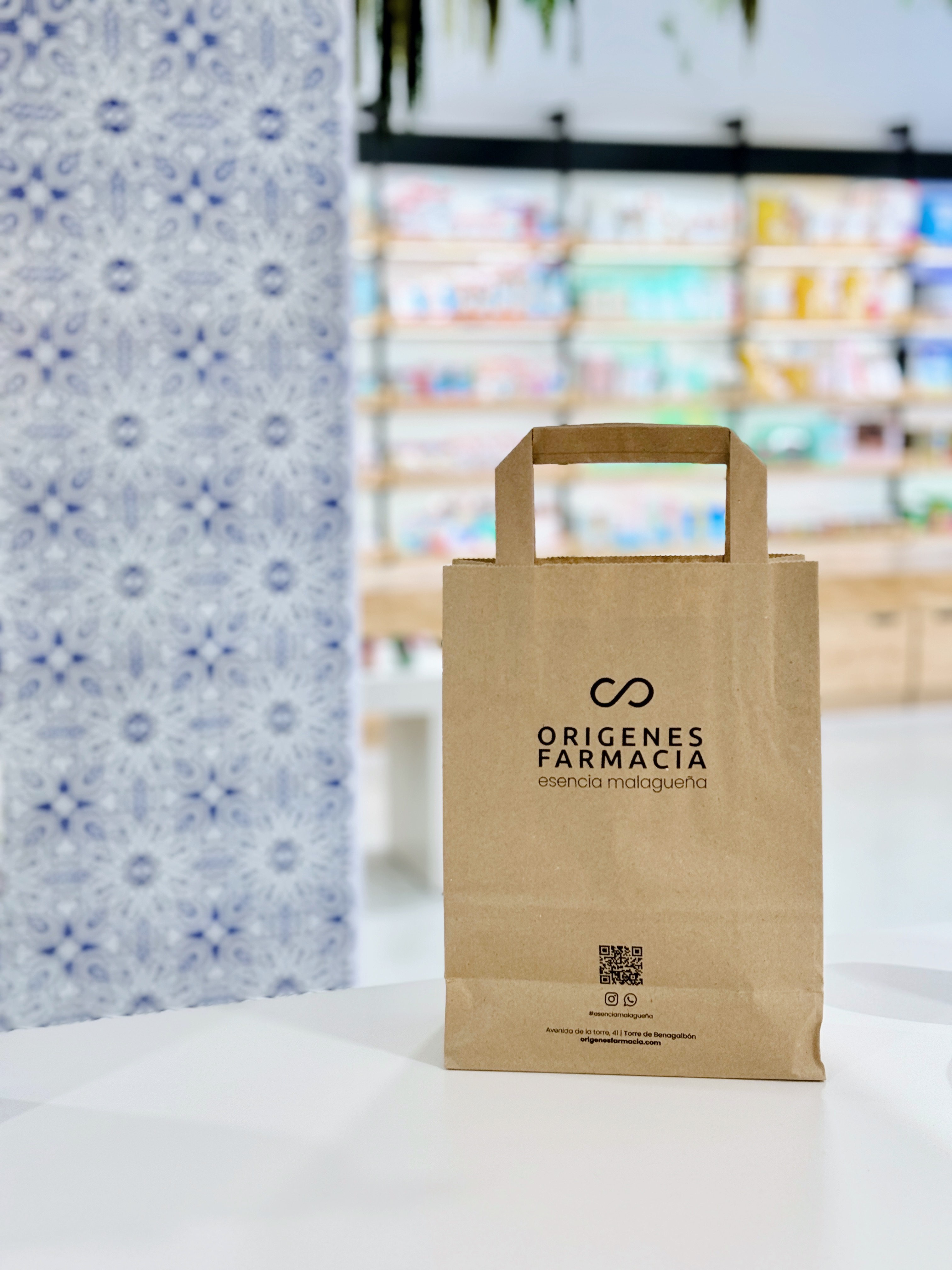
En branding, cada punto de contacto importa, y la primera impresión cuenta. Crear una identidad de marca que resuene profundamente tanto con la comunidad local como con los visitantes es un arte delicado. En Brandcelona Healthcare, hemos tenido el privilegio de diseñar proyectos y narrativas de marca increíbles, pero aquellos que realmente destacan como un verdadero testamento al poder del branding son los que están profundamente enraizados en su comunidad y orígenes. Es por eso que ‘Orígenes’ es una experiencia de diseño de marca farmacia que va más allá de los productos y transforma la idea misma de lo que una farmacia y su retail debería ser.
En el corazón de ‘Orígenes’ está la rica identidad cultural de Málaga, y todo comenzó con el icónico rediseño de “el azulejo malagueño”. Estos azulejos, conocidos por sus intrincados patrones, colores vibrantes y su historia centenaria, son una piedra angular del paisaje arquitectónico de Málaga. Y, de muchas maneras, cuentan la historia de la ciudad: una mezcla de tradición y modernidad, lo viejo y lo nuevo, todo tejido en una sola narrativa visual.
En nuestro detallado proceso de diseño, reimaginamos la tradición, y el desafío era claro para nuestro equipo creativo: ¿Cómo honrar la esencia de Málaga mientras creamos algo completamente nuevo e innovador? El resultado estuvo incrustado en el mismo tejido del patrimonio de la ciudad, “el azulejo malagueño”. Al personalizar este tradicional elemento arquitectónico a través de un diseño de marca distintivo, pudimos crear un puente entre el pasado y el presente, entre la cultura local y las experiencias de farmacia contemporáneas.
Este nuevo azulejo se convirtió en la base sobre la cual construimos ‘Orígenes’. Las intrincadas geometrías del patrón de los azulejos no fueron simplemente elementos decorativos, sino una invitación a una historia más profunda de conocimiento, servicio y experiencia sanitaria. Cada azulejo fue reimaginado, reinterpretado y reestructurado, transformándose en un lenguaje visual que hablaba no solo de la ciudad, sino de un estilo de vida. “Esencia Malagueña”, la esencia de Málaga.
A través del poder de nuestro branding, el azulejo se convirtió en algo más que una pieza ornamental. Se convirtió en el corazón del diseño de ‘Orígenes’, marcando el tono para una experiencia de retail inmersiva e inolvidable. Al entrelazar la elegancia geométrica del azulejo en el centro del espacio retail, comenzamos a contar una historia de raíces, conocimiento, cultura y, lo más importante, de comunidad, alineada completamente con la visión, los valores y la tradición de la familia Pineda.
Crear una experiencia de marca nunca se trata solo de la apariencia. Se trata de cómo la marca te hace sentir. Se trata de cómo eleva lo mundano y transforma una visita ordinaria en un rico viaje sensorial. ‘Orígenes’ es un teatro, donde cada detalle, desde las superficies de madera hasta el diseño del layout, cuenta una historia genuina. El diseño de la marca fomenta la exploración, invita a la interacción y evoca un profundo sentido de conexión con el alma cultural de la ciudad.
Integramos principios de diseño inmersivo en todo el espacio de la farmacia. El uso de azulejos dinámicos crea un viaje fluido que guía a los clientes a través del espacio, llevándolos a diferentes experiencias, como una narrativa que se va desarrollando. Los colores, las texturas, los patrones, todo sirve para crear una experiencia multisensorial que es tanto acogedora como moderna.
El diseño del espacio retail fue conceptualizado desde el principio, como una experiencia de marca donde los clientes se sienten envueltos en el calor de Málaga, como si hubieran entrado en un espacio que honra sus raíces. Cada detalle ha sido creado con un profundo respeto por el espíritu local y los valores de la familia Pineda, y esto es lo que lo hace realmente especial.
Si bien el “azulejo malagueño” es el motivo central del diseño, nuestro enfoque hacia la personalización y el diseño a medida asegura que cada pieza de la marca, desde su logotipo hasta su packaging, cuente una historia única y coherente. Este es el poder de la personalización, ser único, referente y memorable. En un sector donde muchas farmacias ofrecen soluciones y diseños estándar. La tipografía personalizada, los materiales cuidadosamente elegidos y el diseño del layout aseguran que ‘Orígenes’ no sea solo un lugar, sino una marca viva que se adapta y resuena con cada cliente.
‘Orígenes’ es un nuevo diseño de marca y retail de farmacia, donde los usuarios no solo recogen sus recetas, sino que experimentan una conexión profunda y un orgullo por su herencia. ‘Orígenes’ encarna la noción de que «la localidad no es solo geografía»; se trata de crear un vínculo emocional entre el espacio y su comunidad, tanto local como global. Los farmacéuticos no solo están en el negocio de la salud, están en el negocio de las personas, de las comunidades y de las experiencias. Al abrazar las soluciones de branding de Brandcelona, hablan al corazón de su cultura local, ofreciendo mucho más que un lugar para comprar productos, están ofreciendo una historia de marca, un viaje y un sentido de pertenencia.
En el panorama competitivo actual, destacar significa trascender lo típico. Significa abrazar la innovación mientras se honra la tradición, creando un espacio retail que se convierte en algo más que un espacio, un “destino de estilo de vida”. La farmacia ‘Orígenes’ es una prueba de que una experiencia de marca bien ejecutada puede elevar tu negocio, fortalecer la lealtad de los clientes y mejorar tu posición como pilar en la comunidad.
Estamos muy orgullosos de que la familia Pineda, al buscar elevar su marca y diseño de retail, confiara en nosotros para diseñar una narrativa de marca que encarna sus valores, conecta con sus clientes y celebra la esencia de su comunidad. ‘Orígenes’ es un ejemplo vivo de cómo podemos diseñar experiencias de marca increíbles de las que la gente se enamorará. ¡Felicitaciones Laura, Raquel y Eduardo!
What is done with love carries the shelter and warmth of its place of origin.
In branding, every touchpoint matters, and first impressions count. Creating a brand identity that resonates deeply with both the local community and visitors is a delicate art. At Brandcelona Healthcare, we have had the privilege of designing incredible projects and brand narratives, but the ones that stand out as true testaments to the power of branding are those deeply rooted in their community and origins. That’s why ‘Orígenes’ is a branding experience design pharmacy that goes beyond products and transforms the very idea of what a retail pharmacy should be.
At the heart of ‘Orígenes’ is Málaga’s rich cultural identity, and it all began with the iconic ‘Malagueñan tile’ redesign. These tiles, known for their intricate patterns, vibrant colours, and centuries-old history, are a cornerstone of Málaga’s architectural landscape. And in many ways, they tell the story of the city: a blend of tradition and modernity, the old and the new, all woven together in a single visual narrative.
In our detailed design process, we reimagined tradition, and the challenge was clear for our creative team: How can we honor Málaga’s essence while creating something entirely new and innovative? The result was embedded in the very fabric of the city’s heritage, the ‘Malagueñan tile’. By personalising this traditional architectural element through a distinctive branding design, we could create a bridge between past and present, local culture and contemporary pharmacy experiences.
This new tile became the foundation upon which we built ‘Orígenes’. The intricate geometries of the tile pattern were not merely decorative elements, but an invitation into a deeper story of knowledge, service, and healthcare experience. Each tile was reimagined, reinterpreted, and restructured, transforming into a visual language that spoke not only of the city but of a lifestyle. “Esencia Malagueña”, the essence of Málaga.
Through the power of our branding, the tile became more than just an ornamental piece. It became the heartbeat of ‘Orígenes’ design, setting the tone for an unforgettable, immersive retail experience. By weaving the tile’s geometric elegance into the centre of the retail space, we began to tell a story of roots, knowledge, culture, and most importantly, of community, perfectly aligned with the vision, values, and tradition of the Pineda family.
Creating a brand experience is never just about looks. It’s about the way the brand makes you feel. It’s about how it elevates the mundane and transforms an ordinary visit into a rich, sensory journey. ‘Orígenes’ is a theatre, where every detail, from wood surfaces to layout design, tells a genuine story. The brand design encourages exploration, invites interaction, and evokes a deep sense of connection to the city’s cultural soul.
We integrated immersive design principles throughout the pharmacy space. The use of dynamic tiles creates a seamless journey that guides customers through the space, drawing them into different experiences, much like an unfolding narrative. The colours, the textures, the patterns, everything serves to create a multi-sensory experience that’s both cozy and forward-thinking.
The retail space design was conceptualised from the beginning, as a brand experience where customers feel enveloped in the warmth of Málaga, as if they have stepped into a space that honours their roots. Every detail has been crafted with a deep respect for the local spirit and the Pineda family’s values, and this is what makes it truly special.
While the ‘Malagueñan tile’ is the central design motif, our approach to personalisation and bespoke design ensures that every piece of the brand, from its logo to its packaging, tells a unique and coherent story. This is the power of personalisation, to be unique, referent, and memorable. Especially in a sector where many pharmacies offer standard solutions and layouts. Custom typography, carefully chosen materials, and thoughtful layout ensure that ‘Orígenes’ is not just a place but a living brand that adapts and resonates with each customer.
‘Orígenes’ is a new branding and retail pharmacy design, where users don’t just pick up their prescriptions, they experience a sense of connection and pride in their heritage. ‘Orígenes’ embodies the notion that “locality is not just about geography”; it’s about creating an emotional link between the space and its community, both locally and globally. Pharmacists are not just in the business of health; they are in the business of people, of communities, and of experiences. By embracing Brandcelona’s branding solutions, they speak to the heart of their local culture, offering much more than a place to buy products, they are offering a brand story, a journey, and a sense of belonging.
In today’s competitive landscape, standing out means transcending the typical. It means embracing innovation while honouring tradition, creating a retail space that becomes more than just a space but a “lifestyle destination”. The ‘Orígenes’ pharmacy is proof that a well-executed brand experience can elevate your business, strengthen customer loyalty, and enhance your position as a pillar in the community.
We are very proud that the Pineda family, looking to elevate their brand and retail design, trusted us to craft a brand narrative that embodies their values, connects with their customers, and celebrates the essence of their community. ‘Orígenes’ is a living example of how we can design amazing brand experiences that people will fall in love with. Congratulations Laura, Raquel, and Eduardo!
Comunicar nuestros valores de forma clara y auténtica, aportando un significado a nuestra comunidad con una marca personal, cada vez cobra más importancia en el mundo profesional.
Una marca sólida nos permite definir, construir, activar y medir nuestro propio impacto. Es una inversión a largo plazo que requiere una visión y objetivos claros. Una marca personal es el resultado de la extensión de nuestros valores y nuestra misión.
Las marcas personales no son solo un activo reputacional, sino también un activo financiero, tanto para el propio profesional como para su empresa. Es decir, tener una marca bien definida y gestionada no solo mejora nuestra imagen y reputación, sino que también puede generar oportunidades económicas, atraer nuevas oportunidades laborales, clientes, colaboraciones y proyectos.
Una marca personal se estructura en tres fases: el Porqué, el Cómo y el Qué.
El Porqué lo traducimos al autoconocimiento. Conocer nuestra necesidad e intención, definir qué queremos y quiénes somos. Esta es la base de cualquier marca personal sólida.
En segundo lugar, el Cómo. Se trata de comunicar de manera coherente, honesta y consistente, y demostrar cómo nuestras estrategias creativas impactan positivamente en nuestras organizaciones.
Para finalizar, la fase del Qué, o de las ventas. Aquí aparecerá el resultado de nuestras acciones, lo que ofrecemos al mundo. Para nosotros, una marca personal auténtica es aquella que conecta con la gente y añade valor a nuestras comunidades.
En el mundo empresarial, cada vez se reconoce más la importancia de construir una marca personal en los medios de comunicación, como en las redes sociales. Esto no solo potencia la imagen, sino que también refuerza el relato y los valores que queremos representar. Comenzar un negocio con una identidad de marca clara y con propósito es clave.
Para nosotros, la marca personal no es solo una estrategia; es una expresión de quiénes somos y lo que representamos. Una marca no solo define cómo las personas ven el negocio, sino que también moldea sus percepciones y construye un camino sólido para el éxito a largo plazo. Mantener la marca fiel a sí misma y a sus valores, consciente y orgánica, es la clave para que todo lo demás siga su curso.
Creamos marcas personales con carácter y propósito. Si quieres saber más sobre nuestros proyectos, síguenos en nuestras redes sociales o visita nuestra página web.
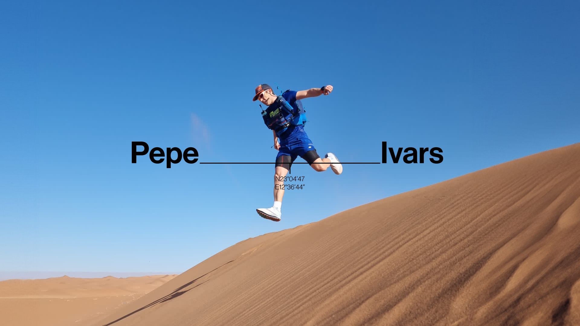
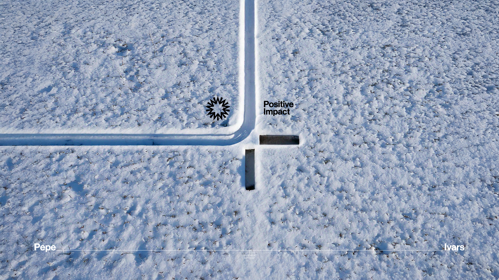
Discover the new personal brand of adventurer and explorer Pepe Ivars, renowned for his commitment to raising awareness about the impact of climate change. A key highlight in the coming year is his debut on digital platforms with the documentary ‘Life’s Ice’, building on a distinguished career marked by notable achievements and purposeful adventures. He serves as a Trustee of the British Spanish Society and is a Fellow of the Royal Geographical Society.
At Brandlond, we were deeply inspired by the brave and visionary adventurer Pepe Ivars. Designing his personal brand as a powerful message of environmental consciousness, resilience, and sustainability was an exciting challenge for our creative team in London.
Our personal branding design helps Pepe Ivars reach new audiences eager to connect with experts they trust and admire. These audiences value the expertise and insights that visible leaders like Pepe Ivars—alongside notable figures such as adventurer Albert Bosch, cyclist David Espallargas, and documentary director Miguel Angel Tobias—bring to their pursuits. Strong personal brands not only captivate larger audiences but also elevate awareness for meaningful causes, as seen with Pepe’s unwavering environmental advocacy.
A well-crafted personal brand also opens doors to valuable partnerships with leading organisations, including Shackleton,Suunto, and others, while generating greater media visibility. Experts with strong personal brands bring added value to their firms, as their reputation often enhances the organisations they represent. This relationship can have a significant impact on a company’s branding and business development efforts, amplifying their reach and influence.
For Pepe Ivars, our design team designed a cohesive suite of graphic solutions that embody his vitality, energy, and environmental consciousness. From the graphic identity and tone of voice to the minimalist black-and-white colour palette—optimised for digital platforms to reduce energy consumption—every element was meticulously designed to reflect his deep core values. These include a profound connection to nature, a commitment to sustainability, and a drive to foster environmental awareness for future generations.
Throughout history, explorers have pushed the boundaries of adventure and discovery, leaving an indelible legacy. Their courage, perseverance, and vision have expanded our horizons, unveiled new cultures and natural wonders, and inspired humanity to transcend its limits. Their fearless quests challenge us to look beyond what we know and embrace exploration in all its forms.
Let us draw inspiration from Pepe Ivars and his team of explorers and adventurers as we seek new environmental adventures. Their stories compel us to confront societal challenges and discover both the world around us and ourselves in the process, just as we did at Brandlond while undertaking this transformative personal branding project.
Convirtiendo un Estilo de Vida en una Marca.
Descubre la nueva marca personal del aventurero y explorador Pepe Ivars, reconocido por su compromiso con la concienciación sobre el impacto del cambio climático. Un hito clave para el próximo año es su debut en plataformas digitales con el documental ‘Life’s Ice’, que se suma a una distinguida trayectoria marcada por logros notables y aventuras con propósito. Además, Pepe es Patrono de la British Spanish Society y Miembro de la Royal Geographical Society.
En Brandlond, nos sentimos profundamente inspirados por el valiente y visionario aventurero Pepe Ivars. Diseñar su marca personal como un poderoso mensaje de conciencia ambiental, resiliencia y sostenibilidad fue un desafío emocionante para nuestro equipo creativo en Londres.
Nuestro diseño de marca personal ayuda a Pepe Ivars a llegar a nuevas audiencias que buscan conectar con expertos en quienes confían y admiran. Estas audiencias valoran el conocimiento y las perspectivas que líderes visibles como Pepe Ivars—junto con figuras destacadas como el aventurero Albert Bosch, el ciclista David Espallargas y el director de documentales Miguel Ángel Tobías—aportan a sus áreas de interés. Las marcas personales sólidas no solo cautivan a un público más amplio, sino que también elevan la concienciación sobre causas significativas, como se demuestra en la constante defensa ambiental de Pepe.
Una marca personal bien diseñada también abre puertas a valiosas colaboraciones con organizaciones líderes como Shackleton,Suunto y otras, al tiempo que genera mayor visibilidad mediática. Los expertos con marcas personales fuertes aportan un valor añadido a las empresas que representan, ya que su reputación a menudo mejora la de estas organizaciones. Esta relación puede tener un impacto significativo en los esfuerzos de branding y desarrollo empresarial de las compañías, ampliando su alcance e influencia.
Para Pepe Ivars, nuestro equipo de diseño creó un conjunto cohesivo de soluciones gráficas que reflejan su vitalidad, energía y conciencia ambiental. Desde la identidad gráfica y el tono de voz hasta la paleta de colores minimalista en blanco y negro—optimizada para plataformas digitales con el fin de reducir el consumo energético—cada elemento fue diseñado meticulosamente para reflejar sus profundos valores fundamentales. Estos incluyen una conexión profunda con la naturaleza, un compromiso con la sostenibilidad y un impulso para fomentar la conciencia ambiental en las generaciones futuras.
A lo largo de la historia, los exploradores han desafiado los límites de la aventura y el descubrimiento, dejando un legado imborrable. Su valentía, perseverancia y visión han ampliado nuestros horizontes, revelado nuevas culturas y maravillas naturales, e inspirado a la humanidad a trascender sus límites. Sus búsquedas audaces nos desafían a mirar más allá de lo que conocemos y a abrazar la exploración en todas sus formas.
Inspiremos nuestra visión en Pepe Ivars y su equipo de exploradores y aventureros mientras emprendemos nuevas aventuras medioambientales. Sus historias nos impulsan a enfrentar los desafíos sociales y a descubrir tanto el mundo que nos rodea como a nosotros mismos en el proceso, tal como hicimos en Brandlond al embarcarnos en este transformador proyecto de marca personal.