The highest taste.
At brandlond®, we partnered with Cooperativa San Isidro Labrador’s farmers to create a brand strategy and design that matches their mission to always provide the best that mountains in Sierra de Gredos in Spain has to offer. Pedro Bernardo is reconnecting to nature and its discerning consumers, with a thoughtful, stand-out design delivering the most exquisite standards in oil and figs. From their stunning liquid gold to their caring ethos, Pedro Bernardo is the highest taste.
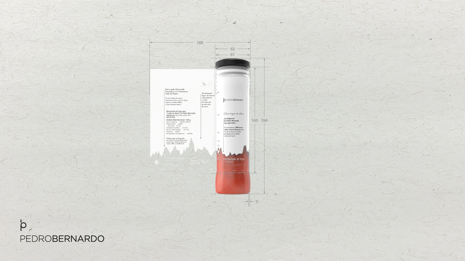
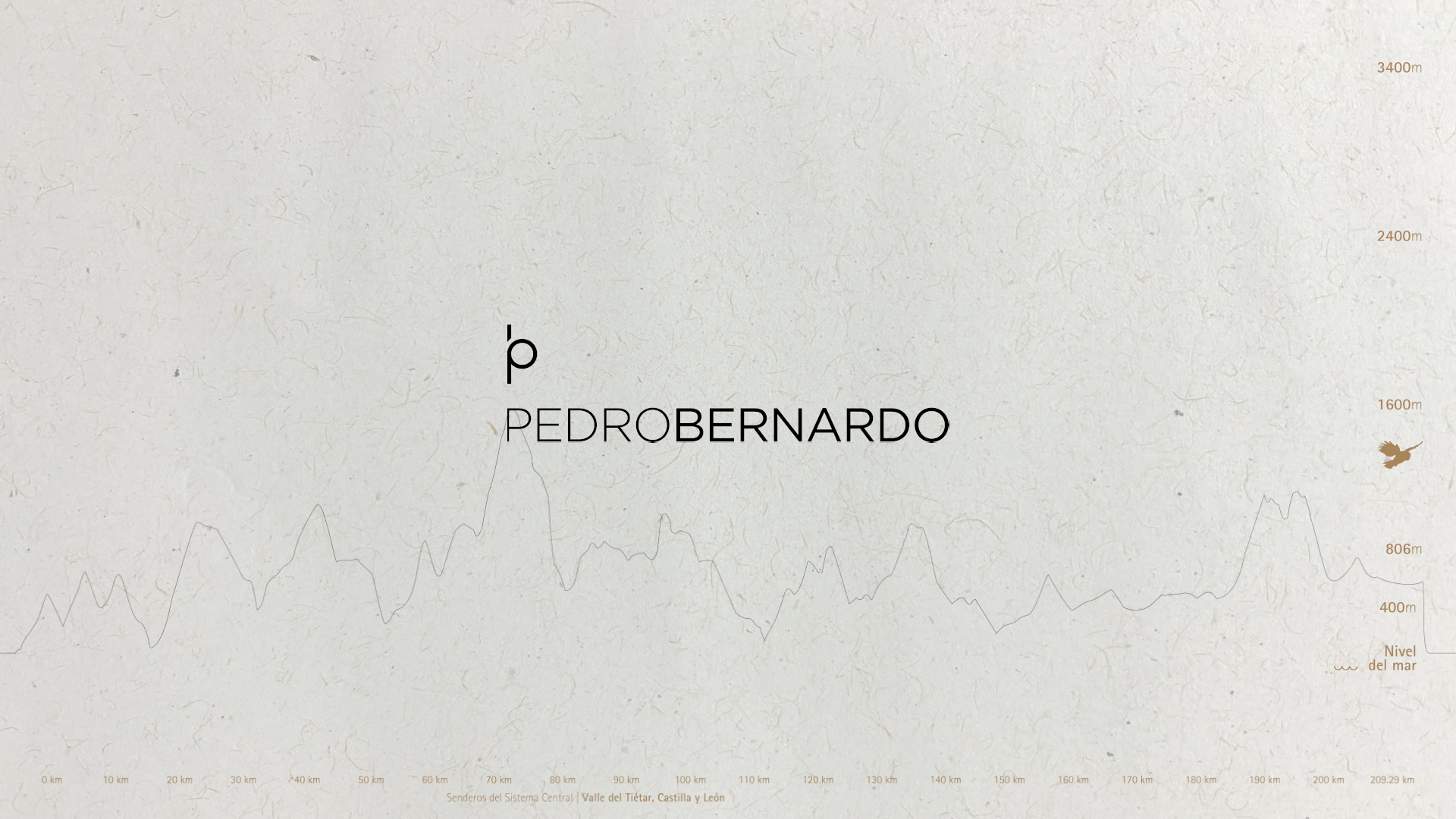
The new branding and packaging design in the whole new lines of product is an immediate commitment to doing things elegantly and choicefully. We created a graphic system from the Sierra de Gredos mountain’s skyline that is introduced on the base of the packs and carried through on the side and back panels to celebrate the natural scale and recognisable shape of the mountains. When the products are displayed on-shelf, the pattern creates a landscape-like appearance.
The brand’s monogram is inspired by the name of the village symbol and the golden ratio, which suggests that the brilliance and infinite detail that naturally occurs in nature is the ideal standard for beauty. Accented in black and white, the monogram, the brand narrative, the different applied distinctive messages and the engravings on the packaging are evocative of the artisanal approach to harvesting olives and figs through the packaging design. The simple color palette and recognisable graphic details allow the design to go beyond the surface and reveal the true color and texture of the product through the packaging itself.
brandlond® Food and Beverages designs successful brands for businesses through innovative strategic branding tools and its own registered project methodology. For more information, get in touch with us.

Un sabor de altura.
En brandlond@ nos asociamos con los agricultores de la Cooperativa San Isidro Labrador para crear una estrategia y un diseño de marca que coincidiera con su misión de brindar siempre lo mejor que ofrecen las montañas de la Sierra de Gredos, España. Pedro Bernardo, conecta con la naturaleza y sus consumidores más exigentes, con un diseño pensado y destacado para ofrecer el estándar más exquisito en aceite e higos. Desde su deslumbrante oro líquido hasta su espíritu cooperativo, Pedro Bernardo es siempre un sabor de altura.
El nuevo diseño de marca y packaging en todas sus nuevas líneas de producto, es una apuesta por hacer las cosas con elegancia y diferenciación. Creamos un sistema gráfico a partir de la silueta de la Sierra de Gredos, que se presenta en la base de los envases y se traslada volumétricamente alrededor del propio envase, para celebrar la escala natural y la forma reconocible de sus montañas. Cuando los productos se exhiben en los estantes, el patrón crea una apariencia total de paisaje.
El monograma de la marca está inspirado en el nombre del símbolo del pueblo y la proporción áurea, evoca el brillo y el detalle infinito que ocurre naturalmente en la naturaleza, es el estándar ideal de belleza. Acentuado en blanco y negro el monograma, la narrativa de marca, los diferentes mensajes distintivos aplicados y los grabados del envase, son evocadores al enfoque artesanal de recolectar aceitunas e higos a través del diseño del empaque. La paleta de colores simple y los detalles gráficos reconocibles permiten que el diseño vaya más allá de la superficie y descubra el color y la textura reales del producto a través del propio envase.
brandlond® Food and Beverages, diseña marcas competitivas para negocios a través de innovadoras herramientas estratégicas de ‘branding’ y su metodología de proyectos registrada. Para ampliar cualquier información, escríbenos.