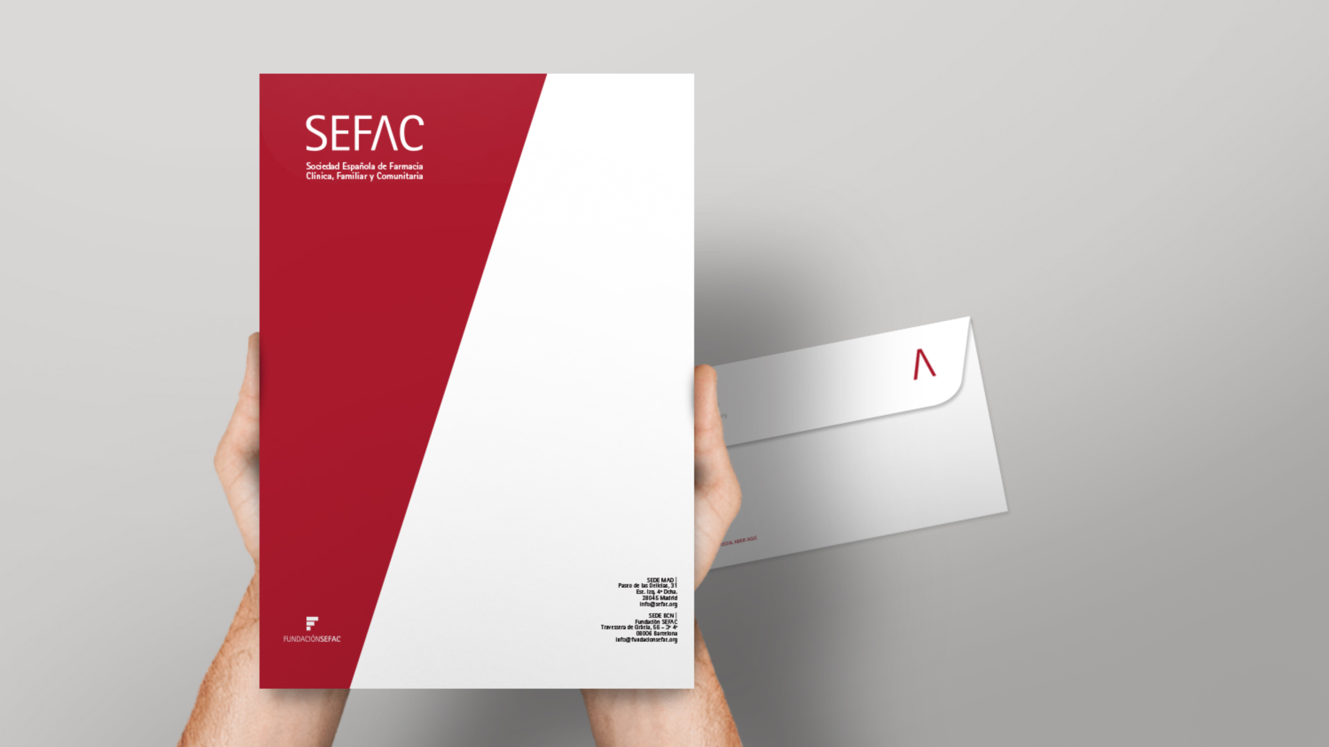
SEFAC tiene el objetivo de aportar innovación, formación y aprendizaje práctico al sector de la farmacia comunitaria. En este liderazgo de la excelencia y la distinción, SEFAC trabaja bajo la clara idea de «Acompañar al profesional de la farmacia». Como consecuencia de este objetivo, esta sociedad científica es el puente entre los farmacéuticos y los profesionales especializados en la diversidad de servicios que ayudan a crecer la oferta y la eficacia de las farmacias.
El liderazgo de la excelencia es una ardua tarea que nace de la curiosidad, la vocación de servicio y la innovación. SEFAC solicitó a nuestro equipo creativo una nueva forma de identificarse estratégicamente con su público objetivo, donde la principal tarea era mostrar su forma de proceder, más fresca y ágil, con la misión de mostrar a las nuevas generaciones de farmacéuticos comunitarios una visión más actual y conectada a las necesidades de la sociedad de lo que es hoy una farmacia y todos los servicios que engloba.
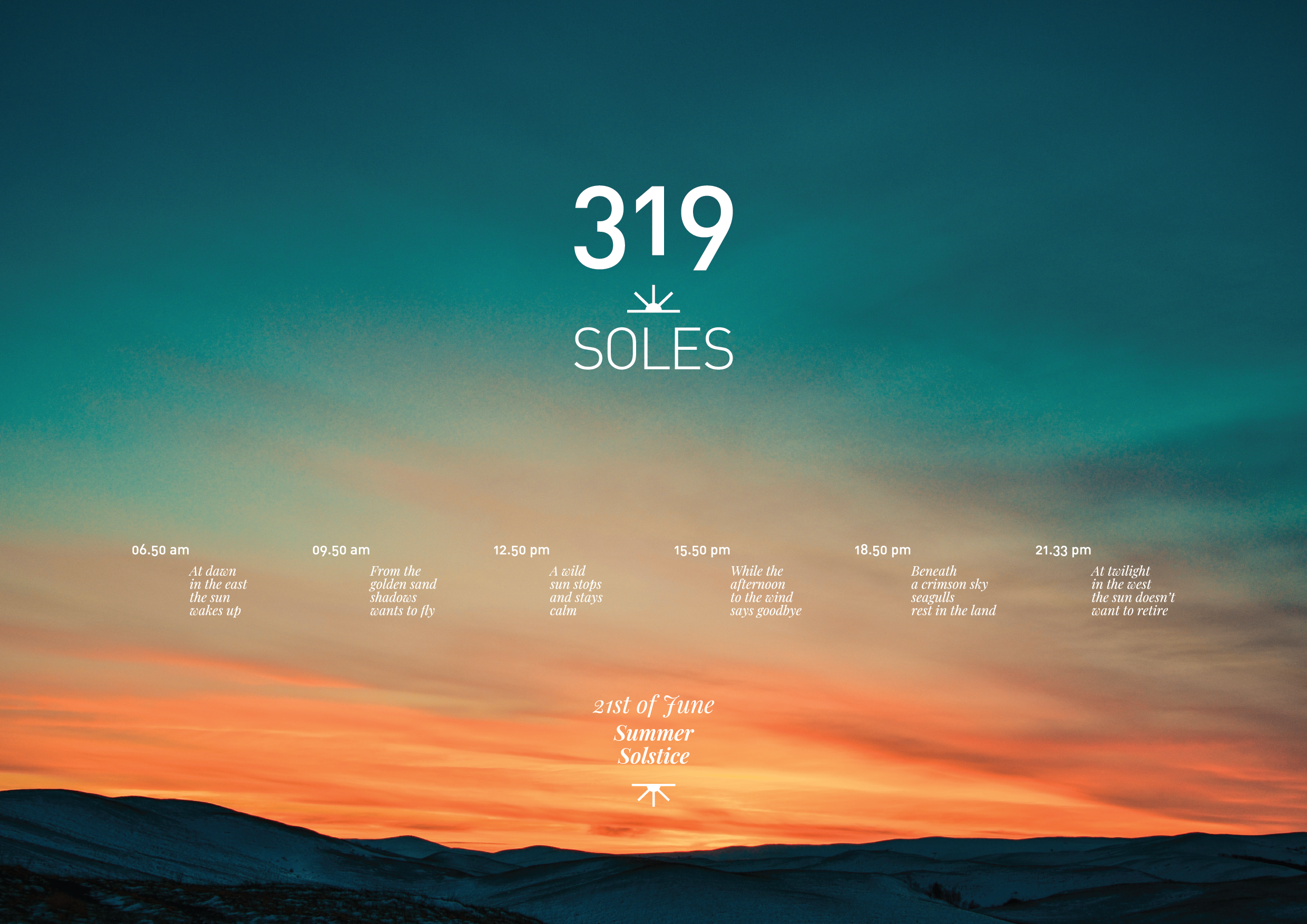
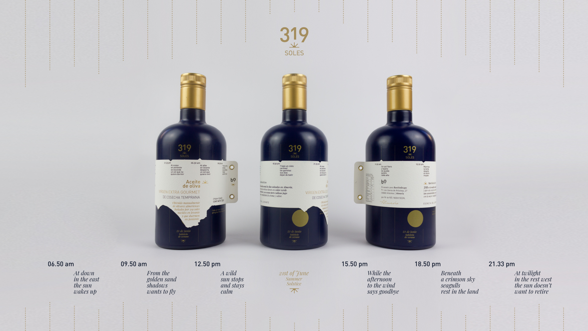
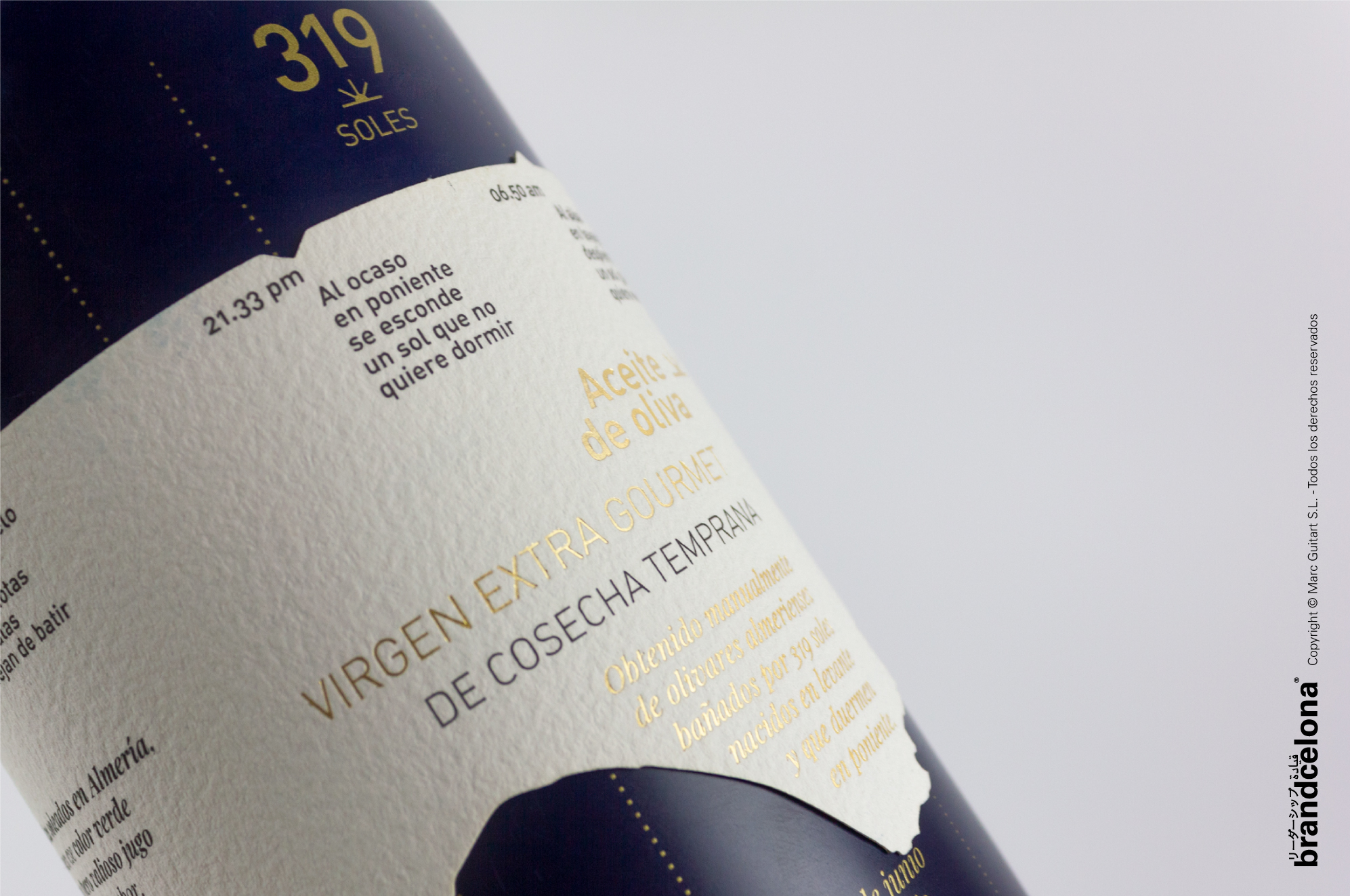
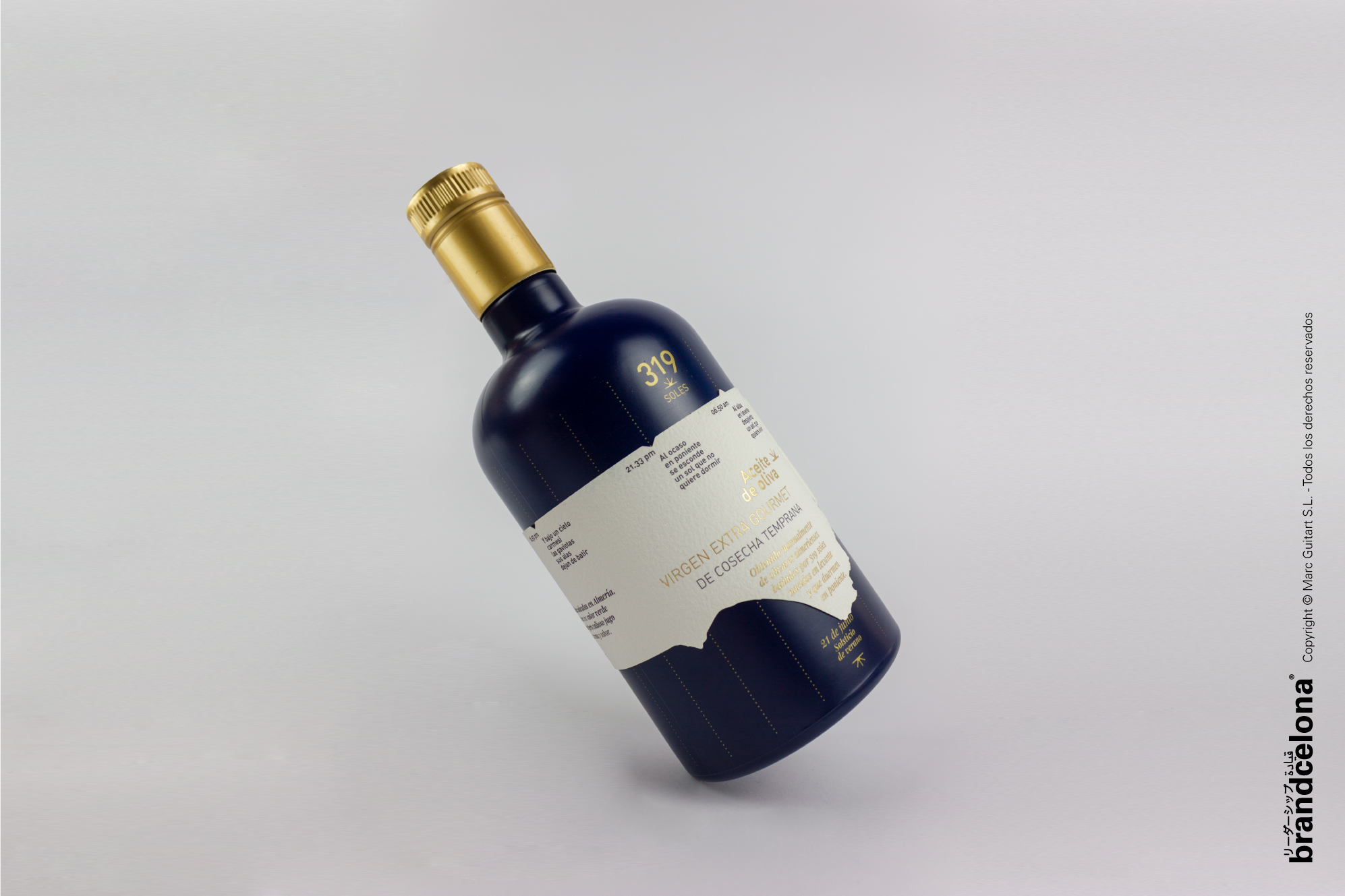
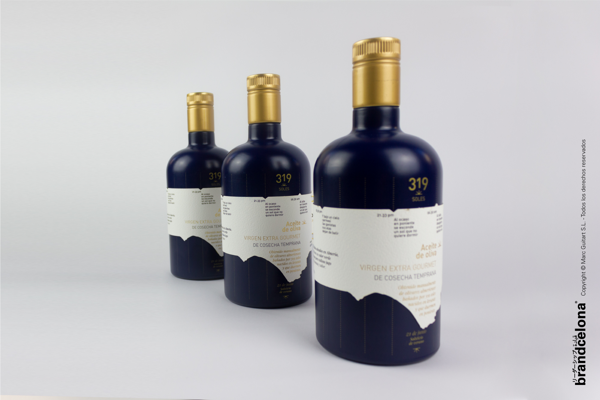
319 are the number of suns in a year that nourish Almeria’s olives.
The sun loves pampering Almería -it is one of the most luminous province in Spain- and representing how the sun rises and sets in here has been the main objective of the project, creating an interactive bottle in which you can find how the sun rises from the east and how it hides on the west just twirling the labeling around.
In Cabo the Gata you can enjoy the sunrise and the sunset viewing how the sun kisses the sea twice in a day. This beautiful peculiarity needed to be told and that is why we decided to tell a story about the sun around the label based on the 21st of june –the longer day in the year- when the sun rises around 6.50 am and sets at 9.33pm aproximately.
This amount of sun light is the reason why the olives are so green and have a little but intense juice.
In this project we dealt with the packaging’s materials, choosing the right one to allow the smooth movement of the label to orbit around the bottle.
319 es el número de soles en un año que nutren las aceitunas de Almería.
Al sol le encanta mimar a Almería -es una de las provincias más luminosas de España- y representar cómo sale y se pone el sol aquí ha sido el objetivo principal del proyecto, creando una botella interactiva en la que se puede encontrar cómo sale el sol por el levante y cómo se esconde por el poniente dando vueltas a la etiqueta.
En el Cabo de Gata se puede disfrutar del amanecer y del atardecer viendo cómo el sol besa el mar dos veces en un día. Esta hermosa peculiaridad necesitaba ser contada y por eso decidimos contar una historia sobre el sol alrededor de la etiqueta basada en el 21 de junio -el día más largo del año- cuando el sol sale alrededor de las 6.50 am y se pone a las 9.33pm aproximadamente.
Esta cantidad de luz solar es la razón por la que las aceitunas son tan verdes y tienen un zumo pequeño pero intenso.
En este proyecto tuvimos que ocuparnos de los materiales, eligiendo el adecuado para permitir un movimiento suave.
This project was born with the aim of continuing a family saga of pharmaceuticals, where tradition and new practices are accompanied by a knowledge that has been transferred from mother to daughter.
For the Caelles Family it was important to have a strategic development of the brand both at a visual level and in the experience in its retail. To explain to their users three concepts:
Who we are, where we are and where we want to go.
The retail stage was devoted to the structural development of the brand experience in space, to its theatricalization; taking into account in its retail the idiosyncrasy of the place and its industrial heritage. Therefore, the materials worked on in the pharmacy had to be in line and coherent with this. Details such as the visible ceiling where all the installations can be seen, the metallic materials such as the shelves of the shelves or the product display modules emphasize this concept of industrialization.
On the other hand, we wanted to greatly enhance the professional figure of the pharmaceutical owner, generating a knowledge space for training and informative talks, which generates a space of knowledge where the user is enriched, with a space where the training of people and collaboration with other colleagues or collaborators prevails. A physical space in the pharmacy where knowledge flows through its corners.
The significant spaces or Wow Effect are equally pieces that help to generate loyalty between brands and people, according to this, we destine a corporate space where the three partners of the group “caellesfarmacias” appear, to promote the concept of pharmaceutical group and family business. The image is accompanied by the Personal Branding of each one, with the corporate promise that explains the values of the brand. On the other hand, we also seek to promote the urban language, close and modern with a side full of hashtags in vinyl cut with the leitmotiv in extrusion, to emphasize the promise of the pharmacy and adapt to new needs of users in constant demand.
With our strategic developments in pharmacies, we seek to enter a new stage, a new language that adapts to the market in a real way with measurable benefits.
Where the knowledge of the professional and the intangibles will be the factors to promote and those that mark the differentiation between the competition.
brandcelona® Strategic Brand Leadership designs smart brands for the new era business through innovative strategic tools and the Cyclical Branding® methodology. For further information please write to hola@brandcelona.com.
Este proyecto nace con el objetivo de continuar con una saga familiar de farmacéuticas, donde la tradición y las nuevas praxis están acompañadas por un conocimiento que se ha ido traspasando de madre a hijas.
Para la Familia Caelles era importante tener un desarrollo estratégico de marca tanto a nivel visual como en la experiencia en su retail. Que explicara a sus usuarios tres conceptos:
¿Quiénes somos?, ¿Dónde estamos? y ¿Hacía donde queremos ir?.
La etapa de retail se destinó al desarrollo estructural de la experiencia de marca en el espacio, a su teatralización; teniendo en cuenta en su retail la idiosincrasia del lugar y su herencia industrial. Por ello los materiales trabajados en la farmacia debían ir acorde y en coherencia a esto. Detalles como el techo visto donde se aprecian todas las instalaciones, los materiales metálicos como las estanterías de los lineales o los módulos de exposición de producto hacen hincapié a este concepto de industrialización.
Por otro lado, hemos querido potenciar mucho la figura profesional de la farmacéutica titular, generando un espacio knowledge para formaciones y charlas divulgativas, donde se genera un espacio de conocimiento donde se enriquece al usuario, con un espacio donde prima la formación de personas y la colaboración con otros colegas o colaboradores. Un espacio físico en la farmacia donde el conocimiento fluye por sus esquinas.
Los espacios significativos o Wow Effect son de igual manera piezas que ayudan a generar fidelización entre marcas y personas, en función de ello, destinamos un espacio corporativo donde aparecen las tres socias del grupo “caellesfarmacias”, para potenciar el concepto de grupo farmacéutico y empresa familiar. La imagen va acompañada del Personal Branding de cada una con la promesa corporativa que explica los valores de la marca. Por otro lado, también buscamos fomentar el lenguaje urbano, cercano y actual, con un lateral lleno de hashtags en vinilo de corte con el leitmotiv en extrusión, para dar énfasis en la promesa de la farmacia y adaptarnos a las nuevas necesidades de unos usuarios en constante demanda.
Con nuestros desarrollos estratégicos en las farmacias, buscamos que entren en un nuevo estadio, un nuevo lenguaje que se adapte al mercado de manera real con beneficios medibles.
Donde el conocimiento del profesional y los intangibles serán los factores a potenciar y los que marquen la diferenciación entre la competencia.
brandcelona® Strategic Brand Leadership diseña smart brands para negocios de la nueva era a través de innovadoras herramientas estratégicas y la metodología de trabajo registrada Cyclical Branding® . Para ampliar cualquier información escríbenos a hola@brandcelona.com.