IDENTIDAD FUNDACIÓN HISPANO BRITÁNICA

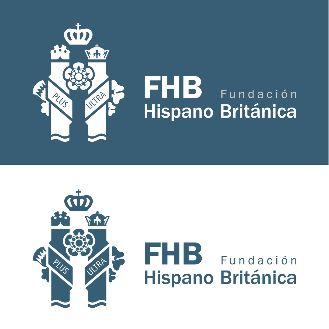
Con esta nueva identidad, ayudamos a la Fundación Hispano Británica a proyectar sus valores y a su notoria tarea de conectar comercio, cultura y sociedad entre España y el Reino Unido.

En este nuevo símbolo gráfico se funden las columnas herculianas de España y las flores del Reino Unido, simbolos de ambas culturas.

La flor nacional de Inglaterra es la rosa. La rosa fue adoptada como emblema de Inglaterra desde el tiempo de la Guerra de las Rosas – guerras civiles (1455 – 1485) entre la casa real de Lancaster, cuyo emblema era una rosa roja, y la casa real de York, cuyo emblema era una rosa blanca. El régimen de los York terminó con la derrota del Rey Ricardo III por parte del futuro Rey Enrique VII, en Bosworth, el 22 de Agosto de 1485, y las dos rosas fueron unidas a la rosa de Tudor (una rosa roja con un centro blanco) por Enrique VII cuando contrajo matrimonio con Elizabeth de York.

La flor nacional de Irlanda del Norte es el trébol. El trébol es una planta de tres hojas que se dice fue usada por San Patricio para ilustrar la doctrina de la Santísima Trinidad.

La flor nacional de Escocia es el cardo. El cardo es una flor morada de hojas espinosas que fue usada inicialmente en el siglo XV como símbolo de defensa.

La flor nacional de Gales es el narciso. El narciso se porta tradicionalmente en el Día de San David. Sin embargo, el humilde puerro también es considerado como un emblema tradicional de Gales, posiblemente por sus colores, blanco sobre verde.

La inscripción Plus Ultra de las columnas de Hércules. Debemos remitirnos a la mitología griega, concretamente a los doce célebres trabajos de Heracles. En el  décimo de sus trabajos, Hércules debía matar al gigante Gerión y robar su ganado. Para viajar hasta la tierra de los geriones , Hércules separó dos grandes rocas que dificultaban su paso, colocando a ambos lados, dos grandes columnas que separarían Europa de África, surgiendo de este modo el Estrecho de Gibraltar. Estas dos columnas, se convierten en frontera con el fin del mundo conocido por el hombre, indicando que no había tierra más allá, NON PLUS ULTRA. El lema surge en época del imperio romano; recordemos que  el mundo giraba entonces en torno al mar Mediterráneo, el Mare Nostrum y, aunque  algunos ya habían navegado por aquel temido océano, nunca lo hacían alejándose de la costa y siempre hacía el norte que los conducía a Finisterre.

Hasta 1492 los navegantes aseguraban que navegar hacia el oeste suponía encontrar una muerte segura, más allá del estrecho de Gibraltar solo existía la oscuridad. El cambio  sobre el límite  geográfico donde se situaba el fin  del mundo, se produce cuando Cristóbal Colón descubre  América.

Plus Ultra transmite un mensaje de entusiasmo, de audacia hacia sus súbditos, que afianzaría la presencia española en ese nuevo mundo. En definitiva, se trataba de enaltecer la intrepidez  de aquellos navegantes que  debían  extender las fronteras, llevando la fe cristiana al mundo que se acababa de descubrir.

Sobre cada Columna de Hércules aparece una corona distinta. Sobre el pilar de la izquierda se representa la corona real y sobre la derecha, la imperial. Ambas aluden al concepto de monarquía e imperio presentes en la historia del Reino de España. La corona real británica se muestra en su parte superior.

FUNDACIÓN HISPANO BRITÁNICA IDENTITY
With this new identity, we help the Fundación Hispano Británica project its values and its notorious task of connecting trade, culture and society between Spain and the United Kingdom.

In this new graphic symbol, the Herculean columns of Spain and the flowers of the United Kingdom, symbol of both cultures, merge.

The national flower of England is the rose. The rose was adopted as the emblem of England from the time of the Wars of the Roses – civil wars (1455 – 1485) between the royal house of Lancaster, whose emblem was a red rose, and the royal house of York, whose emblem was a white rose. The York regime ended with the defeat of King Richard III by the future King Henry VII, at Bosworth, on August 22, 1485, and the two roses were joined to the Tudor rose (a red rose with a white centre) by Henry VII when he married Elizabeth of York.

The national flower of Northern Ireland is the shamrock. The clover is a three-leafed plant that is said to have been used by Saint Patrick to illustrate the doctrine of the Holy Trinity.

Scotland’s national flower is the thistle. The thistle is a purple flower with spiny leaves that was initially used in the fifteenth century as a symbol of defence.

The national flower of Wales is the daffodil, and the daffodil is traditionally carried on Saint David’s Day. However, the humble leek is also regarded as a traditional emblem of Wales, possibly because of its colours, white on green.

The Plus Ultra inscription of the Pillars of Hercules. We must refer to Greek mythology, specifically to the famous twelve labours of Heracles. In the tenth of his labours, Hercules was to kill the giant Geryon and steal his cattle. To travel to the land of the Geryons, Hercules separated two large rocks that hindered his passage, placing two large columns on both sides that would separate Europe from Africa, thus giving rise to the Strait of Gibraltar. These two columns become the border with the end of the world known to man, indicating that there was no land beyond, NON-PLUS ULTRA. The motto arises at the time of the Roman Empire; Let us remember that the world then revolved around the Mediterranean Sea, the Mare Nostrum and, although some had already sailed through that dreaded ocean, they never did so away from the coast. They always headed north, which led them to Finisterre.

Until 1492, navigators claimed that sailing west meant finding certain death. Beyond the Strait of Gibraltar, there was only darkness. The change in the geographical limit where the end of the world was located, occurs when Columbus discovered America.

Plus Ultra transmits a message of enthusiasm, of audacity towards its subjects, which would strengthen the Spanish presence in that new world. In short, it was about extolling the intrepidity of those navigators who had to extend the borders, bringing the Christian faith to the world that had just been discovered.

A different crown appears on each Pillar of Hercules. The royal crown is depicted on the left pillar and the imperial crown on the right. Both allude to the concept of monarchy and empire present in the history of the Kingdom of Spain. The British royal crown is displayed on top of it.

«PRIMERO MI BARRIO» HEALTHCARE CAMPAIGN

Las marcas deben explorar nuevos canales de comunicación más libres para que otros hablen de sus soluciones de una manera más creativa y generen narrativas donde el producto termine buscándose a sí mismo desde una perspectiva innovadora. @cruzfarmacia fomenta la colaboración, conectando la esencia del estilo de vida de su barrio sevillano con el objetivo de su marca. Un enfoque no comercial, que crea resultados inesperados más allá de lo esperado.

«Pino Montano, Sevilla; representa con orgullo la esencia, el carácter y la cotidianidad del día a día de sus vecinos. Es gracias a ello, que podemos decir que estamos orgullosos de nuestro barrio, de nuestra idiosincrasia y nuestra gente. Somos las personas las que damos vida a nuestras calles, a nuestro barrio.»

Os presentamos nuestra nueva campaña de salud “Primero Mi Barrio”, un año en el que vamos a dar visibilidad a los verdaderos protagonistas del barrio de Pino Montano en Sevilla, nuestra gente; porque para nosotros, “Primero mi Barrio.”

«PRIMERO MI BARRIO» HEALTHCARE CAMPAIGN

Brands should explore new, freer communication channels to let others talk about their solutions in a more creative way and generate narratives where the product ends up seeking for itself from an innovative perspective. @cruzfarmacia fosters collaboration, connecting the lifestyle of his Seville neighborhood essence with the aim of his brand. A non-commercial approach, creating unexpected outcomes beyond the brief. 

«Pino Montano, Seville;  It proudly represents the essence, character and everyday life of its neighbors.  It is thanks to this that we can say that we are proud of our neighborhood, our idiosyncrasy and our people.  We are the people who give life to our streets, to our neighborhood.»

We present our new campaign “Primero Mi Barrio”, a year in which we are going to give visibility to the true protagonists of Pino Montano in Seville, our people; because for us, “My neighborhood comes first.”

BREINCO. We are part of the landscape

In a post-pandemic, more globalised and digitalised world, businesses today have almost unlimited choices of where and how to operate. With increasingly fierce competition amongst companies to attract the best urban projects, talent and investment from across the world, brands have never been more important. As any other B2C company would do, B2B companies must now leverage their destination brand and deliver on their brand promise in order to stand out from the other competitors.

Find out about this new company brand breinco to understand how today, organisations can build a strong digital brand to rise in the brand equity and attract more business, sustainable projects and investment for offer better quality of life in our cities.

BREINCO. Somos parte del paisaje

En el contexto actual de post-pandemia con un mundo más globalizado y completamente digitalizado, las organizaciones tienen infinitas opciones de cómo y donde operar. Las diferentes organizaciones se enfrentan a diferentes agentes y competidores para atraer y liderar los mejores proyectos, talento humano e inversores a nivel mundial. Como cualquier otra compañía enfocada a cliente final haría, Breinco aprovecha la nueva identidad para ofrecer una promesa de marca que la diferencia claramente de sus competidores.

Descubre esta renovada identidad de breinco para comprender como las organizaciones de hoy pueden construir una sólida identidad digital que les permite incrementar su ya elevada percepción de valor y atraer más volumen de negocio, más proyectos urbanos sostenibles y mayor inversión para ofrecer mejor calidad de vida en nuestras ciudades.

OTILIA MENA PERSONALMENTE

OTILIA MENA tiene el objetivo de aportar innovación en el sector salud natural a través del cuidado personal, la belleza y el bienestar personal. En este propósito se ha desarrollado una línea de productos propia distintiva, OTILIA MENA. Todos ellos se han supervisado personalmente y con extrema delicadeza para acompañar el cuidado personal de manera cercana. Como consecuencia de este objetivo, la línea de productos que presentamos es el puente entre el conocimiento profesional y las personas que están en la búsqueda de consejos y productos especializados en la diversidad de factores que enriquecen el bienestar personal.

OTILIA MENA PERSONALMENTE es el resultado de la búsqueda por una línea distintiva, que nace de la curiosidad, la belleza y la innovación. OTILIA MENA solicitó a nuestro equipo creativo una forma de identificarse estratégicamente con su público objetivo, donde la principal tarea era mostrar su visión, profundo conocimiento y manera de proceder, fresca y ágil vinculada a @farmaciaterranea, con la misión de mostrar su visión actual y real de lo que es hoy el cuidado personal en nuestro estilo de vida actual.

Descubre esta nueva línea de productos naturales de belleza específicamente diseñados para reducir su impacto medioambiental e inspirar a una nueva generación de belleza en @otiliamenapersonalmente

SEFAC. Liderando la excelencia

SEFAC tiene el objetivo de aportar innovación, formación y aprendizaje práctico al sector de la farmacia comunitaria. En este liderazgo de la excelencia y la distinción, SEFAC trabaja bajo la clara idea de «Acompañar al profesional de la farmacia». Como consecuencia de este objetivo, esta sociedad científica es el puente entre los farmacéuticos y los profesionales especializados en la diversidad de servicios que ayudan a crecer la oferta y la eficacia de las farmacias.

El liderazgo de la excelencia es una ardua tarea que nace de la curiosidad, la vocación de servicio y la innovación. SEFAC solicitó a nuestro equipo creativo una nueva forma de identificarse estratégicamente con su público objetivo, donde la principal tarea era mostrar su forma de proceder, más fresca y ágil, con la misión de mostrar a las nuevas generaciones de farmacéuticos comunitarios una visión más actual y conectada a las necesidades de la sociedad de lo que es hoy una farmacia y todos los servicios que engloba.

319 Suns // 319 Soles

319 are the number of suns in a year that nourish Almeria’s olives.

The sun loves pampering Almería -it is one of the most luminous province in Spain- and representing how the sun rises and sets in here has been the main objective of the project, creating an interactive bottle in which you can find how the sun rises from the east and how it hides on the west just twirling the labeling around.

In Cabo the Gata you can enjoy the sunrise and the sunset viewing how the sun kisses the sea twice in a day. This beautiful peculiarity needed to be told and that is why we decided to tell a story about the sun around the label based on the 21st of  june –the longer day in the year- when the sun rises around 6.50 am and sets at 9.33pm aproximately.

This amount of sun light is the reason why the olives are so green and have a little but intense juice.

In this project we dealt with the packaging’s materials, choosing the right one to allow the smooth movement of the label to orbit around the bottle.


319 es el número de soles en un año que nutren las aceitunas de Almería.

Al sol le encanta mimar a Almería -es una de las provincias más luminosas de España- y representar cómo sale y se pone el sol aquí ha sido el objetivo principal del proyecto, creando una botella interactiva en la que se puede encontrar cómo sale el sol por el levante y cómo se esconde por el poniente dando vueltas a la etiqueta.

En el Cabo de Gata se puede disfrutar del amanecer y del atardecer viendo cómo el sol besa el mar dos veces en un día. Esta hermosa peculiaridad necesitaba ser contada y por eso decidimos contar una historia sobre el sol alrededor de la etiqueta basada en el 21 de junio -el día más largo del año- cuando el sol sale alrededor de las 6.50 am y se pone a las 9.33pm aproximadamente.

Esta cantidad de luz solar es la razón por la que las aceitunas son tan verdes y tienen un zumo pequeño pero intenso.

En este proyecto tuvimos que ocuparnos de los materiales, eligiendo el adecuado para permitir un movimiento suave.

Marcas que dibujan futuros // Brands that draw futures

Mediform plus fue creada por Luis de la Fuente, con el objetivo de aportar innovación, formación y aprendizaje práctico al sector de la farmacia. En este camino de búsqueda de la excelencia y la distinción, Mediform trabaja bajo la clara idea de que «El futuro no se improvisa, se planifica». Como consecuencia de este objetivo, esta organización empresarial es el puente entre los farmacéuticos y los profesionales especializados en la diversidad de productos que ayudan a crecer la oferta y la eficacia de las farmacias.

Reto

La búsqueda de la innovación es una ardua tarea que nace de la curiosidad y la excelencia. Mediform solicitó a nuestro equipo creativo una nueva forma de identificarse estratégicamente con su público objetivo, donde la principal tarea era mostrar una nueva forma de proceder, más fresca y ágil, esto con la misión de mostrar a las nuevas generaciones una visión más actual y real de lo que es hoy una farmacia y todo lo que la engloba.

Resultado

Creación de la estrategia de marca y posicionamiento mediante el desarrollo de la comunicación visual y verbal.

Retocamos el acrónimo MDF para conseguir, a través de formas geométricas, un símbolo totalmente pregnante y memorable.

El icono + desaparece dando lugar a un símbolo geométrico no descriptivo y menos recurrente.

A través de una tipografía muy consolidada (Franklin Gothic) y con muy buena legibilidad, trabajamos esta propuesta de fácil reconocimiento.

Añadimos un leitmotiv aspiracional, descartando cualquier descripción para vincular emocionalmente la marca con sus usuarios.

brandcelona® Strategic Brand Leadership diseña smart brands para negocios de la nueva era a través de innovadoras herramientas estratégicas y la metodología de trabajo registrada Cyclical Branding® . Para ampliar cualquier información escríbenos a hola@brandcelona.com.

www.cyclicalbranding.com

www.yellowweare.com


Mediform plus was created by Luis de la Fuente, with the aim of bringing innovation, training and practical learning to the pharmacy sector. On this path of seeking excellence and distinction, Mediform works under the clear idea that «The future cannot be improvised, it must be planned». As a consequence of this objective, this business organization is the bridge between pharmacists and professionals specialized in the diversity of products that help to grow the offer and effectiveness of pharmacies.

Challenge

The search for innovation is an arduous task born of curiosity and excellence. Mediform asked our creative team for a new way of identifying strategically with its target audience, where the main task was to show a new, fresher and more agile way of proceeding, this with the mission of showing new generations a more current and real vision of what a pharmacy and everything that encompasses it is today.

Outcome

Branding strategy creation and positioning through visual and verbal communication development.

We retouched the MDF acronym to achieve, through geometric shapes, a totally pregnant and memorable symbol.

The + icon disappears giving rise to a non-descriptive and less recurrent geometric symbol.

Through a much-consolidated typography (Franklin Gothic) and with very good legibility, we worked this proposal of easy recognition.

We added an aspirational leitmotif, discarding any description to emotionally link the brand with its users.

brandcelona® Strategic Brand Leadership designs smart brands for the new era business through innovative strategic tools and the Cyclical Branding® methodology. For further information please write to hola@brandcelona.com.

www.yellowweare.com
www.cyclicalbranding.com

Inside the project. Caelles pharmacy // Inside the project. Farmacia Caelles

This project was born with the aim of continuing a family saga of pharmaceuticals, where tradition and new practices are accompanied by a knowledge that has been transferred from mother to daughter.

For the Caelles Family it was important to have a strategic development of the brand both at a visual level and in the experience in its retail. To explain to their users three concepts:

Who we are, where we are and where we want to go.

The retail stage was devoted to the structural development of the brand experience in space, to its theatricalization; taking into account in its retail the idiosyncrasy of the place and its industrial heritage. Therefore, the materials worked on in the pharmacy had to be in line and coherent with this. Details such as the visible ceiling where all the installations can be seen, the metallic materials such as the shelves of the shelves or the product display modules emphasize this concept of industrialization.

On the other hand, we wanted to greatly enhance the professional figure of the pharmaceutical owner, generating a knowledge space for training and informative talks, which generates a space of knowledge where the user is enriched, with a space where the training of people and collaboration with other colleagues or collaborators prevails. A physical space in the pharmacy where knowledge flows through its corners.

The significant spaces or Wow Effect are equally pieces that help to generate loyalty between brands and people, according to this, we destine a corporate space where the three partners of the group “caellesfarmacias” appear, to promote the concept of pharmaceutical group and family business. The image is accompanied by the Personal Branding of each one, with the corporate promise that explains the values of the brand. On the other hand, we also seek to promote the urban language, close and modern with a side full of hashtags in vinyl cut with the leitmotiv in extrusion, to emphasize the promise of the pharmacy and adapt to new needs of users in constant demand.

With our strategic developments in pharmacies, we seek to enter a new stage, a new language that adapts to the market in a real way with measurable benefits.

Where the knowledge of the professional and the intangibles will be the factors to promote and those that mark the differentiation between the competition.

brandcelona® Strategic Brand Leadership designs smart brands for the new era business through innovative strategic tools and the Cyclical Branding® methodology. For further information please write to hola@brandcelona.com.

www.yellowweare.com
www.cyclicalbranding.com


Este proyecto nace con el objetivo de continuar con una saga familiar de farmacéuticas, donde la tradición y las nuevas praxis están acompañadas por un conocimiento que se ha ido traspasando de madre a hijas.

Para la Familia Caelles era importante tener un desarrollo estratégico de marca tanto a nivel visual como en la experiencia en su retail. Que explicara a sus usuarios tres conceptos:

¿Quiénes somos?, ¿Dónde estamos? y ¿Hacía donde queremos ir?.

La etapa de retail se destinó al desarrollo estructural de la experiencia de marca en el espacio, a su teatralización; teniendo en cuenta en su retail la idiosincrasia del lugar y su herencia industrial. Por ello los materiales trabajados en la farmacia debían ir acorde y en coherencia a esto. Detalles como el techo visto donde se aprecian todas las instalaciones, los materiales metálicos como las estanterías de los lineales o los módulos de exposición de producto hacen hincapié a este concepto de industrialización.

Por otro lado, hemos querido potenciar mucho la figura profesional de la farmacéutica titular, generando un espacio knowledge para formaciones y charlas divulgativas, donde se genera un espacio de conocimiento donde se enriquece al usuario, con un espacio donde prima la formación de personas y la colaboración con otros colegas o colaboradores. Un espacio físico en la farmacia donde el conocimiento fluye por sus esquinas.

Los espacios significativos o Wow Effect son de igual manera piezas que ayudan a generar fidelización entre marcas y personas, en función de ello, destinamos un espacio corporativo donde aparecen las tres socias del grupo “caellesfarmacias”, para potenciar el concepto de grupo farmacéutico y empresa familiar. La imagen va acompañada del Personal Branding de cada una con la promesa corporativa que explica los valores de la marca. Por otro lado, también buscamos fomentar el lenguaje urbano, cercano y actual, con un lateral lleno de hashtags en vinilo de corte con el leitmotiv en extrusión, para dar énfasis en la promesa de la farmacia y adaptarnos a las nuevas necesidades de unos usuarios en constante demanda.

Con nuestros desarrollos estratégicos en las farmacias, buscamos que entren en un nuevo estadio, un nuevo lenguaje que se adapte al mercado de manera real con beneficios medibles.

Donde el conocimiento del profesional y los intangibles serán los factores a potenciar y los que marquen la diferenciación entre la competencia.

brandcelona® Strategic Brand Leadership diseña smart brands para negocios de la nueva era a través de innovadoras herramientas estratégicas y la metodología de trabajo registrada Cyclical Branding® . Para ampliar cualquier información escríbenos a hola@brandcelona.com.

www.yellowweare.com
www.cyclicalbranding.com

Caelles pharmacy. Heritage and innovation // Farmacia Caelles. Herencia e innovación

This project was born with the aim of continuing a family saga of pharmaceuticals, where tradition and new practices are accompanied by a knowledge that has been transferred from mother to daughter.

For the Caelles Family it was important to have a strategic development of the brand both at a visual level and in the experience in its retail. To explain to their users three concepts:

Who we are, where we are and where we want to go.

Challenge

Having already a physical pharmacy in Reus, the challenge of creating and theatricalizing a new space in Ripollet was presented. An industrial town that grew exponentially in the 60s and 70s, due to a migration from different parts of Spain, especially Andalusia, which obtained work in the different industrial estates that existed. Being consistent with the reality of the place and the social environment that was presented, we decided to develop the project taking into account the essence and industrial idiosyncrasies that characterize this place, merging it with the professional value offered by this group of professionals who give life and human warmth to this project.

Outcome

Creation, development and implementation of a global communication branding strategy that includes the verbal, attitudinal, sensory and visual axes.

Farmacia Caelles, is part of the group Caelles, a family project composed of mother and daughters who sought to enter a new vision that allows them to develop in a new stage of strategic communication, taking their business idea to another level and seeking differentiation in the sector.

This project was born from an important value, the human factor. This is conveyed through the Personal Branding of these three professionals. Their personal brand is the value that makes the difference and their seal of guarantee; from this, we started to develop the communication by making a constant symbiosis with the pharmaceutical knowledge and the good work of these three professionals. For them we divided the project into three stages: Group Brand, Personal Branding and Retail. These three stages marked the roadmap to develop the project.

The brand was born from a rebranding that we brought under the same concept of Caelles, as a family and business unit, we focused the development of this brand with a sans serif typography that would evoke freshness and innovation, besides choosing a leitmotiv in English that would not go unnoticed by the new typology of users and to focus their business projection.

Following this, and with the group brand already defined, we had to give life and personality to the Personal Branding of the people behind the brand and endow it with personality, charisma and professionalism; therefore, we developed a sequential visual identity, which would give us the opportunity to function individually and represent a coherent group when used together.

An identity was developed that is based on three concepts:

  1. Supported visually by the «Caelles» with a serif typography that evokes the whole tradition of the sector.
  2. The graphic character used for the names is a sans serif typography that generates that contrast between innovation and tradition.
  3. Intangible value. The leitmotiv of each brand is linked to the intangible value offered by each one of them, it is their personal promise to people, where these three visions generate the real expectation of the users towards the brand.

The last stage was devoted to the structural development of the brand experience in space, to its theatricalization; taking into account in its retail the idiosyncrasy of the place and its industrial heritage. Therefore, the materials worked on in the pharmacy had to be in line and coherent with this. Details such as the visible ceiling where all the installations can be seen, the metallic materials such as the shelves of the shelves or the product display modules emphasize this concept of industrialization.

On the other hand, we wanted to greatly enhance the professional figure of the pharmaceutical owner, generating a knowledge space for training and informative talks, which generates a space of knowledge where the user is enriched, with a space where the training of people and collaboration with other colleagues or collaborators prevails. A physical space in the pharmacy where knowledge flows through its corners.

The significant spaces or Wow Effect are equally pieces that help to generate loyalty between brands and people, according to this, we destine a corporate space where the three partners of the group «caellesfarmacias» appear, to promote the concept of pharmaceutical group and family business. The image is accompanied by the Personal Branding of each one, with the corporate promise that explains the values of the brand. On the other hand, we also seek to promote the urban language, close and modern with a side full of hashtags in vinyl cut with the leitmotiv in extrusion, to emphasize the promise of the pharmacy and adapt to new needs of users in constant demand.

With our strategic developments in pharmacies, we seek to enter a new stage, a new language that adapts to the market in a real way with measurable benefits.

Where the knowledge of the professional and the intangibles will be the factors to promote and those that mark the differentiation between the competition.

brandcelona® Strategic Brand Leadership designs smart brands for the new era business through innovative strategic tools and the Cyclical Branding® methodology. For further information please write to hola@brandcelona.com.

www.yellowweare.com
www.cyclicalbranding.com

—–

Este proyecto nace con el objetivo de continuar con una saga familiar de farmacéuticas, donde la tradición y las nuevas praxis están acompañadas por un conocimiento que se ha ido traspasando de madre a hijas.

Para la Familia Caelles era importante tener un desarrollo estratégico de marca tanto a nivel visual como en la experiencia en su retail. Que explicara a sus usuarios tres conceptos:

¿Quiénes somos?, ¿Donde estamos? y ¿Hacía donde queremos ir?.

Reto

Contando ya con una farmacia física en Reus, se presentó el reto de crear y teatralizar un nuevo espacio en Ripollet. Localidad industrial que creció en su población de manera exponencial en los años 60-70, debido a una migración de diferentes partes de España, sobretodo Andalucía, que obtenía trabajo en los diferentes polígonos industriales que había. Siendo consecuentes de la realidad del lugar y el entorno social que se presentaba, decidimos desarrollar el proyecto teniendo en cuenta la esencia e idiosincrasia industrial que caracteriza a este lugar, fusionándolo con el valor profesional que ofrece este grupo de profesionales que le dan vida y calidez humana a este proyecto.

Solución

Creación, desarrollo e implementación de una estrategia de branding global de comunicación que incluya los ejes verbales, actitudinales, sensoriales y visuales.

Farmacia Caelles, forma parte del grupo Caelles, proyecto familiar compuesto por madre e hijas que buscaron entrar en una nueva visión que les permita desenvolverse en un nuevo estadio de comunicación estratégico, llevando su idea de negocio a otro nivel y buscando la diferenciación en el sector.

Este proyecto nace de un valor importante, el factor humano. Éste vehiculizado a partir del Personal Branding de estas tres profesionales. Su marca personal es el valor que marca la diferencia y su sello de garantía; a partir de ello, nos pusimos en marcha para iniciar el desarrollo a comunicar realizando una simbiosis constante junto al conocimiento farmacéutico y el buen hacer de estas tres profesionales. Para ellos dividimos el proyecto en tres etapas: Marca de grupo, Personal Branding y Retail. Estas tres etapas marcaron la hoja de ruta para desarrollar el proyecto.

La marca nace de un rebranding que traemos bajo el mismo concepto de Caelles, como unidad familiar y de negocio, enfocamos el desarrollo de esta marca con una tipografía palo seco que nos evocara frescura e innovación, además de optar por un leitmotiv en inglés que no pase desapercibido por la nueva tipología de usuarios y para focalizar su proyección de negocio.

Seguido de ello, y con la marca de grupo ya definida debíamos dar vida y personalidad a los Personal Branding de las personas que estaban detrás de la marca y la dotaban de personalidad, carisma y profesionalidad; por ello, desarrollamos una identidad visual secuencial, que nos diera la oportunidad de funcionar de manera individual y representara un grupo coherente cuando se usen de manera conjunta.

Se desarrolló una identidad que se basa en tres conceptos:

  1. Tradición. Apoyado de manera visual por el “Caelles” con una tipografía de serifa que nos evoca a toda la tradición del sector.
  2. Innovación. El carácter gráfico usado para los nombres es una tipografía de palo seco que genera ese contraste entre innovación y tradición.
  3. Valor intangible. El leitmotiv de cada marca se ve vinculado al valor intangible que ofrece cada una de ellas, es su promesa personal hacia las personas, donde estas tres visiones generan la expectativa real de los usuarios de cara a la marca.

La última etapa se destinó al desarrollo estructural de la experiencia de marca en el espacio, a su teatralización; teniendo en cuenta en su retail la idiosincrasia del lugar y su herencia industrial. Por ello los materiales trabajados en la farmacia debían ir acorde y en coherencia a esto. Detalles como el techo visto donde se aprecian todas las instalaciones, los materiales metálicos como las estanterías de los lineales o los módulos de exposición de producto hacen hincapié a este concepto de industrialización.

Por otro lado, hemos querido potenciar mucho la figura profesional de la farmacéutica titular, generando un espacio knowledge para formaciones y charlas divulgativas, donde se genera un espacio de conocimiento donde se enriquece al usuario, con un espacio donde prima la formación de personas y la colaboración con otros colegas o colaboradores. Un espacio físico en la farmacia donde el conocimiento fluye por sus esquinas.

Los espacios significativos o Wow Effect son de igual manera piezas que ayudan a generar fidelización entre marcas y personas, en función de ello, destinamos un espacio corporativo donde aparecen las tres socias del grupo “caellesfarmacias”, para potenciar el concepto de grupo farmacéutico y empresa familiar. La imagen va acompañada del Personal Branding de cada una con la promesa corporativa que explica los valores de la marca. Por otro lado, también buscamos fomentar el lenguaje urbano, cercano y actual, con un lateral lleno de hashtags en vinilo de corte con el leitmotiv en extrusión, para dar énfasis en la promesa de la farmacia y adaptarnos a las nuevas necesidades de unos usuarios en constante demanda.

Con nuestros desarrollos estratégicos en las farmacias, buscamos que entren en un nuevo estadio, un nuevo lenguaje que se adapte al mercado de manera real con beneficios medibles.

Donde el conocimiento del profesional y los intangibles serán los factores a potenciar y los que marquen la diferenciación entre la competencia.

brandcelona® Strategic Brand Leadership diseña smart brands para negocios de la nueva era a través de innovadoras herramientas estratégicas y la metodología de trabajo registrada Cyclical Branding® . Para ampliar cualquier información escríbenos a hola@brandcelona.com.

www.yellowweare.com
www.cyclicalbranding.com


Hi Farmacia América! // ¡Hola Farmacia América!

We are happy to share one of our latest developed projects: Farmacia América from Grupo Vensalud designed by brandcelona® through our Cyclical Branding® methodology.

We are living in a world where brands must differentiate themselves from each others. Disruption is not an option anymore but a must for brands if they want to survive because they will always find new competitors ready to disrupt the market.

There are three key concepts to have a successful brand: having a coherent brand experience, being transparent with users and listening to them to keep the relationship. Also working with impact, coherence and differentiation will give us the opportunity to connect with our ambassadors. In a content saturated century the key point is to make users fall in love.

All around Farmacia América is developed with coherence setting human values above any product. Also eye-catching and striking materials for this sector help us gain impact. In the 21st Century, pharmacies have the great challenge of a lack of uniqueness since they all share a cross, a sign that shows “pharmacy” and a professional in a white coat.

In a world constantly evolving the difference is to transform visibility into preference and this is posible thanks to the vision of being a game-changer.

Grupo Vensalud is an example of Smart Brand ready for the new era.

brandcelona® Strategic Brand Leadership designs smart brands for the new era business through innovative strategic tools and the Cyclical Branding® methodology. For further information please write to manager@brandcelona.com

www.yellowweare.com
www.cyclicalbranding.com

—–

Estamos contentos de compartir uno de nuestros últimos proyectos en Asturias: Farmacia América del Grupo Vensalud diseñado por brandcelona® bajo la metodología Cyclical Branding®.

Vivimos en un mundo donde las marcas tienen la obligación de diferenciarse unas de otras. La disrupción ya no es una opción sino un deber para las marcas si quieren sobrevivir ya que siempre encontrarán nuevos competidores preparados para desestructurar el mercado.
Las claves para una marca de éxito son su experiencia, la transparencia y el diálogo con el usuario, y trabajar con coherencia, impacto y diferenciación otorga la oportunidad de conectar con nuestros embajadores. En un siglo de saturación de información, la clave es enamorar.
 
En Farmacia América trabajamos con coherencia sobre los valores humanos por encima de cualquier producto e impactamos con una materialización poco común para las farmacias que, en general, tienen un desafío importante en el sXXI, y es la falta de singularidad ya que todas poseen una cruz, un rótulo que pone farmacia y un facultativo con una bata blanca.
 
En un mundo que está en constante cambio y evolución la diferencia radica en transformar notoriedad en preferencia, y esto no se consigue a través de impactos promocionales sino a través de la visión de ser agente del cambio.
 
Grupo Vensalud, un ejemplo de Smart Brand preparada para la nueva era.

brandcelona® Strategic Brand Leadership diseña smart brands para negocios de la nueva era a través de innovadoras herramientas estratégicas y la metodología de trabajo registrada Cyclical Branding® . Para ampliar cualquier información escríbenos a manager@brandcelona.com

www.yellowweare.com
www.cyclicalbranding.com