Paris Upstores: an ephemeral mall // un centro comercial efímero

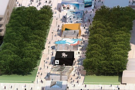
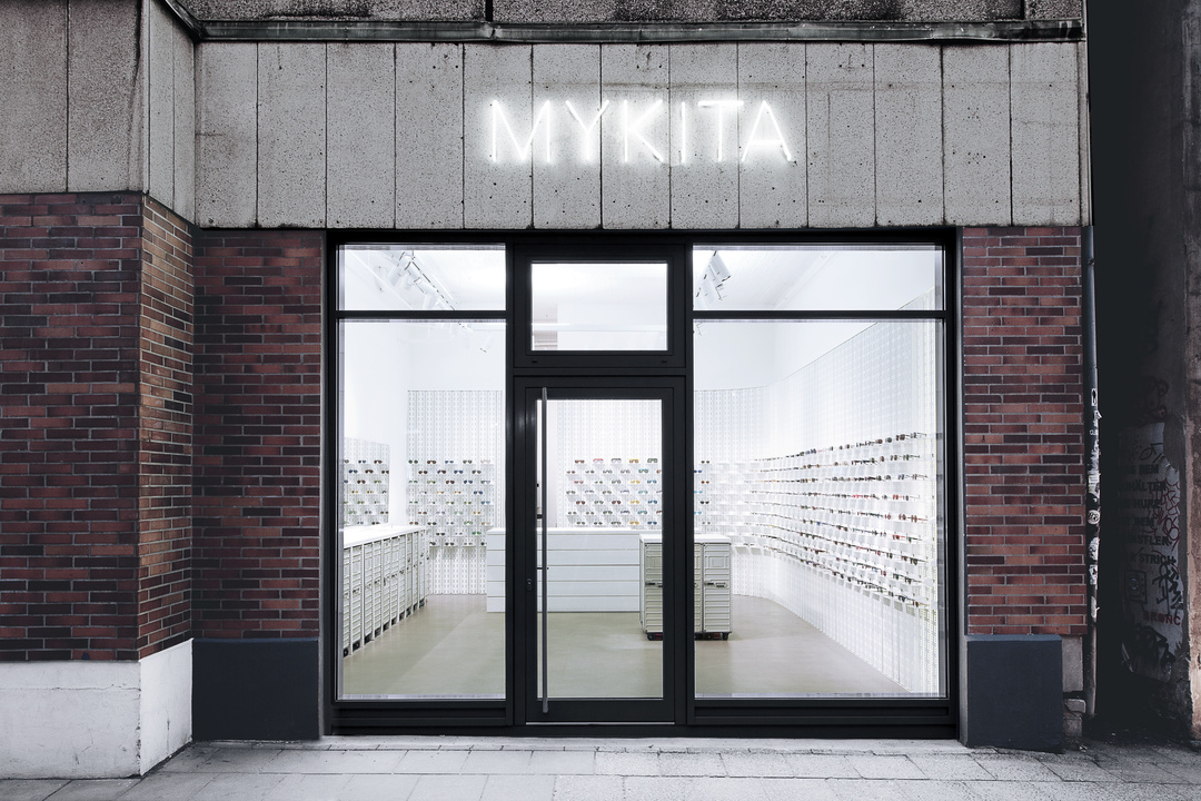
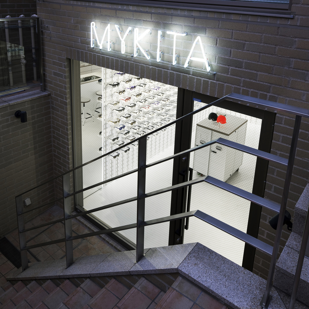
«Paris Upstores», a completely new pop-up mall concept in Europe, is an ephemeral shopping mall that will open its doors on June 1st for six weeks in the well-known business district of La Défense. This initiative has been designed to provide the French and international brands, whether big or small, with an opportunity to create a unique rendezvous for its users.

Benefitting from summer’s arrival and other events of huge commercial potential (summer sales, trade fairs…), as well as from the attractiveness and dynamism of one of the most important financial districts in Europe, the project will house ephemeral open air shops of between 40 and 100 squared meters in a surface of 700 squared meters, where new products and limited editions will be launched, and new collections and concepts will be presented, among others.

Such initiative is not sales-oriented, as it aims at enhancing the branding of the shops, and promoting a particular product or brand. It is all about promoting the concept of a shop, delinking it from its typical point of sale, and providing a unique and memorable shopping experience.

According to the promoters of the project, there is a growing interest in what’s new among consumers, and the element of surprise in «Paris Upstores» feeds the user’s curiosity. In this new fashion venue, it is also intended to improve the situation of the commercial sector through innovation, and thus attract new customers.

«Paris Upstores» should be a big success, and therefore it is expected to reopen every year during the same period.

—-

El «Paris Upstores» es un concepto totalmente nuevo en Europa de pop-up mall, un centro comercial efímero, que abrirá sus puertas el próximo 1 de junio en el conocido barrio de negocios de La Défense, y durará seis semanas. Se trata de una iniciativa concebida con el fin de ofrecer a las marcas francesas y extranjeras, locales y de barrio, un universo que les permita crear una cita única con sus usuarios.

Aprovechando la llegada del verano y de otros eventos con gran potencial comercial (rebajas de verano, ferias comerciales…), además del atractivo y dinamismo de uno de los distritos financieros más importantes de Europa, este proyecto de 700 metros cuadrados al aire libre acogerá comercios efímeros de entre 40 y 100 metros cuadrados, donde se lanzarán nuevos productos, ediciones limitadas, se presentarán nuevas colecciones y también nuevos conceptos, entre otros.

La finalidad de este tipo de tiendas no es conseguir un alto número de ventas, sino potenciar el branding y promocionar un determinado producto o marca. Se trata de que las marcas potencien su concepto desvinculándose del punto de venta físico que todos conocen, y puedan proporcionar una experiencia de compra única y memorable.

Según aseguran los promotores del proyecto, la inquietud por la novedad no para de crecer entre los consumidores, y el factor sorpresa de «Paris Upstores» alimenta la curiosidad del consumidor. Con esta iniciativa, la novedad intenta también contribuir en la mejora de la situación que vive actualmente el comercio, y atraer, así, a nuevos clientes.

Todo apunta a que «Paris Upstores» será un éxito, y es por ello que está previsto que reabra sus puertas cada año en las mismas fechas.

pop-up-mall-paris-upstores

Fuente // Source: www.cushwake.com

Citysumers: On trend // Citysumers: Marcando tendencias

citysumers

Forget national pride – nowadays, it’s all about urban pride. Just 100 cities account for 30% of the world’s economy, and metropolis dwellers are justifiably proud of their cities, embracing iconic products that connect them to their particular «brand» – think of the I heart NY T-shirts, first created in the 1970s. Nowadays, manufacturers are looking to reflect something of a city’s identity in their products to entice the «citysumers».

On summer 2011, fragrance house Histoires de Parfums, for instance, created the Scent of Departure range, with the aim of capturing a city’s essence in a bottle. Scents are available for Munich, Vienna, Istanbul, Budapest and Frankfurt.

Meanwhile, Heineken launched limited-edition beer can designs in France, with music-related images representing the culture of cities: turntables for Berlin, a drum kit for London and headphones for Paris.

The idea often goes even more local. Spanish candle brand Cerabella (1862.cat), for instance, brought out a range of candles capturing the scents of Barcelona’s districts, like the flower-seller-inspired La Rambla and cosmopolitan, cinnamon El Raval.

Brandcelona wants to share its know-how in “citysumers” focused on retail, as Barcelona has managed to do the same with its people and visitors. Through its essence, Brandcelona can advise you on the most important elements to design a great user experience on your brand. Do not hesitate to contact us at info@brandcelona.com.

—-

Olvídense del orgullo nacional – hoy en día todo es cuestión de orgullo urbano. En la actualidad, tan sólo 100 ciudades representan el 30% de la economía mundial, y los habitantes de estas ciudades cuentan con suficientes razones para estar orgullosos del lugar donde viven, aceptando productos icónicos que les conectan con su “marca” particular – piensen en las camisetas “I love NY”, creadas en los años setenta. Hoy en día, los fabricantes buscan reflejar algo de la identidad de una ciudad en sus productos para seducir a los citysumers.

En verano de 2011, la casa de fragancias Histoires de Parfums, por ejemplo, creó la línea de perfumes “the Scent of Departure”, con el fin de captar la esencia de una ciudad en un frasco. Los aromas están disponibles para Múnich, Viena, Estambul, Budapest y Frankfurt.

Al mismo tiempo, Heineken lanzó un diseño de lata de cerveza de edición limitada en Francia, con imágenes relacionadas con la música que representaban la cultura de las ciudades: un tocadiscos para Berlín, una batería para Londres y unos auriculares para París.

Pero la idea a menudo se acerca aún más a lo local. La empresa española de velas Cerabella, por ejemplo, lanzó una gama de velas inspirada en el aroma de los barrios de Barcelona, desde la famosa Rambla de los vendedores de flores, hasta El Raval cosmopolita y de canela.

Brandcelona® quiere compartir este conocimiento de “citysumers” a través del retail, tal y como Barcelona ha sabido hacerlo con su gente y sus visitantes. Así, a través de su esencia, te puede asesorar sobre los aspectos más destacados para diseñar una excelente experiencia de usuario sobre tu marca. No dudes en contactarnos en info@brandcelona.com.

Fuente // Source: www.trendwatching.com by Henry Mason

Kirk Originals optician’s shop // Óptica Kirk Originals

Kirk-Originals-14Kirk+Originals_0212Kirk_Originals_019In order to make the user live a stimulating experience, Kirk Originals Eyewear, an optician’s shop with presence in over 40 countries, combines blue and grayish tones with bright lightning and presents a product layout, which is more than just creative.

66 squared meters conform this Kirk Originals’ flagship store in London, whose objective aims at interacting with the user. Located in 6 Conduit Street, this retail shop makes a difference in the optical industry and guarantees its success through minimalist design, by giving up on standard furniture to help the user perceive the product in its entire splendor.

Winking eyes on its shop window attract the passers-by attention and invite them to interact with the inside of the shop, where 187 glasses are displayed on white curved surfaces with imprinted eyes.

At the underground level, far from its main space, eye testing and assembling of these handcrafted frames take place, it all tailored to the user’s needs since the 1980s. At the ground-floor level, the firm’s corporate identity in black and white is projected on its back wall and it completes the big exhibiting wall of the store.

Kirk Originals is a model of differentiation through design and architecture, as it goes beyond the limits between retail shop and users by evoking memorable experiences on the user.

If you wish to create a memorable experience, Brandcelona retail consulting can advise you on the highlights to design a flagship store. Do not hesitate to contact us at info@brandcelona.com  to study the best alternatives and plan how to carry them out in your business plan.

—-

Con el fin de que el usuario viva una experiencia estimulante, Kirk Original Eyewear, óptica con presencia en más de 40 países, combina tonos azules y grisáceos con una iluminación brillante y presenta una disposición de producto más que creativa.

66 metros cuadrados son los que conforman la tienda flagship de Kirk Originals en Londres, cuyo objetivo es interactuar con el usuario. Este punto de venta situado en la calle Conduit número 6 marca la diferencia en el mundo de la industria óptica y garantiza su éxito apostando por un diseño minimalista, donde se prescinde de mobiliario auxiliar, con el fin de que el usuario perciba el producto con todo su protagonismo.

Los guiños de los ojos de los escaparates invitan a los transeúntes a entrar en contacto con el interior, donde se exponen 187 gafas diferentes montadas sobre superficies curvas blancas con ojos sobreimpresos.

En el piso inferior, lejos del espacio principal, tienen lugar los exámenes oculares y el montaje de este producto elaborado de forma artesanal y personalizada desde hace más de dos décadas. En la planta principal, la proyección en blanco y negro de la identidad corporativa de la empresa en el fondo de la tienda completa la gran pared expositora.

Kirk Originals es un ejemplo más de diferenciación por medio del diseño que consigue romper con las barreras impuestas en la relación entre espacio comercial y usuario, provocando en él una experiencia memorable.

Si deseas crear una experiencia memorable, Brandcelona retail consulting te puede asesorar sobre los aspectos más destacados para diseñar una flagship store. No dudes en contactarnos en info@brandcelona.com para que estudiemos las mejores alternativas y planificar cómo llevarlas a cabo en tu plan de negocio.

Chocolate Research Facility: visual impact // Chocolate Research Facility: impacto visual

Chocolate Research Facility store vía http://sergetheconcierge.typepad.com/

Chocolate Research Facility store vía http://sergetheconcierge.typepad.com/

Chocolate Research Facility packagings vía CRF Facebook Page

Chocolate Research Facility packagings vía CRF’s Facebook Page

Chocolate Research Facility store vía CRF's Facebook Page

Chocolate Research Facility store vía CRF’s Facebook Page

Chocolate Research Facility store desk vía CRF's Facebook Page

Chocolate Research Facility store desk vía CRF’s Facebook Page

CRF (Chocolate Research Facility) it’s a brand from Singapore specialized in innovation and research of new chocolates. Under the slogan of «Happy Food Makes Happy People«, they recreate in their stores-lab impossible and classic mixes in their more than 100 flavors of chocolate. They highlight strategically and consecutively three concepts of their core business: the flavors, the packaging and the store-laboratory.

They establish a strategy through a series of general flavors ordered in large blocks easily recognizable: seasonal flavors, classic, fruit, double fruit, coffee, for tea, with nuts, for experts, exotic and with alcohol. They not only offer an amazing product and experimenter for the senses, but also the resulting flavor is delicious! And from there, the packaging is involved, predisposing and guiding senses to the taste of each tablet. Its image in packaging outstands with graphics and is worked both ranges (series) as flavors within each series. No doubt in many cases one could be to collecting the entire series for the visual effect that produce together. Their website keeps the leitmotif of the brand, reinforcing the graphic and sensorial coherence of its positioning. As well as have various merchandising items (mugs, shirts, plates …) that impact on the sense of identity for chocolate lovers.

And finally, how can this highlight in a space without overshadowing it? Well, maintaining the concept of experiment, bringing the interiorism to a vintage laboratory in which  products stand for their colors and shapes, so the space simply serves as the scenario. In their stores-lab not only exhibit all the flavors and formats but also reserve a small coffee-tasting area, which relieves the feeling of facing a choice between more than 100 options. In addition, they introduce new elements in stores, coinciding with seasonal activities and campaigns. In 2009 CRF was recognized by Time’s magazine as the best Asian store to experiment with chocolate.

Flavors, packaging and store form a triad always ready to impact visually and sensually attract visitors. The brand, as they say, was conceptualized by a serious chocolate lover. They keep the youthful character of chocolate disguised in serious and alchimist version of this food so appreciated.

—-

CRF (Chocolate Research Facility) es una marca de Singapur especializada en la innovación e investigación de nuevos chocolates. Bajo el lema de «Happy Food Makes Happy People«, recrean en sus tiendas-laboratorio mezclas imposibles y clásicos en sus más de 100 sabores de chocolate. Destacan estratégicamente y de forma correlativa 3 conceptos de su core-business: los sabores, el packaging y la tienda-laboratorio.

Establecen su estrategia de sabores mediante unas series generales que los ordenan en grandes bloques fácilmente reconocibles: sabores de temporada, clásicos, de frutas, con doble fruta, de café, para el té, con frutos secos, para expertos, exóticos y con alcohol. No sólo ofrecen un producto sorprendente y experimentador para los sentidos, sino que además el sabor resultante resulta delicioso! Y a partir de ahí, es el packaging el que interviene, predisponiendo y guiando nuestros sentidos hacia el sabor de cada tableta. Su imagen gráfica en packaging es excepcional y se trabaja tanto por gamas (series) como por sabores dentro de cada serie. Sin duda, en muchos casos podría llevarse al coleccionismo de toda la serie por el efecto visual que producen en conjunto. Su web mantiene el leitmotiv de la marca, reforzando la coherencia gráfica y sensorial del posicionamiento, al igual que cuentan con distintos elementos de merchandising (tazas, camisetas, platos…) que impactan sobre el sentimiento de identidad de los amantes del chocolate.

Y por último, ¿cómo hacer destacar todo esto en un espacio sin eclipsarlo? Pues manteniendo el concepto de experimento, llevando el interiorismo hacia un laboratorio vintage en el que destaquen los productos por sus colores y formas y el espacio sirva simplemente de marco / escenario. En sus tiendas-laboratorio no solo exponen todos los sabores y formatos sino que también reservan una pequeña zona de degustación-café, que aligere la sensación de enfrentarse a una decisión entre más de 100 opciones.  Además, introducen nuevos elementos en las tiendas, coincidiendo con acciones estacionales y campañas. En 2009 fue reconocida por la revista Time como la mejor tienda asiática para experimentar con el chocolate.

Sabores, packaging y tienda forman una tríada dispuesta siempre a impactar visualmente, atrayendo sensorialmente a los visitantes. La marca, como dicen, se conceptualizó por un serio amante del chocolate. Mantienen el carácter juvenil del chocolate camuflado en una versión seria y alquimista de este alimento tan apreciado.

Pa de Sucre: when the quality of bread is the main feature // Pa de Sucre: cuando la calidad del pan es la protagonista

Pa de Sucre (Sant Cugat del Vallès) vía http://www.masdeudesign.com

Pa de Sucre (Sant Cugat del Vallès) vía http://www.masdeudesign.com

Pa de Sucre (Sant Cugat del Vallès) vía http://www.masdeudesign.com

Pa de Sucre was born under the idea of ​​being a bakery «honest and sincere» wherein not distracting the user with a vast range of products, but highlighting their bread and its simplicity as an added value. A few months ago, we posted on new bakeries and what formulas are used to show the craft in an innovative way, without losing respect for tradition and quality. Well, this bakery in Sant Cugat del Vallès (Barcelona) is another example on how to apply it.

The exhibition of the product and the quality of their traditional process and raw materials,  is made without decorations or «makeup» or additives, showing its essence as a staple food in a healthy diet. The interior plays with the volumes of the counter and the display desks. The walls are white to maintain the purity and the display desks were coated in black color to highlight the appearance of bread and other bakery products. And with the large windows, natural lighting accompanies that purity, to appreciate better the nuances of bread and creates a welcoming and friendly space to visitors. Also, to maintain the  philosophy of the store, only one wall is coated with an adhesion batter and a gray toothed wool, creating a striped texture that resembles the fermented bread dough.

The restored entrance door, the oak parquet floor and the old wooden beams of the ceiling, introduce natural elements that are integrated into the traditional architecture of the area and the artisan process that follow. The bakery workshop is on public view through a large window. Black was introduced as the predominant color of this room to ensure the cleanliness and neatness of it.

This is a clear example of how to effectively implement the concept of «less is more» in a sector where the competence abounds but not differentiation for quality and tradition.

—-

Pa de Sucre nació bajo la idea de ser una panadería «honesta y sincera» en la que no distraer al usuario con una gama inmensa de productos, sino resaltar el pan y su simplicidad como principal valor añadido. Hace unos meses ya hablamos sobre nuevas panaderías y cuáles eran sus fórmulas para mostrar la artesanía de una forma innovadora, sin perder el respeto por la tradición y la calidad. Pues bien, esta panadería de Sant Cugat del Vallès (Barcelona) nos proporciona otro ejemplo sobre cómo aplicarlo.

La exposición del producto y la calidad de su proceso de elaboración artesanal y materias primas, se hace sin elementos decorativos ni «maquillajes» ni aditivos, mostrando su esencia como alimento básico en una dieta saludable. El interiorismo juega con los volúmenes del mostrador y el mueble expositor. Las paredes son blancas para mantener la pureza y los muebles expositores se lacaron de color negro para hacer resaltar el aspecto del pan y los productos. Además, gracias a los ventanales, la iluminación natural acompaña esa pureza, pues hace apreciar mejor los matices del pan así como crea un ambiente acogedor y amable con el visitante. También, para mantener la filosofía del local, sólo se revistió una de las paredes con una pasta de adherencia de color gris y una lana dentada, creando una textura rayada que recuerda a la masa de pan fermentada.

La puerta de entrada restaurada, el suelo de parquet de roble y las antiguas vigas de madera del techo, introducen elementos naturales que se integran en la arquitectura tradicional de la zona así como en el proceso de elaboración artesana que siguen. El obrador está a la vista del público a través de un gran ventanal. Se introdujo el negro como color predominante de este espacio para asegurar la limpieza y pulcritud de éste.

Este es un ejemplo claro de cómo aplicar eficazmente el concepto de «menos es más» en un sector en el que abunda la competencia pero no la diferenciación por la calidad y la tradición.

Mykita: designed in-house

mykita-shop-berlin-01Mykita Berlin via https://mykita.com/  mykita-shop-berlin-02Mykita Berlin via https://mykita.com/ mykita-shop-tokyo-01Mykita Tokyo via https://mykita.com/

Mykita is a young eyewear brand from Berlin with six stores across de world (Berlin, Paris, Monterrey, Tokyo, Vienna and Zurich) and with presence in over 60 countries. Their commitment to design new collections with the collaboration of designers so interesting like Bernhard WillhelmDamir Doma or Alexandre Herchcovitch, has positioned the brand as one of the most innovative in the sector.

The common element in their stores is the «Mykita Wall»: a white surface to present the frames, where they can assemble small shelves with the collections in order to create unique scenarios. It’s a simple idea, but when they exhibe it in all of their stores, they create leitmotiv that identifies the brand around the world. This element is also applied in multi-brand shops where Mykita is sold, as in Andrea Murkudis (Berlin) or Common People (Mexico DF), expanding the Mykita experience when sharing space with others.

Moreover, they have their own system of production with professional optics and precision mechanics from around the world. Even, have they been developing their own machines and tools as a result of the vast knowledge they have accumulated over the years by combining traditional optical crafts with designs that create the latest trends. The quality, accuracy and durability of their glasses stand out above the superficiality of trends, added values ​​that position the brand as an expert not only in innovation but in the full guarantee of the product they produce.

A distinguished savoir-faire has provided them with numerous awards in communication and design as the Red Dot Design Award 2012 that they achieved this year, despite its recent trajectory since they began in 2003.

We emphasize the development and execution of the brand in their own establishments and the brand experience that they transmit, using the concept of the Mykita Wall in multi-brand stores. The quality, expertise and innovation of their products form the seal of identity and the positioning of Mykita in the sector.

—-

Mykita es una joven marca de gafas y lentes de Berlín que cuenta con seis establecimientos en todo el mundo (Berlín, París, Monterrey, Tokyo, Vienna y Zurich) y con presencia en más de 60 países. Su apuesta por diseñar nuevas colecciones con la colaboración de diseñadores tan interesantes como Bernhard Willhelm, Damir DomaAlexandre Herchcovitch, ha posicionado la marca como una de las más innovadoras en su sector.

El elemento común de sus establecimientos es la «Mykita Wall»: una superfície blanca iluminada para presentar las monturas, a la que se añaden pequeñas estanterías de colecciones que crean su propio escenario. Es una idea simple, pero que al presentarla en todos sus establecimientos crea un hilo conductor de la marca en cualquier lugar del mundo. Este elemento también les identifica en aquellos establecimientos ajenos en los que se vende esta marca, como en Andrea Murkudis (Berlín) o en Common People (Ciudad de México), ampliando la experiencia de Mykita cuando comparten espacio con otros.

Por otro lado, cuentan con un sistema propio de producción con profesionales de todo el mundo de la óptica y la mecánica de precisión. Incluso, han estado desarrollando sus propias máquinas y herramientas a raíz del enorme conocimiento que han acumulado durante años combinando la artesanía tradicional de la óptica con diseños que crean las últimas tendencias. La calidad, precisión y durabilidad de sus gafas destacan por encima de la superficialidad de las tendencias; valores añadidos que posicionan la marca no sólo como experta en innovación sino en la garantía plena del producto que elaboran.

El buen savoir-faire los ha dotado de numerosos premios en comunicación y diseño como el Red Dot Design Award que obtuvieron este año 2012, a pesar de su reciente trayectoría desde que empezaron en 2003.

Destacamos el desarrollo y ejecución de la marca en sus establecimientos propios, así como la experiencia de marca que transmiten, aplicando el concepto de la Mykita Wall en establecimientos multi-marca. La calidad, expertise e innovación de sus productos conforman el sello de identidad y posicionamiento de Mykita en el sector.

Hot Paper Restaurant, enveloping leitmotif // Hot Paper Restaurant, leitmotif envolvente

Hot Paper restaurant in Tczew via http://www.archdaily.com

Hot Paper restaurant in Tczew via http://www.archdaily.com

Hot Paper restaurant in Tczew via http://www.archdaily.com

Last February was inaugurated in the Polish city of Tczew the urban restaurant Hot Paper under the leitmotif of newspapers and information, perhaps as a symbol of openness to an  increasingly cosmopolitan and modern environment.

On the walls blend 2 textures: a wallpaper of newspapers cuttings and a purple geometric shape made ​​of milled rock tiles. The combination is accentuated by the subtle lighting of the edges which creates two distinct planes, remembering the sound and image of a paper cut by hand. In addition, natural oak wood and colored milled rock tiles are incorporated to neutralize and give more prominence to the leitmotif, too.

In front of the kitchen, there is a small bar counter that recreates the concept three-dimensionally, making a game of lights, shapes and colors, thanks to the shelves where drinks are displayed.

The restrooms also maintain the concept and even seek a way to interact with the visitor, as the background music teaches words and phrases in other languages​​, as part of the cosmopolitan experience of the place.

The leitmotif of a space will help to articulate the type and style of the experience that we want the visitor remember, that’s why it’s so important to work it in all spaces and media of a business so long as it’d be enveloping, and specially, genuine and memorable.

Brandcelona retail consulting can advise you on the highlights to structure corporate identities through enveloping messages, as the leitmotif. Do not hesitate to contact us at info@brandcelona.com  to study the best alternatives and plan how to carry them out in your business plan.

—-

El pasado febrero se inauguró en la ciudad polaca de Tczew el restaurante urbano Hot Paper bajo el leitmotif de los periódicos y la información, quizás como símbolo de apertura a un entorno cada vez más cosmopolita y moderno.

En las paredes se mezclan 2 texturas: el papel de pared con recortes de periódico y unas formas geométricas de color violeta hechas de piedra molida. La combinación se acentúa gracias a la sutil iluminación de los bordes que crea dos planos diferenciados, recordando el sonido e imagen de un periódico recortado a mano. Además, la madera natural de roble y los azulejos de roca molida de colores se incorporan para neutralizar y a la vez, darle más protagonismo al leitmotif.

Frente la cocina, se sitúa una pequeña barra de bar que recrea el concepto tridimensionalmente, haciendo un juego de luces, formas geométricas y colores, gracias a las estanterías donde se coloca la bebida.

Los lavabos también mantienen el concepto e incluso, buscan una forma de interactuar con el visitante, pues el hilo musical enseña palabras y frases en otros idiomas, como parte de la experiencia cosmopolita del lugar.

El leitmotif de un espacio ayudará a articular el tipo y estilo de la experiencia que queremos que el visitante recuerde, por eso es tan importante trabajarla en todos los espacios y soportes de un negocio con tal de que sea envolvente y, sobre todo, genuína y memorable.

Brandcelona retail consulting te puede asesorar sobre los aspectos más destacados para estructurar identidades corporativas a través de mensajes envolventes, como el leitmotif. No dudes en contactarnos en info@brandcelona.com para que estudiemos las mejores alternativas y planificar cómo llevarlas a cabo en tu plan de negocio.

PAVÉ, cycling culture // PAVÉ, cultura ciclista

Rarely bikes have been exhibited in such a unique and enveloping space as PAVÉ. Their proposal of becoming a reference in the cycling culture, becomes the place in a meeting point of knowledge and lifestyle for all passionate about cycling.

Overlooking the advantages of this reinvented transport (does not consume or makes noise, takes up little space, improves the physical health of the driver and is more fun), the focus on showing technological innovation creating a culture it is no coincidence, but goes closely linked with this lifestyle. Sharing what are the best accessories and parts, the best cycling routes and enjoying with trips that start and end in the same location of Prat de Llobregat (Barcelona). Beginning with a coffee reading the morning newspaper, finishing with a refreshing shower and even, sometimes, with a sports massage and a good chat.

They take advantage of a large open space to share uses and environments. The Factory is dedicated to the «princesses» -the bikes- and serves as a workshop, maintenance area, pupilage and cleanliness. The bikes are kept with great order and neatness, exposing them as if they were pieces of art. In addition, the workshop is not hidden, is visible for the visitor as an open surgery. The Pop-up Hall serves as exhibition space and debate, showing surprising art works and pieces that keep the experience of culture-museum- space. They also have a Lounge where you can taste coffee, relax after a trip, read and view projections.

Their commitment to schedule group trips is divided into a group of young (the Crew) that wants to explore new routes and the Jubilee Crew that encourages an active aging through cycling.

Their communication and branding amazed by their excellent quality without losing the closeness and saboir-faire that they have. Probably that’s why The Guardian included it in the list of the best shops in the world. We leave you with a video they made to present their opening.

—-

Pocas veces la bicicletas han sido expuestas en espacios tan singulares y envolventes como PAVÉ. Su propuesta de ser un referente en cultura ciclista, convierte el lugar en un punto de encuentro del conocimiento y estilo de vida de todo apasionado por la bicicleta.

Vistas las ventajas que aporta este reinventado transporte (no consume ni hace ruido, ocupa poco espacio, mejora la salud física de su conductor y es más divertida), la apuesta por mostrar la innovación tecnológica creando cultura sobre ello no es casualidad, sino que va estrechamente ligado con este estilo de vida. Compartir cuáles son los mejores accesorios o piezas, las mejores rutas, así como disfrutarlo con salidas que empiezan y acaban en el mismo local del Prat de Llobregat (Barcelona). Empezando con un buen café leyendo la prensa del día, acabando con una ducha reconfortante e incluso, a veces, con un masaje deportivo y una buena charla.

Aprovechan un espacio amplio y diáfano para compartir usos y ambientes. La Factory está dedicada a las «princesas» -las bicicletas- y sirve de taller, zona de mantenimiento, pupilaje y limpieza. Las bicicletas se guardan con mucho orden y pulcritud, exponiéndose como si fueran obras de arte. Además, el taller no se esconde, está a la vista del visitante como un quirófano abierto. El Pop-up Hall sirve de espacio de exposición de arte y debate mostrando obras y piezas sorprendentes que mantienen la experiencia de espacio-museo-cultura. También disponen de un Lounge en el que degustar café, relajarse después de una salida, leer y visionar proyecciones.

Su apuesta por programar salidas en grupo se divide en un grupo de jóvenes (Crew) con ganas de explorar nuevas rutas y el Jubilee Crew que fomenta el envejecimiento activo a través del ciclismo.

Su comunicación y branding sorprenden por ser de una calidad excelente sin perder la cercanía y el saboir-faire que tienen. Probablemente por eso The Guardian la añadió a la lista de las mejores tiendas del mundo. Os dejamos con un vídeo que hicieron para presentar su apertura.

Ania Kruk: Innovative jewelry from Poland // Ania Kruk: Joyería innovadora desde Polonia

The evolution of jewelry has been closely linked to the increase in the offer of complements of big fashion brands as well as the emergence of costume jewelry as an alternative to precious stones and jewels. The options were distancing: or betting on a traditional jewelry with author pieces, or designing and producing for either bigger brands, or offering cheap simple pieces with bright materials that public could buy without spending a fortune.

In Ania Kruk propose something different: reinterpret jewelry with original materials and supporting closeness. From Poland, this new family brand of jewelry, not only innovate in the use of unconventional materials like resins, wood, ceramic, silicone, leather, but also in the way they expose their collections and the philosophy of their shop. Color invades every corner and jewels, giving energy and vitality to the visitor. Their proposal focuses on casual products at reasonable prices, and even have a basic range of simple products with colors that vary according to seasonal trends. They opt for a close attendance so they want the wearer to feel unique and genuine when they wear their jewelry, highlighting femininity as a lifestyle and a pride. They approach modern jewelry collections fto everyone, democratizing the prices with the introduction of new materials.

The brand W.Kruk 1840 is one of the most popular jewelery companies in Poland, and that is why the new Kruk generation, by the hand of Ania and Wojtek Kruk, wants to introduce a completely different concept without losing the tradition and experience that distinguishes their family business. They plan to open three stores until late 2012 in major Polish cities, including Warsaw, a part of the one that have in Poznan; although they sell online across the country.

—-

La evolución de la joyería ha ido muy ligada al aumento de la oferta de complementos de grandes marcas de moda, así como a la aparición de la bisutería como alternativa a las piedras preciosas y joyas. Las opciones se iban distanciando: o apostar por una joyería tradicional con piezas de autor, diseñar o producir para marcas más grandes o bien, ofrecer piezas sencillas con materiales brillantes económicos y que permitieran al público comprar múltiples complementos sin gastar una fortuna.

En Ania Kruk proponen algo distinto: reinterpretar la joyería con materiales originales y apostando por la cercanía. Desde Polonia, esta nueva marca familiar de joyas, no sólo innova en el uso de materiales no convencionales como las resinas, la madera, la cerámica, la silicona, el cuero, sino también en su forma de exponerlos y la filosofía de su tienda. El color invade todos los rincones y las joyas, dando energía y vitalidad al visitante. Su propuesta se centra en productos ocasionales a buen precio, e incluso cuentan con una gama básica de productos sencillos con colores que varían según las tendencias de la temporada. El trato cercano que ofrecen pretende hacer sentir a la usuaria de sus joyas única y genuína cuando las lleve, resaltando la feminidad como estilo de vida y de orgullo. Sus colecciones acercan la joyería moderna a todo el mundo, democratizando los precios gracias a la introducción de nuevos materiales.

La marca W.Kruk 1840 es una de las empresas joyeras más populares en Polonia, y es por eso que la nueva generación Kruk, de la mano de Ania y Wojtek Kruk, quiere introducir un concepto totalmente distinto sin perder la tradición y experiencia que distingue a su empresa familiar. Tienen previsto abrir 3 tiendas hasta finales de 2012 en las principales ciudades de Polonia, entre ellas Varsovia, a parte de la que ya tienen en Poznan; aunque ya venden online por todo el país.

The shopping villages experience // La experiencia de las villas de shopping

La Roca Village (Barcelona) via somepleasures.blogspot.com

Havainas Store in Las Rozas Village (Madrid) vía Las Rozas Village Facebook Page

Ingolstadt Village (Munich) vía Ingolstadt Village Facebook Page

The city center has gradually become a space of pace and stress in which traffic, construction and the crowd are the background music and distances between the chic shops is widening more and more. All this, is just turning the experience of shopping into a «risky sport» that saturates and depletes visitor forces. Shopping villages are responding to this new scenario: decentralized small towns with streets and squares to walk through without cars or noise and where brands are exposed in an intimate and relaxed way.

The added value of this retail format is to offer an enjoyable experience, more adapted to the needs of visitors. In shopping villages we often find luxury brands with great deals and innovative and unique collections, as well as independent retailers and cultural projects, such as exhibitions and leisure activities. Its aesthetic of small autochthonous village  accompanied by a good choice of restaurants, cafes and terraces as well as gardens and areas for the amusement of children. They become places to visit with the family and offer common services for all facilities as the possibility of having a personal shopper, shopping without hanging bags and visitor information points. Also usually consider a good link with the surrounding towns and from the airport, providing shuttle buses and proximity to major transport networks, as they also represent a good tourism offer to the area.

One of the pioneers in Europe of this format is the company Chic Outlet Shopping that has villas in London, Milan/Bologna, Dublin, Brussels/Antwerp/Cologne, Frankfurt and Munich, Barcelona (La Roca) and Madrid (Las Rozas). They plan to open a new villa in Suzhou (Shanghai, China), to push the boundaries of the European continent. We could also cite as a reference, the Boxpark mall in London or the popup REC festival in Igualada (Barcelona)  of whom we talked about a few months ago.

—-

El centro de la ciudades se ha ido convirtiendo en un espacio de paso y estrés en el que el tráfico, las obras, la multitud son el hilo musical y las distancias entre las tiendas más chic cada vez se amplían más. Todo ello, acaba convirtiendo la experiencia del shopping en un «deporte de riesgo» que satura y agota las fuerzas del visitante. Las shopping villages son la respuesta a este nuevo escenario: pequeños pueblos descentralizados en los que pasear por calles y plazas sin coches ni ruidos donde las marcas se exponen de forma más íntima y relajada.

El valor añadido de este formato de retail reside en ofrecer una experiencia agradable y más adaptada a las necesidades de los visitantes. En las shopping villages suelen encontrarse marcas de lujo con grandes descuentos con colecciones innovadoras y exclusivas, así como proyectos de retail independiente y culturales como exposiciones y actividades de ocio. Su estética de pequeño pueblo autóctono se acompaña por una buena oferta de restauración, cafés y terrazas así como zonas ajardinadas y áreas para el divertimento de los más pequeños. Se convierten en espacios en los que visitar en familia además de ofrecer servicios comunes para todos los establecimientos como la posibilidad de contar con un personal shopper, comprar sin cargar bolsas y puntos de información al visitante. También suele tenerse en cuenta la buena conexión con las localidades vecinas y también desde el aeropuerto, ofreciendo buses lanzadera y cercanía a las principales redes de transporte, pues también representan una buena oferta turística para la zona.

Una de las compañías pioneras en Europa de este formato es Chic Outlet Shopping que cuenta con villas en Londres, Milán/Bolonia, Dublín, Bruselas/Antwerp/Colonia, Frankfurt y Munich, Barcelona (La Roca) y Madrid (Las Rozas). Próximamente planean abrir una nueva villa en Suzhou (Shanghái, China), traspasando las fronteras del continente europeo. También podríamos citar como referente, el centro comercial Boxpark en Londres o el festival popup REC en Igualada (Barcelona) de los que hablamos hace unos meses.