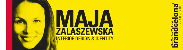
For a better understanding and to complete all those elements linked to the brand experience that influence the buying process, we will count with the collaboration of experts that will introduce concepts that will improve our business development, from different disciplines and points of view. Today we are pleased to introduce a text of Elena Rocchi, architect, teaching artist and visiting faculty at the Herberger Institute of Design and the Arts.
I am right now on the other side of the Ocean. In my new Phoenician apartment there is a nightstand lamp with a dark wooden base, sculpted in the shape of an owl… I can’t remember when I bought it. Moreover, I bought a nightstand lamp, but I don’t have a nightstand. I do remember buying the lamp at an American Supercenter, an Artifact that gulps anyone against their will: an object created for a Performance that someone once had in mind, a projective object, not an objective one. I am currently living in a country of Artifacts that work on a subconscious level to persuade people to buy what they don’t really need; Artifacts, whose precedent is Walmart: the first Real Time tool for controlled shopping activation in a Supercenter. Walmart’s founder Sam Walton, a farmer’s son, brought change to commercial spaces in the 1960s, through two paradigms that he sensed while observing the retail industry: Discounts and Self-Service. Sam is a great observer and a data collector. Because of his understanding of the agricultural world and by flying many kilometers over the US in a small plane, flown by himself, he knows well how to milk places and how to sort collected data. Sam carefully analyses everything by observing everything from above and gets down in order to visit small retail spaces. There he senses what will change the future of commercial spaces: allow customers to Compare, allow them to Select the products on their own and Pay at the cashier.
Sam codifies at a large scale the Self-Service concept for Superstores, in whose interior design he doesn’t spend a single dollar: Sam Piles Up everything he Buys and then Sells it Cheaper. Its interior design is not about shop shelves; it is about more than that. According to IBM spies –the ones in charge of controlling sales and inventory in Real Time– it is about using a barcode positioning system. Sam’s spartan artifact, with big lights and wider than normal aisles, is designed to optimally display the discounts. I almost never see anything in supermarkets; however, I find everything there without much effort: everything is displayed according to an interior project called ‘Experience expansion’ to make you buy anything.
Wandering between Supercenters I find a Microcenter, a Micro Utopia that started while Sam Beger and Nick DiPastena were attending University. At a traffic light intersection, with a desert climate and early in the morning, a Micro Utopia starts because Nick’s cousin gave him an old coffee roaster as a present, which he called “the Dinosaur”. Nick and Sam, micro Utopians, call themselves fun artists. They ride a bike to work and carry their store on their backs. It takes them only 7 minutes to get there. They don’t need a plane, nor to travel many kilometers. An old tuned up bicycle is their store and their mean of transport, a portable and efficient Artifact they have built in three months like real industrial designers, without actually being one: Sam is a recent graduate in Anthropology and Nick is still in college studying Economics –just like Sam Walton–, both at the Arizona State University. They both know what waiting in line to buy a Regular Coffee before or after class means. They have turned need into virtue. For a year now, they park their Ready Made every day on the corner of East University Drive and South College Avenue at the Tempe Campus, where I am currently working. I pass by every day, after having parked my car, on my way to Herberger Institute for Design and the Arts. Sam and Nick work on the street, with big smiles on their faces, greeting me every morning. Their shop/bicycle opens every day of class early in the morning like Pandora’s box, and they offer Iced Toddies, a coffee for all ages. Every morning they steal customers from Starbucks, filling the transparent walky cups with coffee with ice, to beat the desert heat. Here, in Phoenix, it is always very hot. We wear our stillsuits just like the Fremen, who inhabit the desert planet Arrakis, do: straws inject any kind of liquid into our bodies to counteract unconscious and constant dehydration. Sam and Nick use nitrogen pressurized kegs to freshly serve toddy cold-brewed coffee –a blend of 1/3rd of coffee concentrate and 2/3rd of water– and to prevent coffee from oxidizing. The economist is in charge of preparing the coffee, while the anthropologist cools it down with a technique also used for beer. They have found the perfect idea for Arizona, soon to become the Mecca of iced coffee. It seems they have decided to offer a wider range of coffee with coffee from various countries for their Ready Made: Ethiopia, Sumatra, Guatemala and Cameroon.
Sam and Nick encourage us, designers, to play with things. They invite us to become nomadic across design frontiers. And, in a country where shopping is controlled by Supercenters, they actualize a little intervention: a Micro Utopia philosopher Francisco Jarauta likes. Little interventions are the ones that help us to overcome the aseptic aspects of design. Sam and Nick have built their model by trying to deal with today’s complexity through a Micro institution, a Microcenter. Besides me, that I observe them, there are no designers behind them. Them, like Nick says, they are only Funny Artists. Artists in the broadest sense of the Greek word, which refers to ‘people engaged in one or more of a broad spectrum of activities related to creating art (art), practicing the arts (design), and/or demonstrating an art (craft).’
Design is the art that emerges from the creation of something that will later be proved. That’s what Nick and Sam, two funny artists, say.
Should we start calling ourselves Artists instead of Designers? Isn’t it true that it is now time to get back to the beginning of all things and to the essence of all meanings? In the beginning it was the Art. Ars, ‘Order’ and Τέχνη, ‘techně’, the expert at producing a process. The Art of being a designer or not is based on order and experience. An Artist is, then, the one able to create an object thanks to knowing the rules for producing it. An Artist is not only a painter or a designer: an anthropologist and an economist can also become an Artist. Design nowadays is not only about creating what is more functional, but also about bearing in mind what model should be applied in one’s trip and being Generous in the intervention. Art demands utopian tension, the dimension that honors us. In my first article I spoke about the need of finding a temps suspendu: by studying Economics and Anthropology, Nick and Sam reflect on the model they should apply to their trip by means of art, to put their ideas in order at a crossroad, setting time with a traffic light, while selling coffee.
Whatever it is, Do It Yourself.
http://bluehousecoffee.tumblr.com/
http://www.bluehousecoffee.com/#!aboutus/c2414
If you buy a blue house bag, Nick and Sam will give you an artistic sticker. If you are an artist, you can send them your contact details so they can check your work.
—-
Para completar y entender mejor todos los elementos vinculados a la experiencia de marca que inciden en el proceso de compra, contaremos con la colaboración de expertos que nos irán introduciendo, desde distintas disciplinas y visiones, conceptos que nos ayudarán a construir mejor nuestro negocio. Hoy estamos encantados de presentaros un texto de Elena Rocchi, arquitecta, artista y profesora en el Herberger Institute of Design and the Arts.
Me encuentro al otro lado del Océano. En mi nuevo apartamento fenicio tengo una lámpara para mesita de noche con un pie de madera oscura, entallada en forma de búho… No me acuerdo del momento en el que la elegí. Es más. He comprado una lámpara de mesita de noche y no tengo mesita de noche. Compré la lámpara, de eso sí me acuerdo, en un Supercenter americano, un Artefacto que engulla a cualquiera contra su voluntad: un objeto configurado con vista a una Performance considerada con anterioridad por alguien, un objeto proyectivo y no objetivo. Vivo ahora en un país de Artefactos que trabajan con el subconsciente para que compres lo innecesario, Artefactos de los que Walmart es el precedente: el primer instrumento de activación de compra controlada en Real Time en un Supercenter. Sam Walton, hijo de agricultores, es su fundador y quien, en los años Sesenta, opera el cambio de los espacios comerciales, que hoy todos bien experimentamos, según dos paradigmas que él mismo intuye observando la venta al por menor: Descuentos y Autoservicio. Sam es un gran observador y coleccionista de datos: por su comprensión del mundo agrícola, sabe cómo ordeñar lugares y ordenar datos acumulados, viajando cientos de kilómetros sobre Estados Unidos en un avión pequeño que él mismo pilota. Observándolo todo de manera general desde arriba, Sam de vez en cuando baja a lugares para observar los pequeños locales de venta al por menor. Su análisis riguroso le hace intuir el dato que cambiará el futuro de los espacios comerciales: el de permitir a los clientes Comparar, Seleccionar en solitario los productos en los estantes y Pagar en caja.
Sam codifica a gran escala el concepto de Autoservicio para Supertiendas en cuyo interiorismo y decoración no gasta ni un dólar: Sam Apila todo lo que Compra y lo Vende más Barato. Su diseño de interiores no son las estanterías. Es algo más, que depende de la lógica de lo colocado según lo que informan las espías IBM, las que controlan la venta y el inventario en Real Time: el sistema de códigos de barra. El artefacto espartano de Sam, de grandes luces y con pasillos más anchos de lo normal, está pensado para poner en movimiento la Performance de ver mejor los ahorros. Yo que casi no veo nunca nada, allí lo encuentro todo sin mucho esfuerzo: todo está dispuesto según un proyecto de interiores llamado “Expansión de la Experiencia” para que compres lo que sea.
Navegando entre un Supercenter y otro, descubro un Microcenter, una Micro Utopía que arranca mientras Sam Beger y Nick DiPastena atienden la Universidad. En un cruce de semáforo, en un clima desértico y pronto por la mañana, una Micro Utopía arranca porque a Nick su primo le regala una vieja tostadora de café que él llama “el Dinosaurio”. Nick y Sam, micro Utópicos, se definen a sí mismos fun artists. Artistas divertidos. Van a trabajar en bicicleta y con la tienda a cuestas. Tardan solamente 7 minutos en llegar. No necesitan ni un avión ni cientos de kilómetros. Una vieja bicicleta tuneada es su tienda y su medio de transporte, un Artefacto transportable y eficiente que han construido en tres meses como verdaderos diseñadores industriales, sin que lo sean: Sam es recién graduado en Antropología y Nick esta todavía estudiando, como Sam Walton, Económicas, ambos en la Arizona State University. Los dos saben lo que significa esperar en la cola para comprar un Regular Coffee antes o después de clase. De necesidad han hecho virtud. Aparcan su Ready Made cada día, desde hace un año, en la esquina East University Drive y South College Avenue en el Campus en Tempe, donde trabajo. Paso cada día por allí, después de haber aparcado mi coche, de camino hacia el Herberger Institute for Design and the Arts. Sam y Nick trabajan en la calle, con una gran sonrisa que me saluda cada mañana. Su tienda/bicicleta se abre como una caja de Pandora todas las mañanas del Campus, pronto, y distribuye el Iced Toddy, un café para todas las edades. Cada mañana le roban clientes a Starbucks que llena los walky cups transparentes de café con hielo por el calor que hace en el desierto. Aquí, en Phoenix, hace calor siempre. Nos enchufamos como los Fremen de Arrakis a nuestro destiltraje: tubos de pajillas que nos inyectan cualquier tipo de líquido para compensar nuestra deshidratación inconsciente y constante. Sam y Nick inyectan cold-brewed coffee “Toddificado”, una mezcla hecha de 1/3 de concentrado de café y 2/3 de agua y sacado de granos frescos, usando barriletes presurizados al nitrógeno que evitan al café oxidarse. El economista es el que sabe hacer el café, mientras el antropólogo lo enfría con una técnica similar a la de la cerveza. Han dado con la idea perfecta para este lugar del mundo, Arizona, que muy pronto será la Meca del café helado. Parece que se han decidido a ampliar el Ready Made para ampliar la oferta geográfica de café: Etiopía, Sumatra, Guatemala y Camerún.
Jugar entre cosas parece el camino que nos proponen Sam y Nick a nosotros los diseñadores. Nos invitan a ser nómadas entre las fronteras del diseño. Y en un país que controla las compras a través de los Supercenters, ponen en acto una little intervención: una Micro Utopía de las que les gustan al filósofo Francisco Jarauta. Son las pequeñas intervenciones las que nos salvan de lo aséptico del diseño. Sam y Nick han construido su modelo a través del tentativo de administrar la complejidad de esta época según una institución Micro, un Microcenter. Detrás de ellos no hay un diseñador, a parte de mí que los observo. Ellos, como dice Nick, son sólo Artistas Divertidos. Artistas pero en el amplio sentido del término Griego, el que se refiere a “unas personas involucradas en una o más actividades de un amplio espectro de actividades relacionadas con la creación del arte (art), la práctica del arte (design) y la demostración del arte (craft)”.
El Design es la práctica consecuente de la creación de algo que será demostrado. Eso nos dicen Nick y Sam, dos artistas divertidos.
¿Será que debemos empezar a llamarnos Artistas en lugar de Diseñadores? ¿Será que son estas unas épocas para volver al principio de las cosas y a la esencia de los significados? En un principio fue el Arte. Ars, “Ordenar”, y Τέχνη, “techně”, el ser experto en la producción de un proceso. De orden y de experiencia trata el Arte, que seamos diseñadores o no. Son Artistas entonces los que tienen la capacidad de hacer algún objeto, por conocer las reglas de cómo hacerlo. No son sólo pintores o diseñadores: son también antropólogos y economistas. El Design hoy en día no trata sólo de hacer aquello que sea más funcional, sino también de pensar en qué modelo uno aplica a su viaje y de ser Generoso en la intervención. Arte revindica la tensión utópica, la dimensión que nos da dignidad. En mi primer artículo hablaba de la necesidad de encontrar un tiempo suspendido: Estudiando Económicas y Antropología Nick y Sam reflexionan para ver cuál es el modelo que aplican a su viaje a través del arte, para ordenar sus ideas en un cruce de calles y con la tranquilidad del tiempo marcado por un semáforo, vendiendo café.
Sea lo que Usted sea, hágaselo Usted Mismo.
http://bluehousecoffee.tumblr.com/
http://www.bluehousecoffee.com/#!aboutus/c2414
Si les compráis una blue house bag, Nick y Sam os regalan una pegatina artística. Si sois artistas, les podéis enviar vuestro contacto para que miren vuestro trabajo.
Elena Rocchi