Loft37: Personalized shoes // Loft37: Zapatos personalizados

mZalaszewskaDEFFor a better understanding and to complete all those elements linked to the brand experience that influence the buying process, we will count with the collaboration of experts that will introduce concepts that will improve our business development, from different disciplines and points of view. Today we are pleased to introduce a text of Maja Zalaszewska, specialist in brand’s identity in the interior space.

I am a woman. If I was asked about the leitmotif of this brand, this is what would come to my mind first… I love to express myself. I have a weakness for beauty. I love shoes. Isn’t this about every woman? But every woman is different and unique, right?

The brand Loft37 seems to have found a recipe for this: hand-°©‐made, great quality (very comfortable, nice materials), good branding, accessible and affordable. Delivered to your home. Beautiful. With a funky twist. PERSONALIZED shoes. Yes! One can have a name written on ones beloved heels!

Loft37 was created by two very creative and talented young ladies –Joanna and Paulina– a lawyer and an interior designer/stylist. They say they are both very enthusiastic, energetic and share passion for beauty. Those features are probably what we can see in their brand Loft37. For the past few years, since its beginning, the brand has been growing really fast. They are now shipping outside of Poland, even to the US.

The key is their website. It is all about fun: easy going, creative, colorful. You click in and you find yourself in a shoe paradise.

The most amazing thing is that you can choose any model and configure your own materials and colors.

The selection of fabrics is vast –and what is important –the quality is what matters here. Women love details and jewelry –Loft37 did not forget about this important aspect of the feminine side. Additional application allows you to choose from ribbons, chains, belts, etc.

The cherry on the cake is the touch of luxury: the brand has invited several famous Polish designers to design several models.

The strategy and branding go smoothly together. Loft37 stands for personality, easygoing elegance, leisure, fun, comfort, luxury. All brought in together and delivered to your house. Simple.

—-

Para completar y entender mejor todos los elementos vinculados a la experiencia de marca que inciden en el proceso de compra, contaremos con la colaboración de expertos que nos irán introduciendo, desde distintas disciplinas y visiones, conceptos que nos ayudarán a construir mejor nuestro negocio. Hoy estamos encantados de presentaros un texto de Maja Zalaszewska, especialista en identidad corporativa aplicada al diseño de espacios.

Soy mujer, y como tal, si me preguntaran acerca del leitmotiv de esta marca, esto es lo primero que me vendría a la mente… Me encanta decir lo que pienso. Tengo debilidad por la belleza. Me encantan los zapatos. ¿Y no es así en toda mujer? Aunque cada mujer es única y diferente, ¿verdad?

La marca Loft37 parece haber encontrado la receta perfecta para dicha debilidad: hechos a mano, calidad de primera (muy cómodos y hechos con materiales muy buenos), con un buen branding, accesibles y asequibles. Entregados a domicilio. Bonitos. Con un aire moderno. Zapatos PERSONALIZADOS. ¡Sí! ¡Por fin es posible inscribir nombres en tus adorados tacones!

Loft37 fue fundada en Polonia por Joana y Paulina, una abogada y una estilista y diseñadora de interiores muy creativas y con mucho talento, quienes se definen como entusiastas, enérgicas y con una pasión en común: la belleza. Esta fusión de virtudes es probablemente lo que han conseguido plasmar en su marca Loft37. Desde su inicio, y sobre todo en estos últimos años, la marca ha crecido de forma muy rápida, y a día de hoy ya exporta a nuevos mercados, incluso a los Estados Unidos.

La clave de todo se encuentra en la página web: su accesibilidad, creatividad y sus vivos colores garantizan la diversión del usuario. Haces clic para entrar y descubres un paraíso de zapatos ante ti.

¡Pero lo más asombroso de todo es que puedes escoger cualquier modelo y configurar un diseño con los materiales y colores que más te gusten!

La selección de tejidos y materiales es amplia y, lo que es más importante, la calidad es primordial. Las mujeres adoran los detalles y las joyas, y Loft37 no olvida este importante detalle. Aplicaciones adicionales te permiten escoger entre lazos, cadenas, cinturones, etc.

La guinda del pastel viene dada por el toque de lujo: la marca ha invitado a  varios diseñadores de Polonia a colaborar con varios de sus diseños.

Estrategia y branding fluyen conjuntamente. Loft37 es el significado de personalidad, elegancia desenfadada, diversión, confort y lujo. Todo en uno y entregado a domicilio. Así de fácil.

Maja Zalaszewska

Screen shot 2012-12-21 at 9.05.00 PM 225178_188214984558501_1144585_n loft37.pl

Kirk Originals optician’s shop // Óptica Kirk Originals

Kirk-Originals-14Kirk+Originals_0212Kirk_Originals_019In order to make the user live a stimulating experience, Kirk Originals Eyewear, an optician’s shop with presence in over 40 countries, combines blue and grayish tones with bright lightning and presents a product layout, which is more than just creative.

66 squared meters conform this Kirk Originals’ flagship store in London, whose objective aims at interacting with the user. Located in 6 Conduit Street, this retail shop makes a difference in the optical industry and guarantees its success through minimalist design, by giving up on standard furniture to help the user perceive the product in its entire splendor.

Winking eyes on its shop window attract the passers-by attention and invite them to interact with the inside of the shop, where 187 glasses are displayed on white curved surfaces with imprinted eyes.

At the underground level, far from its main space, eye testing and assembling of these handcrafted frames take place, it all tailored to the user’s needs since the 1980s. At the ground-floor level, the firm’s corporate identity in black and white is projected on its back wall and it completes the big exhibiting wall of the store.

Kirk Originals is a model of differentiation through design and architecture, as it goes beyond the limits between retail shop and users by evoking memorable experiences on the user.

If you wish to create a memorable experience, Brandcelona retail consulting can advise you on the highlights to design a flagship store. Do not hesitate to contact us at info@brandcelona.com  to study the best alternatives and plan how to carry them out in your business plan.

—-

Con el fin de que el usuario viva una experiencia estimulante, Kirk Original Eyewear, óptica con presencia en más de 40 países, combina tonos azules y grisáceos con una iluminación brillante y presenta una disposición de producto más que creativa.

66 metros cuadrados son los que conforman la tienda flagship de Kirk Originals en Londres, cuyo objetivo es interactuar con el usuario. Este punto de venta situado en la calle Conduit número 6 marca la diferencia en el mundo de la industria óptica y garantiza su éxito apostando por un diseño minimalista, donde se prescinde de mobiliario auxiliar, con el fin de que el usuario perciba el producto con todo su protagonismo.

Los guiños de los ojos de los escaparates invitan a los transeúntes a entrar en contacto con el interior, donde se exponen 187 gafas diferentes montadas sobre superficies curvas blancas con ojos sobreimpresos.

En el piso inferior, lejos del espacio principal, tienen lugar los exámenes oculares y el montaje de este producto elaborado de forma artesanal y personalizada desde hace más de dos décadas. En la planta principal, la proyección en blanco y negro de la identidad corporativa de la empresa en el fondo de la tienda completa la gran pared expositora.

Kirk Originals es un ejemplo más de diferenciación por medio del diseño que consigue romper con las barreras impuestas en la relación entre espacio comercial y usuario, provocando en él una experiencia memorable.

Si deseas crear una experiencia memorable, Brandcelona retail consulting te puede asesorar sobre los aspectos más destacados para diseñar una flagship store. No dudes en contactarnos en info@brandcelona.com para que estudiemos las mejores alternativas y planificar cómo llevarlas a cabo en tu plan de negocio.

Crab’s essence // Esencia de cangrejo

banner_erocchi For a better understanding and to complete all those elements linked to the brand experience that influence the buying process, we will count with the collaboration of experts that will introduce concepts that will improve our business development, from different disciplines and points of view. Today we are pleased to introduce a text of Elena Rocchi, architect, artist and teacher.

All crabs have something in common: they all wander at the bottom of the sea. As they develop, their forelegs turn into two claws, which capture and manipulate the food, so they can be better at courting and fighting.

Claws are what I need on a Sunday afternoon stroll during Christmas time to get through the crowd at Passeig de Gràcia, one of the main shopping streets in Barcelona. I leave home in order to do some research and understand what people like and how people react when they face a shop window during Christmas time. How can a firm get the ones standing there engaged only with their shop window-stages?

Just imagine that you are going for a walk on a Sunday when you suddenly notice a shop window approaching. A group of people is standing in front of it. More people than expected. You think then about continuing without stopping, trying not to run over the people standing there. What should you do? The answer is relatively straightforward: you will have to stop.

You are by the boutique of a brand that was founded in Spain by a German craftsman specialized in leather working that arrived in Madrid in 1872 to learn from the Spanish leather industry: Enrique Loewe Roessberg. Enrique Loewe arrived in Spain in the late 19th century like many other German craftsmen that, since the 16th century, sought their fortune and, at the same time, wanted to undertake a training journey in Spain, France and Italy. Such was the success of Loewe in expanding his business by opening a leather goods workshop in the most commercial district in Madrid, in Lobo street, that in 1905 Loewe was appointed Purveyor to the Royal Household, and Alfonso XIII of Spain became his regular customer. Loewe started manufacturing pink frames écrasé, Moroccan leather jewel boxes and handbags, among others: a Leather goods factory E. Loewe. Príncipe Street, 39. Phone number 1.810. Man spricht deutsch. On parle français. English spoken. Established 1846”).

Over the same years in which Mariano Fortuny produced exotic fabrics in Italy, “Loewe, fiel a la piel” (“Loewe, faithful to leather”) remains faithful to its original philosophy. In Spain, where the firm is renowned for the quality of its lambskins, he finds the “Cordero entrefino español”, which refers to lambs bred in the cool heights of the Spanish Pyrenees.

As we were saying… You are standing in front of a shop window from the boutique at Passeig de Gràcia, 35, first opened in 1940 by German Loewe Knappe and relocated to Passeig de Gràcia from Carrer Ferran (Ferran Street), the second boutique from Loewe opened in Barcelona, after the one in Carrer Fonanella (Fontanella Street). Javier Carvajal was the architect that during 1960s conducted a study about Northern interior design transformed into “Spanish” by using walnut. Designer Vicente Vela not only added many different colors to Loewe’s leather, but he also shaped the firm as a “crab” in 1970. However, the precursor of Loewe’s visual merchandising back in the 70s was designer José Pérez Rozas, as he was the one that first brought such an ephemeral art performance to its shop windows.

Since 1980s Loewe has brought together through its Foundation writers, painters and philosophers as aesthetic consultants of the firm, in order to know how to proceed when selling “Spanishness” of the brand in the world, especially in Japan and in Asia-Pacific. Loewe does so by including “shawls with motifs from Velásquez or the Gala fragrance in the form of a Menina (Spanish for “Maid of Honour”), as said by Luis Antonio de Villena, one of the consultants of the Foundation, which was founded in 1988 by Enrique Loewe Lynch (the fourth Loewe generation).

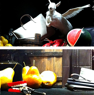
Since you have stopped when trying not to run over the people standing in front of the shop windows from Loewe, you suddenly see a flying rabbit and a world map in the shape of a rotating watermelon next to some handbags, when looking at the show window. Standing right next to a group of women taking pictures of the still life of Loewe, you will be astonished and fascinated by the flying rabbit. While wandering at the bottom of the sea, the crab has caught it with its claws. The crab begins to court the rabbit; he captures it and will eventually manipulate it like the best comfort food.

Stuart Vevers, Loewe’s current creative director since 2008 and the author of the brand’s rejuvenation, explains that the “good practice” of the firm in regards to its shop windows-still lifes for Christmas time in the 20th century results from some ancient and classical codes and aims at pursuing the key principle “A luxury firm must cause tachycardia on its customers”. If the famous advertising campaign “Quizás, quizás, quizás de Loewe” (“Perhaps, perhaps, perhaps by Loewe”) by Eugenio Recuenco focused on the “Spanish traditional character”, seduction and social valuation, what kind of tachycardia should cause the new shop windows-still lifes at Passeig de Gràcia in Barcelona? Every still life has an allegorical and symbolic meaning in their general iconographic messages; Loewe takes up such messages again in this year’s Christmas campaign. And if Leonardo da Vinci’s still lifes show genuine interest for the new-enlightened world, at what new world do the handbags and wallets made out of “Spanish cordero fino” leather aim?

As in the finest still life tradition, the shop window represents natural inanimate objects from our daily life or inanimate objects created by the human Loewe. A gold baroque frame determines the space of the shop window on a black rigorous background. The lighting highlights the symbolic value of the message. Furthermore is Loewe’s still life animate. The flying rabbit wings (probably in its resurrection) and the rotating watermelon-world map appoint Africa as the world’s future. They move.

Based on the belief that objects become “Real” at the other side of death, in case the pharaoh may need them, the still lifes made of food and domestic objects are born for the first time as interior decoration for the tombs in Ancient Egypt. Through baroque paintings, still lifes celebrate the “Vanitas things” (XXX) that death snatches from us when we all become equal. Omnia mors aequat (“Death levels all distinctions”). The genre of “Vanitas” still lifes has to do with the Thirty Years’ War (1618-1648), where many European countries went bankrupt and the economy collapsed. In this context, still lifes try to forget about the crisis by representing vanity and wealth in its fleetingness. The Spanish version here refers to an impoverished country from the 1600s, since the gold found in the American colonies was not invested in a productive way: the Spanish still lifes by Juan Sánchez Cotán had a “lack of food”.

Right in front of the hyperrealist shop window where you are standing you can see these new skilled Zeuxis and Parrhasius and their Trompe-l’oeil. Pliny the Elder appointed the Greek painter Peiraikos as “the painter of vulgar objects” and his works as “a group of delicious things sold at higher prices than the greatest paintings of many other artists”, just like Loewe’s still lifes. Wealthy Loewe financed a new collection with new types of leather. But this time there are no moral messages in his “Cabinet of Wonder”. What would you say there is instead?

Through “World’s disillusion, Vision of a Knight” from 1670, painter Antonio de Pereda explains probably better the disillusionment shown in Loewe’s shop window. While sleeping, an angel appears in the young boy’s dreams and warns him. Here the flying rabbit is warning you. “Aeterna pungit, cito volat et occidit” (“Eternally it stings, swiftly it flies and it kills”). A bit higher than your eye-level the flying rabbit reminds you of Lewis Carroll’s March Hare at the Unbirthday Party in Alice in Wonderland, and, just like Alice, you are a subgenre in this Tea Party. You are the one celebrating on your Unbirthday; on the day of your death. Only your teeth are lying among this setting of Loewe handbags, watermelons, crabs and key-chains. You are not there anymore. And this all reminds you of the fleetingness of life. Omnia mors aequat (Death levels all distinctions). The Trompe-l’oeil is misleading you, but if you look a little bit closer at the reflection of the shop window you will see that you have no longer multiple points of view; you are now standing in front of your own point of view, where your face is now at the height of the plastic teeth.

The severe austerity in Spanish still lifes is probably what Loewe identifies with the “being Spanish” concept and what would best represent Spain in form of a souvenir to bring back home. But when this is translated into Loewe’s shop window by introducing the brand’s luxury and you in your impermanence, Loewe develops a new technique that goes beyond the boutique. As in the Pop Art-still life “Campbell’s Soup Cans” produced by Andy Warhol, the modified image of the product and your critical view as a consumer, as well as the fact of being temporarily alive, constitutes its real matter.

Ready to wear. Only for a while. Before the Tachycardia.

Stuart Vevers knows these are hard times. And his “good clinical eye” points to the impermanence. Albert Puyol, former president of Loewe, says about the enfant terrible:  “Some people, like Marc Jacobs, John Galliano or Stuart Vevers, perceive life in five different dimensions, instead of perceiving it in two. They see the world through a hole, which turns to be the hole we all eventually see through”.

A whole we all go through in our Sunday stroll in the fifth dimension. Now, honestly; do not forget to take a Loewe handbag for your trip.

—-

Para completar y entender mejor todos los elementos vinculados a la experiencia de marca que inciden en el proceso de compra, contaremos con la colaboración de expertos que nos irán introduciendo, desde distintas disciplinas y visiones, conceptos que nos ayudarán a construir mejor nuestro negocio. Hoy estamos encantados de presentaros un texto de Elena Rocchi, arquitecta, artista y profesora.

Lo que tienen en común todos los cangrejos es vivir “vagando” sobre el fondo del mar.

En su evolución, sus patas delanteras locomotoras se mudan en un par de pinzas que capturan y manipulan el alimento, que cortejan y luchan mejor.

Pinzas son las que necesito un domingo por la tarde para hacerme espacio el Passeig de Gràcia, en época de Navidad. En Barcelona. Salgo a la calle a seguir las investigaciones que me ayudan a entender el gusto de la gente y sus reacciones humanas al encontrarse delante de un escaparate en Navidad. ¿Cómo una firma consigue comprometer con sus escaparate-escenarios a todos aquellos que allí delante están?

Imagínese que Usted está realizando su paseo dominguero cuando a lo lejos observa un escaparate que se aproxima. Un grupo de personas esta parado delante de el. Más gente de lo normal. Piensa entonces Usted en continuar su recorrido y no pararse, intentando ingeniárselas para evitar atropellar a los individuos allí parados. ¿Qué es lo que Usted debería hacer? La respuesta es relativamente sencilla: deberá pararse.

Está Usted a la altura de la tienda de una marca fundada en España por un artesano alemán, que llega a Madrid en 1872 para aprender sobre la marroquinería española: Enrique Loewe Roessberg. Enrique Loewe llega a España a finales del siglo XIX como todos aquellos artesanos alemanes que tienen el propósito de hacer fortuna y al mismo tiempo emprender su viaje de formación en España así como en Francia y Italia desde el siglo XVI. Tal es la fortuna de Loewe en relevar un taller de trabajo de marroquinería en la calle Lobo de Madrid, que en 1905 es distinguido como Proveedor de la Casa Real. Y Alfonso XIII es su cliente habitual. Loewe empieza fabricando marcos de ecrasé rosas, cajas de alhajas en piel de tafilete, bolsos, saquitos para automóvil en piel: una “Fábrica de artículos de piel E. Loewe. Príncipe, 39. Teléfono 1.810. Man spricht deutsch. On parle français. English spoken. Casa fundada en 1846”.

En los mismos años en los que Mariano Fortuny produce tejidos exóticos en Italia, “Loewe, fiel a la piel” sigue con su filosofía original. En España, reconocida por la calidad de las pieles de cordero, Loewe encuentra el «Cordero entrefino español», que vive y pastea feliz en las frías alturas de los Pirineos españoles.

Como estaba diciendo… Está Usted delante de un escaparate de esta tienda al número 35 del Passeig de Gràcia, abierta en 1940 por German Loewe Knappe y trasladada aquí desde la Calle Ferran, la segunda tienda Loewe en Barcelona después de la Calle Fontanella. Javier Carvajal es el arquitecto encargado durante los años 60 del estudio de un interiorismo de carácter nórdico “españolizado” con madera de nogal. El diseñador Vicente Vela es el que, a parte dar a la piel Loewe diversos colores, da forma de “cangrejo” a la firma en 1970. Y sobre todo, José Pérez Rozas, es el creador de bolsos de la casa y el precursor del «visual merchandising» en aquellos años 70, que inaugura la tradición de los escaparates teatrales y elegantes de Loewe, demostración verdadera de arte efímero.

Desde los años 80 Loewe convoca a través de su fundación a escritores, pintores y filósofos como asesores estéticos de la firma sobre como proceder en la venta de la “españolidad” de la firma en el mundo, principalmente en Japón y Asia-Pacifico. Lo hace desde sus tiendas y escaparates “con sus pañuelos con motivos de Velásquez o el perfume Gala, con forma de menina”, como recuerda el escritor Luís Antonio de Villena, uno los asesores de la Fundación creada en 1988 por Enrique Loewe Lynch, cuarta generación Loewe.

Al haberse parado Usted en su intento de evitar atropellar a los individuos delante de los escaparates Loewe, al mirar a la vitrina, descubre un conejo volador y un mapamundi en forma de Sandía Giratoria al lado de unos bolsos. Quedará Usted perplejo y fascinado delante del Conejo volador, allí detrás del grupo de señoras tirando fotos al Bodegón Loewe lleno de ideas regalo. El cangrejo le ha atrapado en sus pinzas mientras estaba “vagando” sobre el fondo del mar. Le empieza a cortejar, le captura y le manipulará como su mejor alimento.

Stuart Vevers, director creativo de Loewe desde 2008 y rejuvenecedor de la marca, apunta en los escaparates-Bodegones el “buen hacer” de la firma según unos códigos antiguos y clásicos, en estos días de Navidad de nuestro siglo XXI, bajo su propósito según el cual “Una firma de lujo tiene que provocar taquicardia en el cliente”. Si la tradicionalidad española junto con la seducción y valoración social son temas centrales de una famosa campaña publicitaria de Eugenio Recuenco «Quizás, Quizás, Quizás de Loewe», ¿qué taquicardia nos deberían dar los nuevos bodegones escaparate del Passeig de Gràcia en Barcelona? Los Bodegones tienen un significado alegórico y simbólico en su mensaje iconográfico general que bien es retomado por Loewe en la campaña de estas Navidades. Y si con los bodegones de Leonardo da Vinci se demuestra el interés por un nuevo mundo ilustrado, ¿a qué nuevo mundo apuntan los bolsos y las carteras de piel de cordero entrefino español?

Como en la mejor tradición de los bodegones, el escaparate representa objetos inanimados de la vida cotidiana, naturales o hechos por el hombre Loewe. El espacio del escaparate, sobre riguroso fondo negro, es determinado por un marco barroco de oro. La iluminación resalta el valor simbólico del mensaje. El Bodegón Loewe es, además, animado. Las alas del conejo volador (quizás en su resurrección) y la sandía-mapamundi que apunta a África como el futuro del mundo, se mueven.

Los bodegones hechos de comida y objetos domésticos nacen por primera vez como adorno del interior de las tumbas del Antiguo Egipto, en esta creencia de que los objetos se hacen “Reales” al otro lado, por si el faraón los necesita. Con la pintura Barroca, los bodegones celebran las “Cosas Vanitas” que la muerte borra al igualar a todos. Omnia mors aequat. El género de Bodegones “Vanitas” tiene que ver con la Guerra de los Treinta Años (1618/1648), con la ruina de muchos países europeos y el desplome de la economía. Los Bodegones en este contexto intentan olvidar la crisis a través de la representación de la vanidad y la riqueza aunque en su fugacidad. La variante española es la de un país empobrecido alrededor de 1600 ya que el oro de las colonias americanas no se ha invertido de manera productiva: los bodegones españoles de Juan Sánchez Cotan son “carentes de comida”.

Delante de este escaparate hiperrealista, Usted se encuentra delante de estos nuevos y diestros Zeuxis y Parrasio y de su Trampantojo. Plinio el Viejo indica al pintor griego Peiraikos como “el pintor de los objetos vulgares”, y a sus obras que, como los Bodegones Loewe “eran en conjunto deliciosas, y se vendían a precios más altos que las más grandes (pinturas) de muchos otros artistas”. El rico Loewe financia una colección de nuevas especies de piel. En su “gabinetes de curiosidades” no hay carnes crudas ni mensajes morales. ¿Qué diría Usted que hay entonces?

Con “Desengaño del Mundo, El sueño del caballero” de 1670, Antonio de Pereda nos explica quizás mejor el desengaño ofrecido por el Escaparate Loewe. El ángel se lo advierte en sueños al joven ricamente vestido.
El conejo Volador se lo advierte a Usted. “Aeterna pungit, cito volat et occidit” (Eternamente hiere, vuela veloz y mata). Ubicado un poco más arriba de la altura del ojo, el conejo volador recuerda la Liebre de Marzo de Lewis Carroll de la Fiesta de No Cumpleaños de Alicia en el País de las Maravillas, y Usted, como Alicia, es un subgénero dentro de este Tea Party. Usted es el celebrado en su día de no cumpleaños. En el día de su muerte. En este arreglo de bolsos Loewe, sandías, cangrejos y llaveros, está su dentadura sin Usted ya, recordándole la fugacidad de la vida. Omnia mors aequat. La  “trampa ante el ojo” le engaña, pero si mira bien en el reflejo del vidrio de la tienda, su figura se coloca ya no en puntos de vista múltiples, sino en el suyo propio, donde su cara está a la altura de la dentadura de plástico.

La severa austeridad de los bodegones españoles es para Loewe quizás lo que identifica el “ser español” para llevarse de souvenir de vuelta al país de cada uno. Pero al traducirlo en sus escaparates introduciendo el lujo de la marca y a Usted en su impermanencia, Loewe inventa una nueva técnica mixta que se expande mas allá de la tienda. Como en los bodegones Pop Art de latas de sopa Campbell de Warhol, su verdadero tema es la imagen modificada del producto comercial y la postura crítica que Usted tome como consumidor y ser vivo temporalmente.

Ready to wear. Only for a while. Before the Tachycardia.

Stuart Vevers sabe que no son tiempos de lujo. Y su inteligente ojo apunta a la impermanencia. El expresidente del grupo de moda Albert Puyol dice del enfant terrible: “Hay gente que, en vez de percibir la vida en dos dimensiones, lo hace en cinco, como Marc Jacobs, John Galliano o Stuart Vevers, que ven el mundo por un agujero que, al final, es por el que acabamos viendo todos”.

Un agujero por el que acabamos pasando todos en nuestro paseo dominguero en la quinta dimensión. Eso sí. Llévese un bolso Loewe para el Viaje.


Elena Rocchi


Antonio de Pereda El sueño del caballero bodegon

MOSAIC 2

#mybestretailexperience has already a winner // #mybestretailexperience ya tiene ganador

brandcelona_concurs-01brandcelona_concurs-02

The winner of the #mybestretailexperience contest has been @sergibway with a picture of an installation from Louis Vuitton that took place in Paris in 2009. Congrats sergibway!

In the coming days you will receive a Christmas kit from brandcelona® in which you will find 5 delicious chocolate packs, which will make you enjoy its taste and, at the same time, you will be able to send a postcard and share our lifestyle and brand experience.

We wanna thank all the people that participated in the contest. brandcelona® wishes you all a Merry X-mas!

—-

El ganador del concurso #mybestretailexperience ha sido @sergibway con una instalación de Louis Vuitton que se realizó en París el año 2009. Felicidades sergibway!

En los próximos días te haremos llegar un kit de navidad de brandcelona®; en él encontrarás 5 deliciosos packs de chocolate que te permitirán disfrutar de todo su sabor y a su vez enviar una postal compartiendo nuestro estilo de vida y experiencia de marca.

Muchas gracias a todos los que participastéis en el concurso. Desde brandcelona® os deseamos a todos una feliz navidad!

Chocolate Research Facility: visual impact // Chocolate Research Facility: impacto visual

Chocolate Research Facility store vía http://sergetheconcierge.typepad.com/

Chocolate Research Facility store vía http://sergetheconcierge.typepad.com/

Chocolate Research Facility packagings vía CRF Facebook Page

Chocolate Research Facility packagings vía CRF’s Facebook Page

Chocolate Research Facility store vía CRF's Facebook Page

Chocolate Research Facility store vía CRF’s Facebook Page

Chocolate Research Facility store desk vía CRF's Facebook Page

Chocolate Research Facility store desk vía CRF’s Facebook Page

CRF (Chocolate Research Facility) it’s a brand from Singapore specialized in innovation and research of new chocolates. Under the slogan of «Happy Food Makes Happy People«, they recreate in their stores-lab impossible and classic mixes in their more than 100 flavors of chocolate. They highlight strategically and consecutively three concepts of their core business: the flavors, the packaging and the store-laboratory.

They establish a strategy through a series of general flavors ordered in large blocks easily recognizable: seasonal flavors, classic, fruit, double fruit, coffee, for tea, with nuts, for experts, exotic and with alcohol. They not only offer an amazing product and experimenter for the senses, but also the resulting flavor is delicious! And from there, the packaging is involved, predisposing and guiding senses to the taste of each tablet. Its image in packaging outstands with graphics and is worked both ranges (series) as flavors within each series. No doubt in many cases one could be to collecting the entire series for the visual effect that produce together. Their website keeps the leitmotif of the brand, reinforcing the graphic and sensorial coherence of its positioning. As well as have various merchandising items (mugs, shirts, plates …) that impact on the sense of identity for chocolate lovers.

And finally, how can this highlight in a space without overshadowing it? Well, maintaining the concept of experiment, bringing the interiorism to a vintage laboratory in which  products stand for their colors and shapes, so the space simply serves as the scenario. In their stores-lab not only exhibit all the flavors and formats but also reserve a small coffee-tasting area, which relieves the feeling of facing a choice between more than 100 options. In addition, they introduce new elements in stores, coinciding with seasonal activities and campaigns. In 2009 CRF was recognized by Time’s magazine as the best Asian store to experiment with chocolate.

Flavors, packaging and store form a triad always ready to impact visually and sensually attract visitors. The brand, as they say, was conceptualized by a serious chocolate lover. They keep the youthful character of chocolate disguised in serious and alchimist version of this food so appreciated.

—-

CRF (Chocolate Research Facility) es una marca de Singapur especializada en la innovación e investigación de nuevos chocolates. Bajo el lema de «Happy Food Makes Happy People«, recrean en sus tiendas-laboratorio mezclas imposibles y clásicos en sus más de 100 sabores de chocolate. Destacan estratégicamente y de forma correlativa 3 conceptos de su core-business: los sabores, el packaging y la tienda-laboratorio.

Establecen su estrategia de sabores mediante unas series generales que los ordenan en grandes bloques fácilmente reconocibles: sabores de temporada, clásicos, de frutas, con doble fruta, de café, para el té, con frutos secos, para expertos, exóticos y con alcohol. No sólo ofrecen un producto sorprendente y experimentador para los sentidos, sino que además el sabor resultante resulta delicioso! Y a partir de ahí, es el packaging el que interviene, predisponiendo y guiando nuestros sentidos hacia el sabor de cada tableta. Su imagen gráfica en packaging es excepcional y se trabaja tanto por gamas (series) como por sabores dentro de cada serie. Sin duda, en muchos casos podría llevarse al coleccionismo de toda la serie por el efecto visual que producen en conjunto. Su web mantiene el leitmotiv de la marca, reforzando la coherencia gráfica y sensorial del posicionamiento, al igual que cuentan con distintos elementos de merchandising (tazas, camisetas, platos…) que impactan sobre el sentimiento de identidad de los amantes del chocolate.

Y por último, ¿cómo hacer destacar todo esto en un espacio sin eclipsarlo? Pues manteniendo el concepto de experimento, llevando el interiorismo hacia un laboratorio vintage en el que destaquen los productos por sus colores y formas y el espacio sirva simplemente de marco / escenario. En sus tiendas-laboratorio no solo exponen todos los sabores y formatos sino que también reservan una pequeña zona de degustación-café, que aligere la sensación de enfrentarse a una decisión entre más de 100 opciones.  Además, introducen nuevos elementos en las tiendas, coincidiendo con acciones estacionales y campañas. En 2009 fue reconocida por la revista Time como la mejor tienda asiática para experimentar con el chocolate.

Sabores, packaging y tienda forman una tríada dispuesta siempre a impactar visualmente, atrayendo sensorialmente a los visitantes. La marca, como dicen, se conceptualizó por un serio amante del chocolate. Mantienen el carácter juvenil del chocolate camuflado en una versión seria y alquimista de este alimento tan apreciado.

Eco-consulting: Grow your business through sustainability // Eco-consultoría: Haz crecer tu negocio mediante la sostenibilidad

Business sustainability is governed by three basic pillars to consider: economic sustainability, environmental sustainability and social sustainability. These three pillars may form a balanced triangle, as we would say in geometry an equilateral triangle, in which all sides have equal weight.

As Insik exposed in his latest collaboration, commitment to growth -or development- from sustainability, presents the way of working and commercializing that has ruled so far. The price we pay for most products is not worth the impact generated, and yet rarely reconsiders how to redistribute it.

There are many factors to be analyzed within each of these pillar. At the point of sale, for example, issues such as energy bills, water management and consumables like paper, the emission of hazardous waste or the choice of materials for the interior – because though wood is natural, it is not a unlimited resource-. At the social level, the question is what is the responsibility of the brand with all persons and entities that surround it, whether workers, neighbors, suppliers, users and shareholders. And economically, what is the investment strategy and the redistribution of benefits – is it invested in the sustainable development of the company?, or in the training and knowledge of the team?, what causes do your brand support? -. All this is not only part of a growing mass of small retailers, because increasingly large chains are investing in it. As in the case of Sainsbury’s who are celebrating the first anniversary of their 20×20 Sustainability Plan.

This new service of brandcelona® in eco-consulting, structure work methodologies to advice and develop the brand experience in the retail space, under sustainability criteria. Considering these new criteria, help positioning the brand, adapting and preventing changes in the current scenario. For any further information, please contact us via the email info@brandcelona.com.

—-

La sostenibilidad empresarial se rige por 3 pilares básicos a tener en cuenta: la sostenibilidad económica, la sostenibilidad medioambiental y la sostenibilidad social. Estos 3 pilares deben formar un triángulo equilibrado, como se diría en geometría un triángulo equilátero, en el que todos tienen un peso equitativo.

Como exponía Insik en su última colaboración, la apuesta por un crecimiento -o bien desarrollo- desde la sostenibilidad, plantea la forma de trabajar y de comercializar que ha gobernado hasta ahora. El precio que pagamos por la mayoría de productos no compensa el impacto que generan y sin embargo, pocas veces se replantea cómo redistribuirlo.

Hay muchos factores a analizar dentro de cada uno de estos pilares. En el punto de venta, por ejemplo, temas como la factura energética, la gestión del agua y consumibles como el papel, la emisión de residuos peligrosos o la elección de materiales para el interiorismo – pues, aunque la madera sea natural, no es un recurso ilimitado-. A nivel social, cabe plantearse qué responsabilidad tiene la marca con todas las personas y entidades que la rodean, ya sean trabajadores, vecinos, proveedores, usuarios o accionistas. Y a nivel económico, cuál es la estrategia de inversión y redistribución de beneficios – ¿se invierte en el desarrollo sostenible de la empresa?, ¿en la formación y conocimiento del equipo?, ¿en apoyar causas?-. Todo ello, no sólo forma parte de una creciente masa de pequeños retailers sino que cada vez más grandes cadenas invierten en ello. Como en el caso de Sainsbury’s que ya celebran el primer aniversario de su 20×20 Sustainability Plan.

El nuevo servicio de brandcelona® en eco-consulting estructura metodologías de trabajo y actuación junto con el asesoramiento y la experiencia de marca en el espacio comercial, bajo criterios de sostenibilidad. Tener en cuenta estos nuevos criterios, ayuda al posicionamiento corporativo, adaptándose y previniendo los cambios en el panorama  actual. Para ampliar cualquier información al respecto, contacte con nosotros a través del email info@brandcelona.com .

#mybestretailexperience Our Instagram Contest! // #mybestretailexperience ¡Nuestro concurso en Instagram!

So yes, today begins our Instagram contest on What’s your favorite store in the world? Take a picture of your favorite stores and tag them with the hashtag #mybestretailexperience. If your photo gets more «Like»s than anyone, you’ll receive at home a brandcelona® Xmas kit.

Votations will be open until December 19 and on December 20 we’ll post the winner here.  Good luck and enjoy!

—-

Pues sí, hoy empieza nuestro concurso de Instagram sobre ¿Cuál crees que es la mejor tienda del mundo? Haz una foto a tus tiendas preferidas y taguéalas con el hashtag #mybestretailexperience. Si consigues que tu foto tenga más «Me Gusta» que nadie, recibirás en casa un kit navideño brandcelona®.

Tienes hasta el 19 de diciembre para que voten tus capturas y el día 20 de diciembre publicaremos por aquí el ganador. ¡Mucha suerte y disfruta!

Views of the 20th century: Schumpeter // Lecturas del siglo XX: Schumpeter

For a better understanding and to complete all those elements linked to the brand experience that influence the buying process, we will count with the collaboration of experts that will introduce concepts that will improve our business development, from different disciplines and points of view. Today we are pleased to introduce a new text of Insik W. Yoon, sociologist.

Joseph Schumpeter saw capitalism the best system for economic progress but nevertheless, predicted its inevitable collapse. The reasons for the decline of capitalism would obey, according to the economist, to an internal sclerosis of the system. In other words, the capitalist growth is not sustainable: an economy that for growing needs to sell more than they buy, and if all economies have to grow the same way, in the end, who will buy?

To sustain economic growth over time, consumption must be sustainable too. To maintain production, individuals from the other side of the equation, must be buying. If a production-oriented economy has reached its limits, there is no reason to believe that an economy based on consumption and credit will be different. Is the consumer society a sustainable model? Capitalism is a zero-sum system, in the sense that not everyone can be competitive and have a trade surplus, necessarily it must have players who spend more than they generate. Otherwise, there would come a point where no one would buy or sell. Fortunately, it is still not the end of capitalism, it may be the beginning of a new cycle.

The current economic situation is forcing us to consume less and less. Manufacturers are reacting and offering in their stores a reduced format of their products, individual doses or smaller packs. A logical reaction, because if the average cost of purchases is 18 euros, can not be expected that consumers devote half of its budget to a single product. With medications could do the same, ie, pharmacies could sell treatments by the doses prescribed by doctors instead of the whole box of pills. This would avoid the waste of medicines and would be a relief to the pocket of pensioners.

I.W.Y.
Ego Consumans

—-

Para completar y entender mejor todos los elementos vinculados a la experiencia de marca que inciden en el proceso de compra, contaremos con la colaboración de expertos que nos irán introduciendo, desde distintas disciplinas y visiones, conceptos que nos ayudarán a construir mejor nuestro negocio. Hoy estamos encantados de presentaros un nuevo texto de Insik W. Yoon, sociólogo.

Joseph Schumpeter consideraba al capitalismo el mejor sistema para el progreso económico, pero a pesar de ello, auguró su inevitable colapso. Las razones de la decadencia del capitalismo obedecerían, según el economista, a un esclerosamiento interno del propio sistema. Dicho de otro modo, el crecimiento capitalista no es sostenible: si para que una economía crezca es necesario que venda más de lo que compra, y si todas las economías tienen que crecer del mismo modo, al final, ¿quién comprará?

Para que el crecimiento económico sea sostenible en el tiempo, el consumo debe serlo también. Para seguir produciendo es necesario que hayan personas al otro lado de la ecuación comprando. Si una economía orientada a la producción llegó a sus límites, no hay razones para pensar que una economía basada en el consumo y el crédito vaya a resultar diferente. ¿Es la sociedad del consumo un modelo sostenible? El capitalismo es un sistema de suma cero, en el sentido que no todos pueden ser competitivos y tener superávit comercial, necesariamente tiene que haber actores que gasten más de lo que generan. De lo contrario, llegaría un punto en el que nadie compraría o nadie vendería. Afortunadamente, todavía no es el fin del capitalismo, tal vez sea el inicio de un nuevo ciclo.

La actual coyuntura económica nos está forzando a consumir cada vez menos. Los fabricantes están reaccionando y ofrecen en las tiendas formatos reducidos de sus productos, dosis individuales o botes más pequeños. Una reacción lógica, ya que si el gasto medio de las compras es de 18 euros, no se puede pretender que el consumidor destine la mitad de su presupuesto a un solo producto. Con los fármacos se podría hacer lo mismo, es decir, que las farmacias vendieran los tratamientos por las dosis recetadas por los médicos en lugar de toda la caja de pastillas. Se evitaría el desperdicio de medicamentos y supondría un alivio para los bolsillos de los pensionistas.

I.W.Y.
Ego Consumans